
Supernova
October 2021 . Brand design and Visual Identity . Kuwait
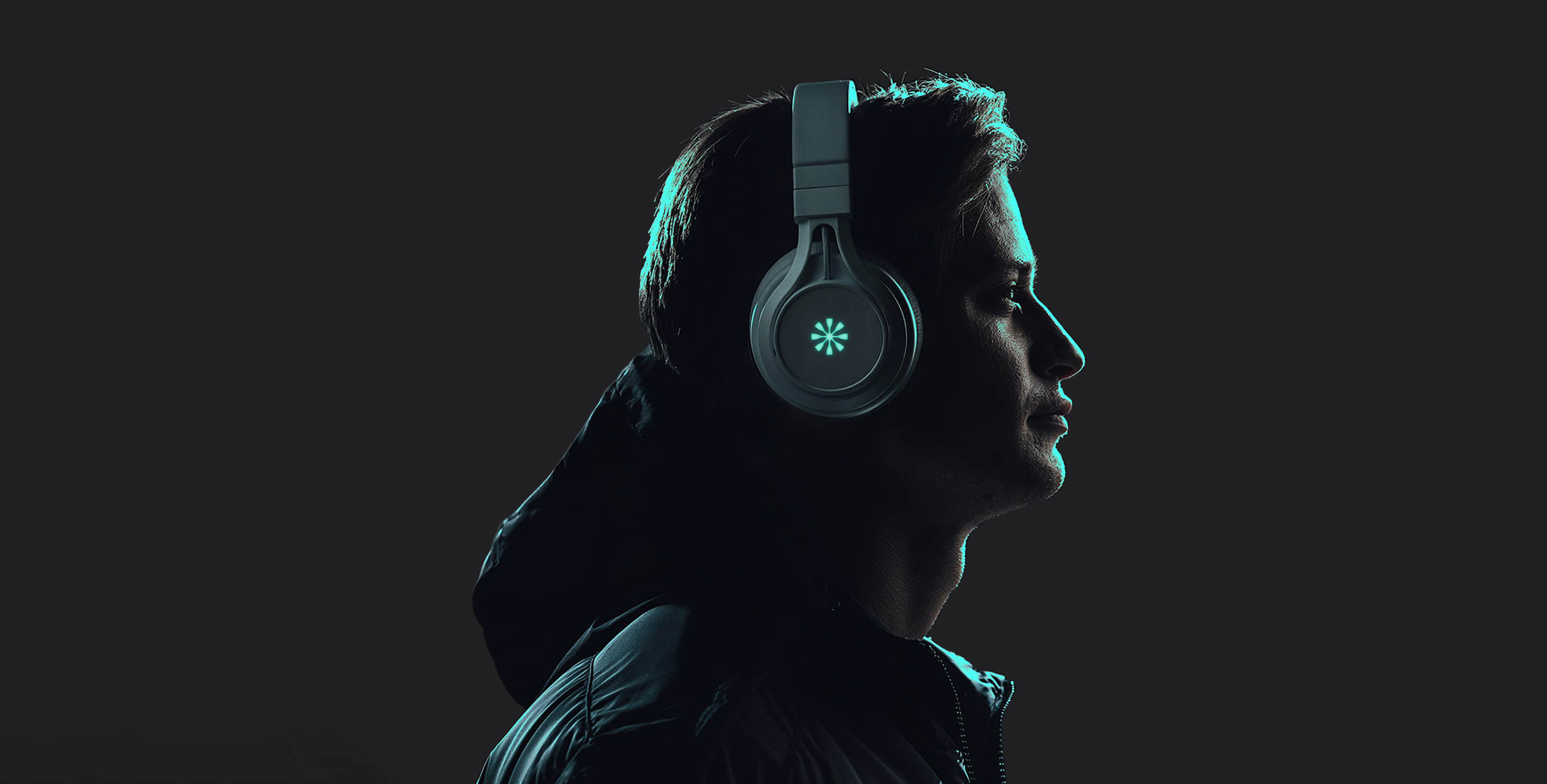
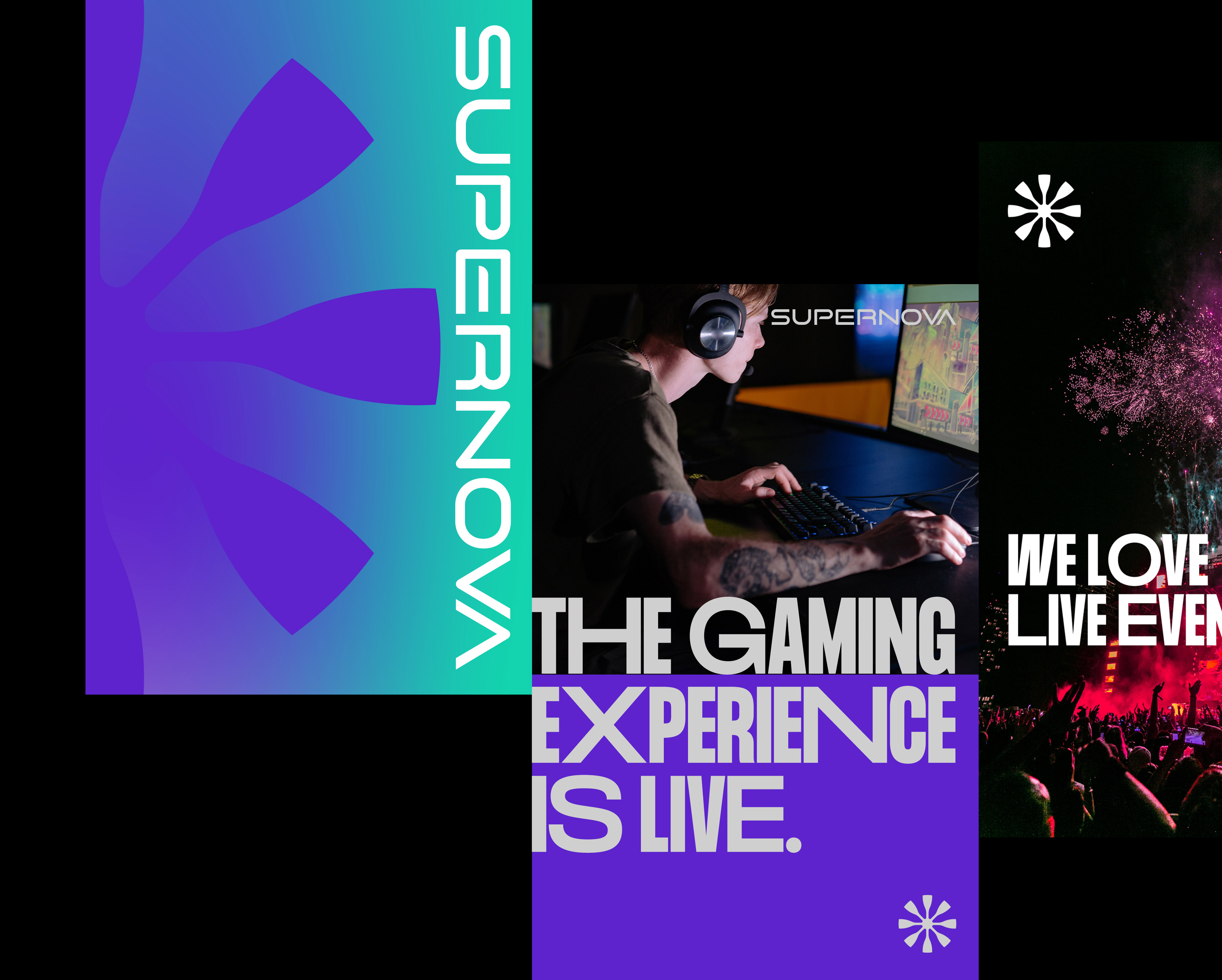
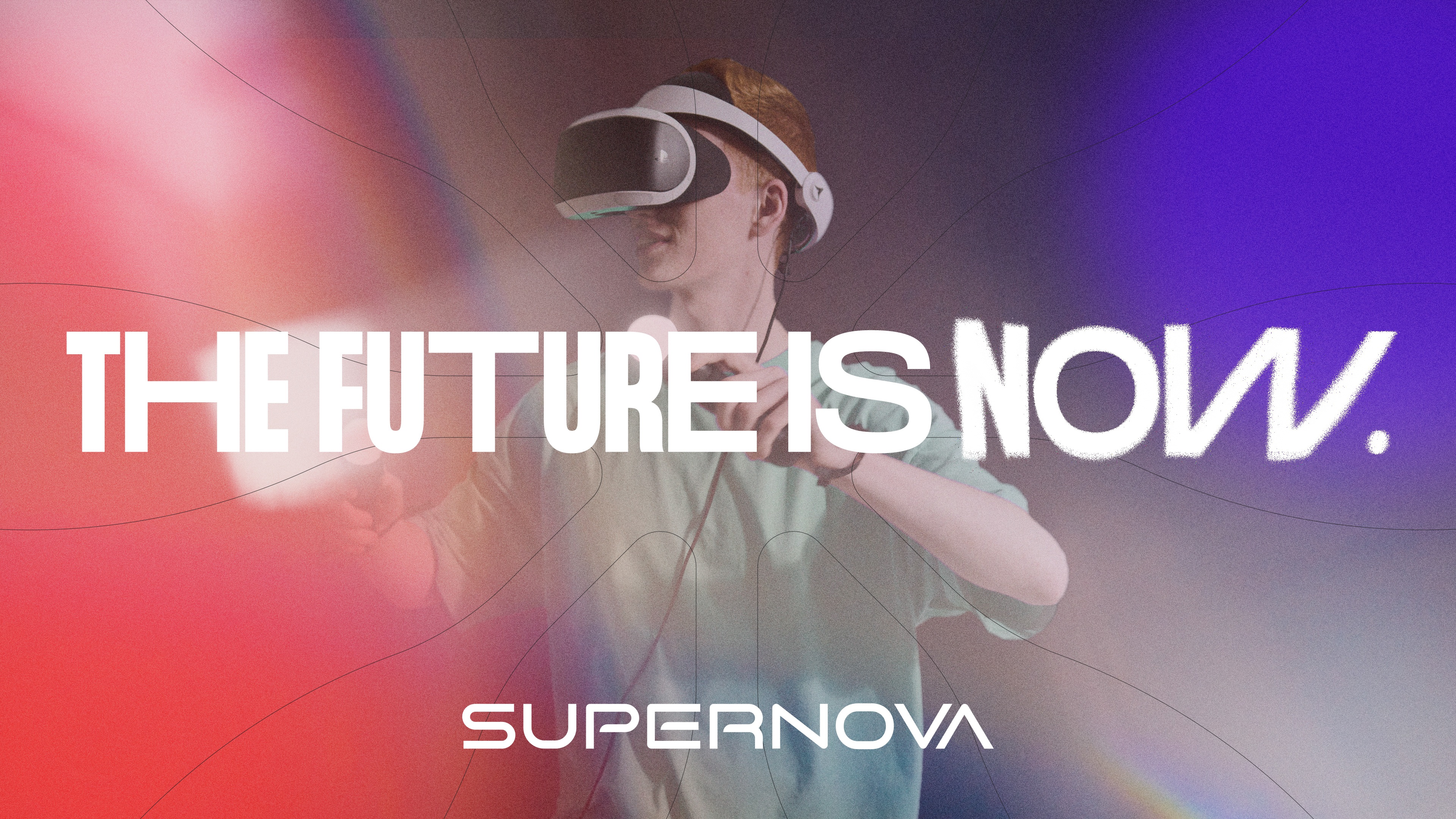
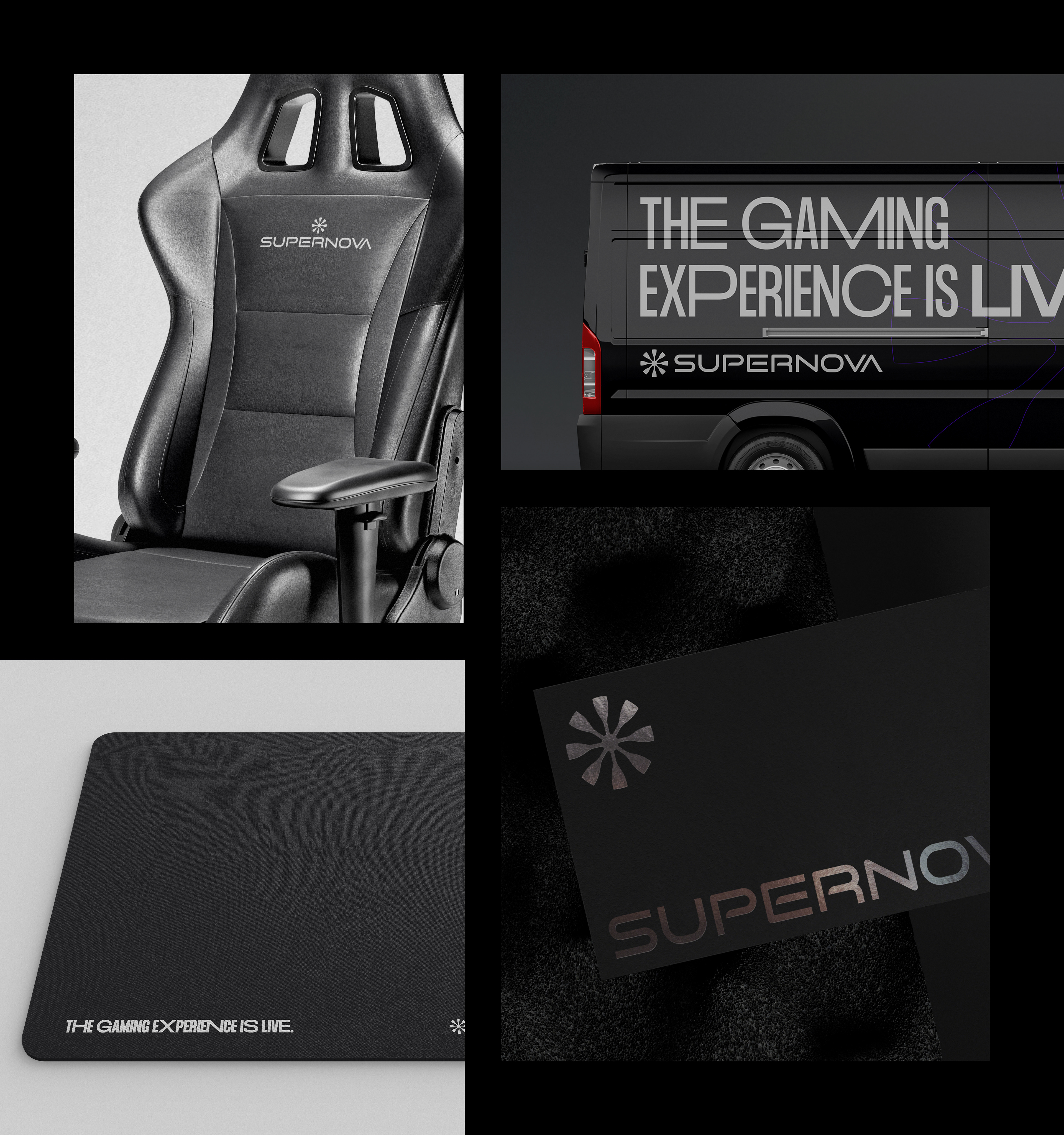
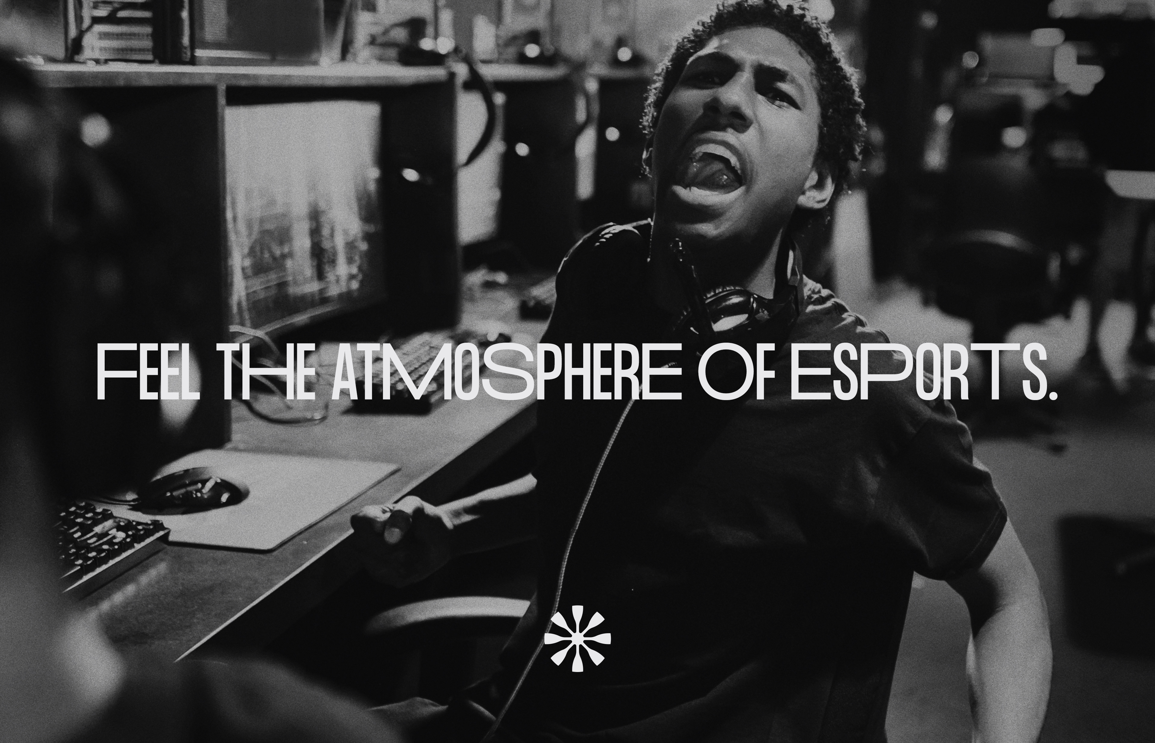
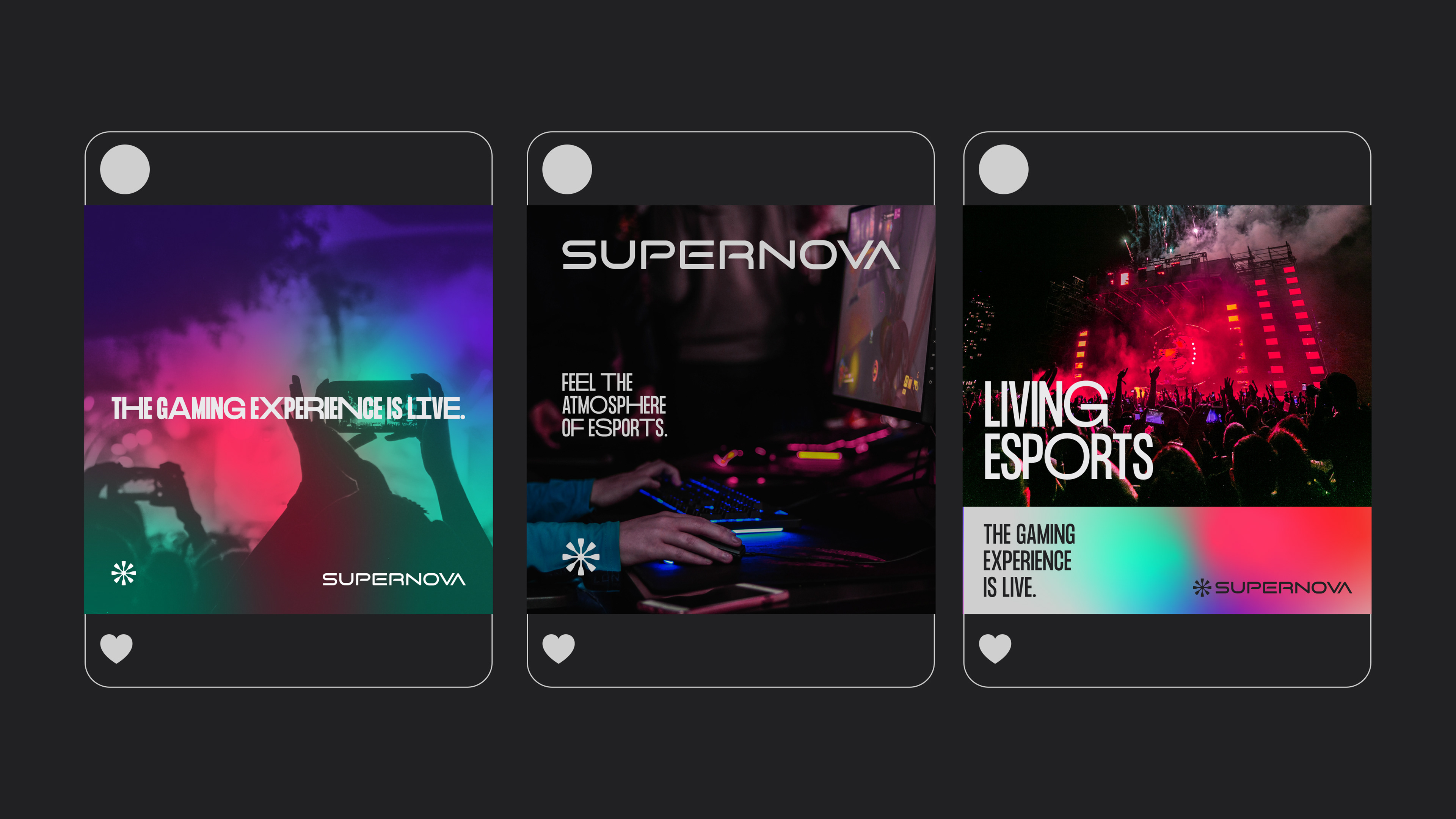
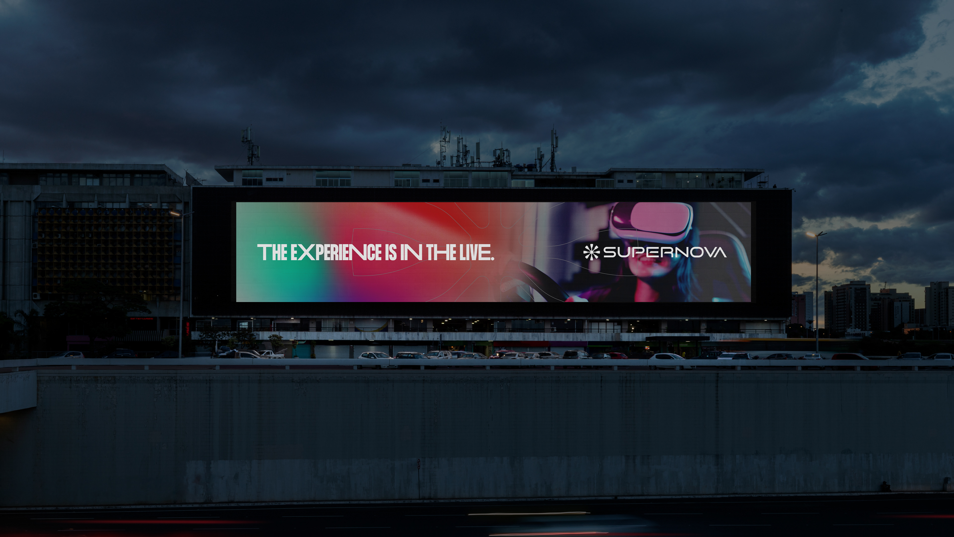
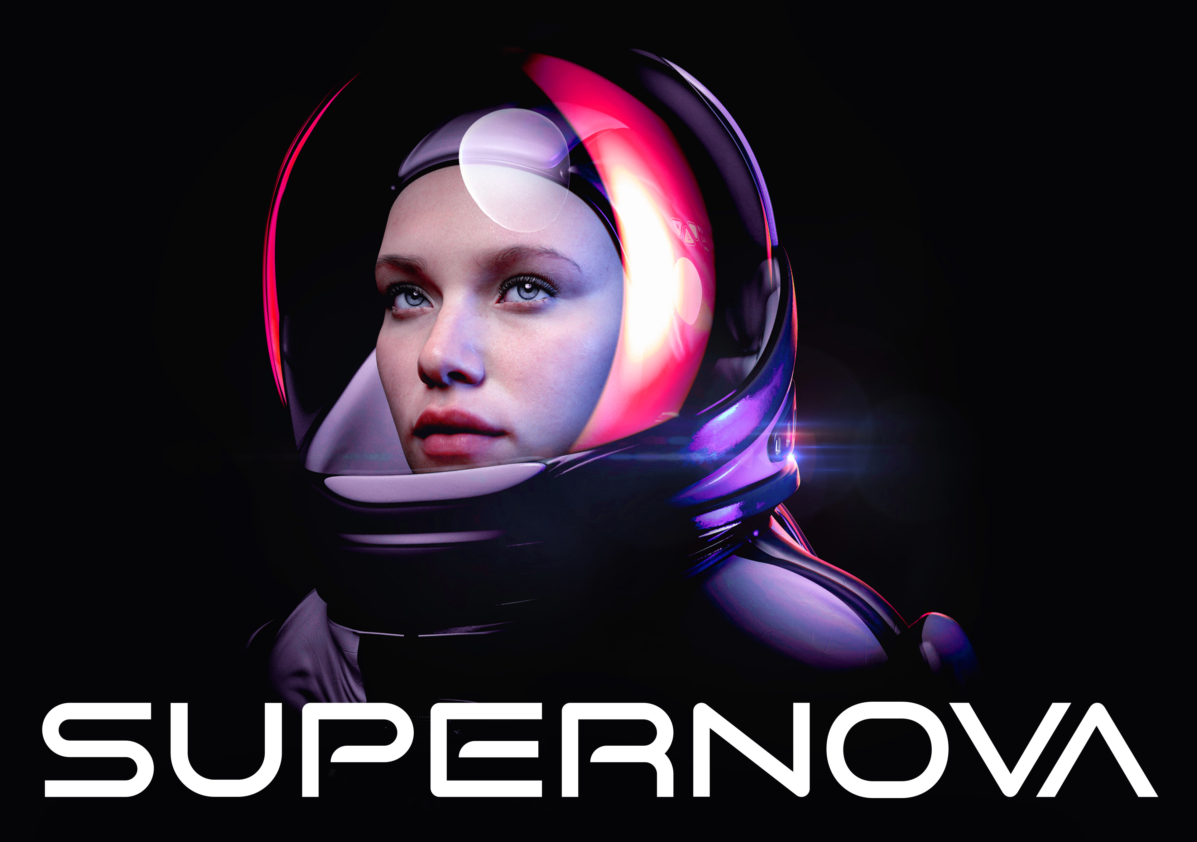
Supernova is a company that produces e-sports tournaments and related products. The company's idea is something minimalist, totally eschewing the usual within its niche. Supernova aims to produce high-end events and products in Kuwait and the region.
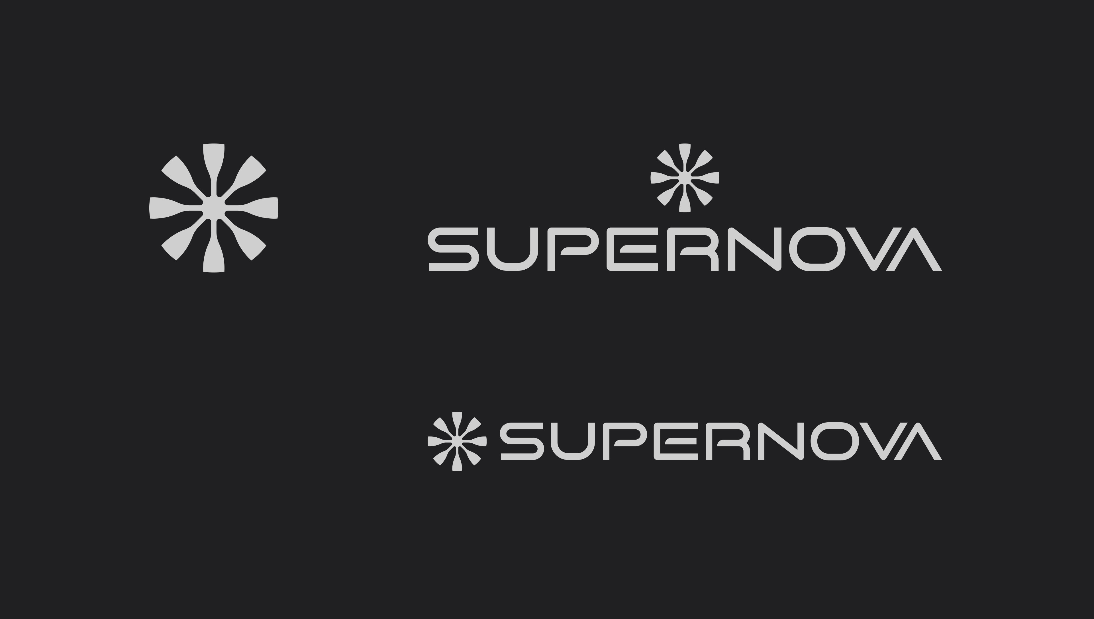
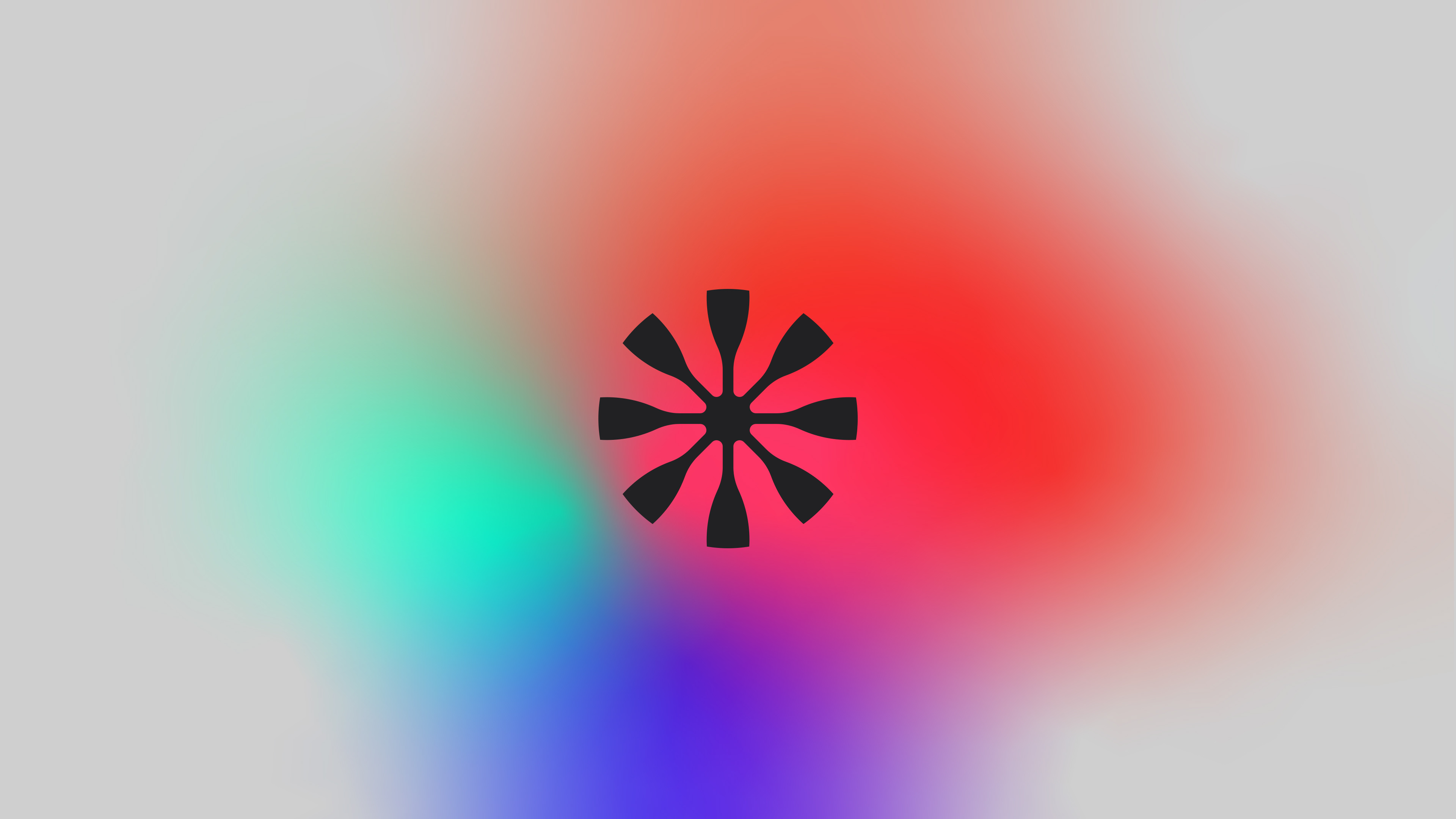
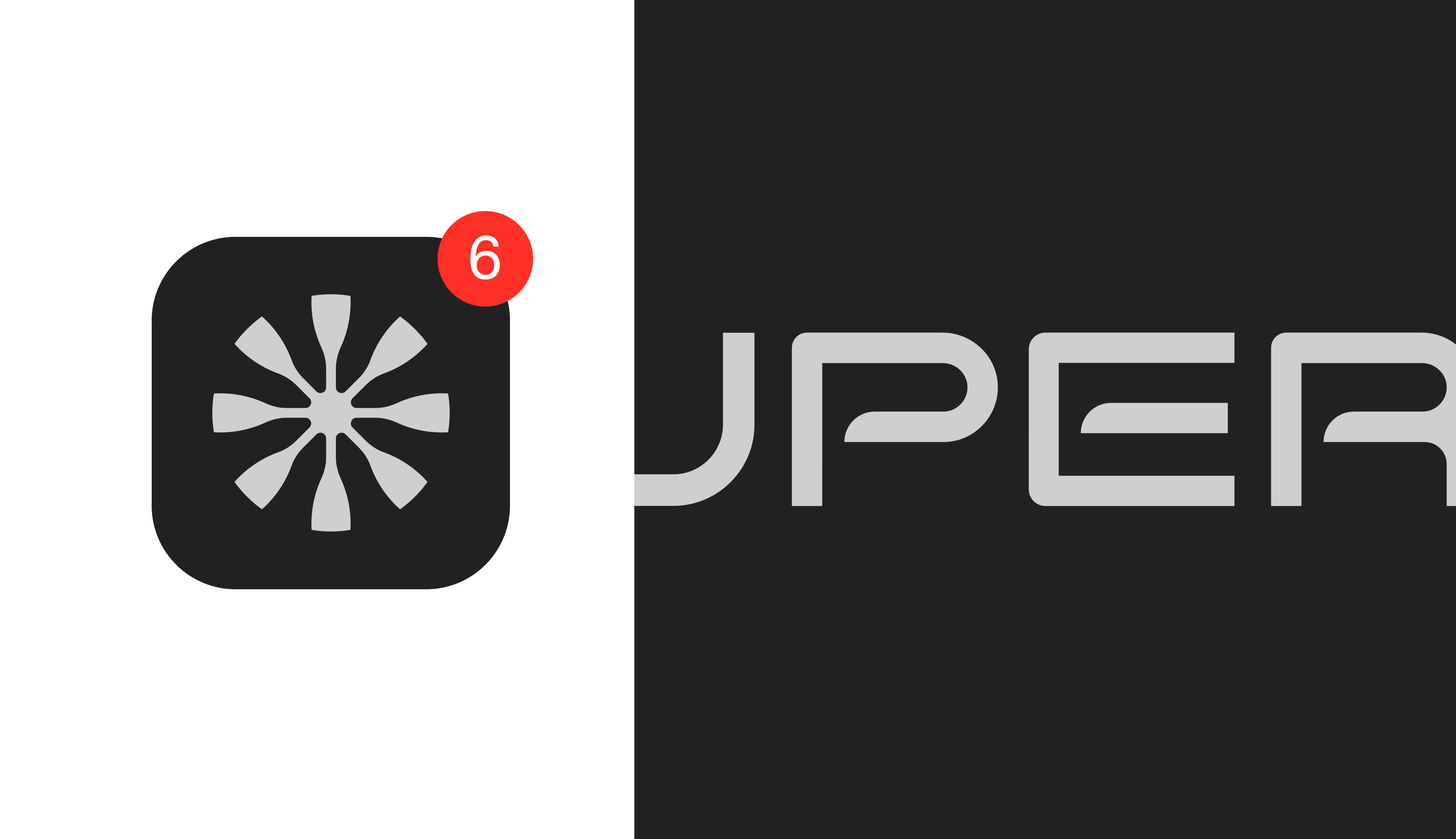
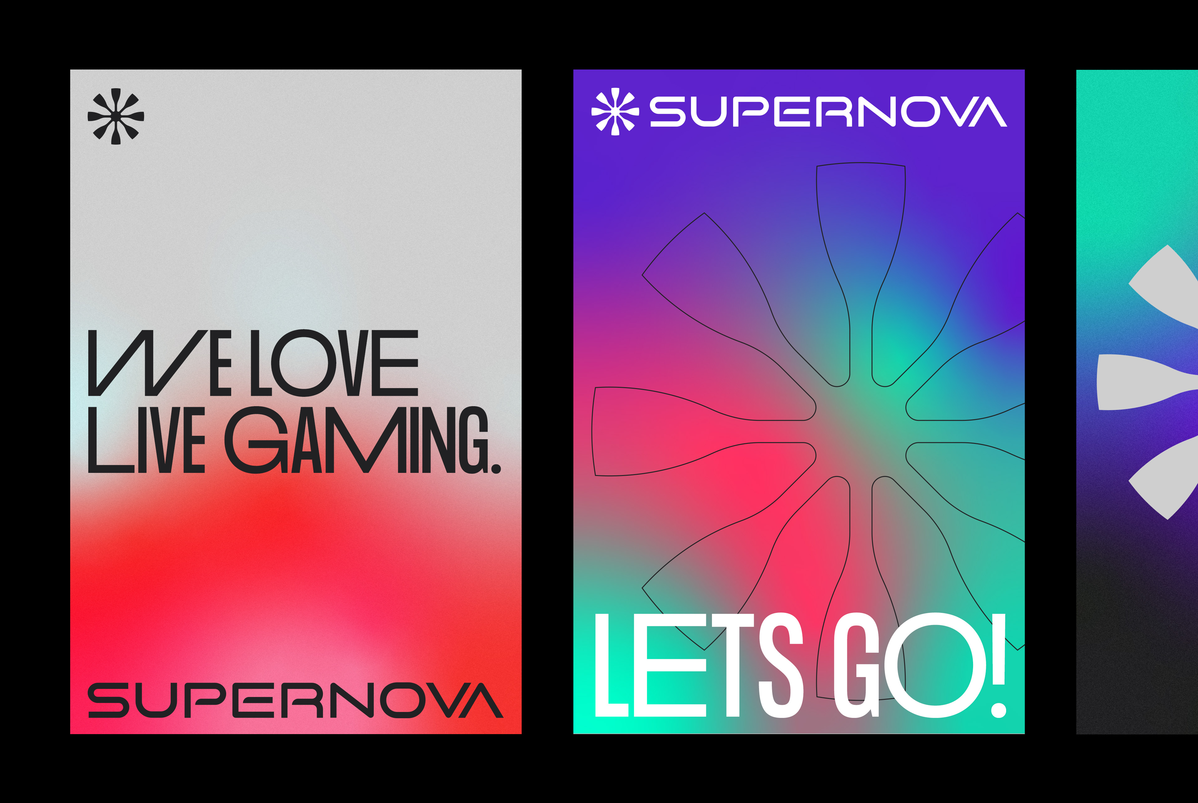
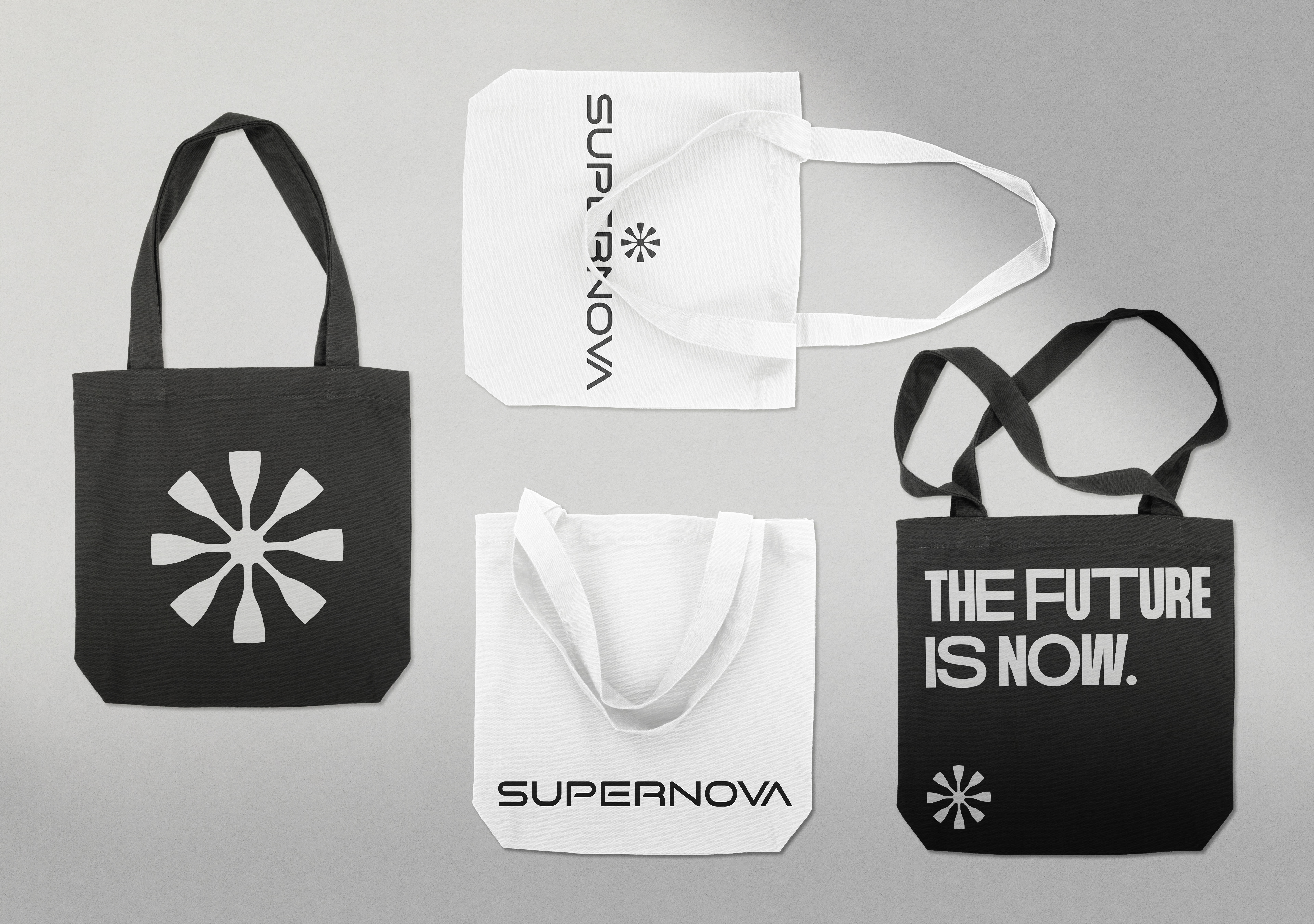
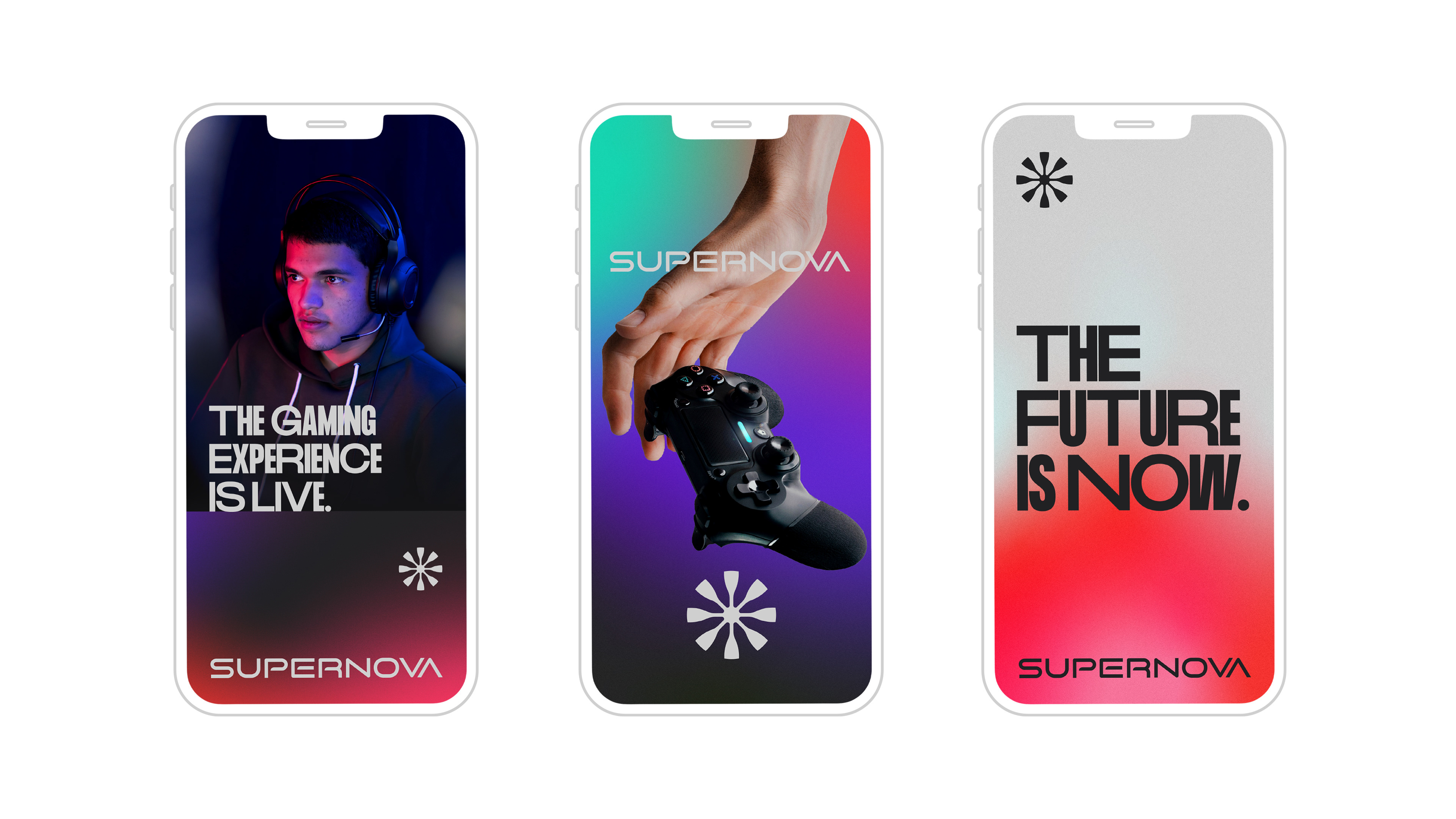
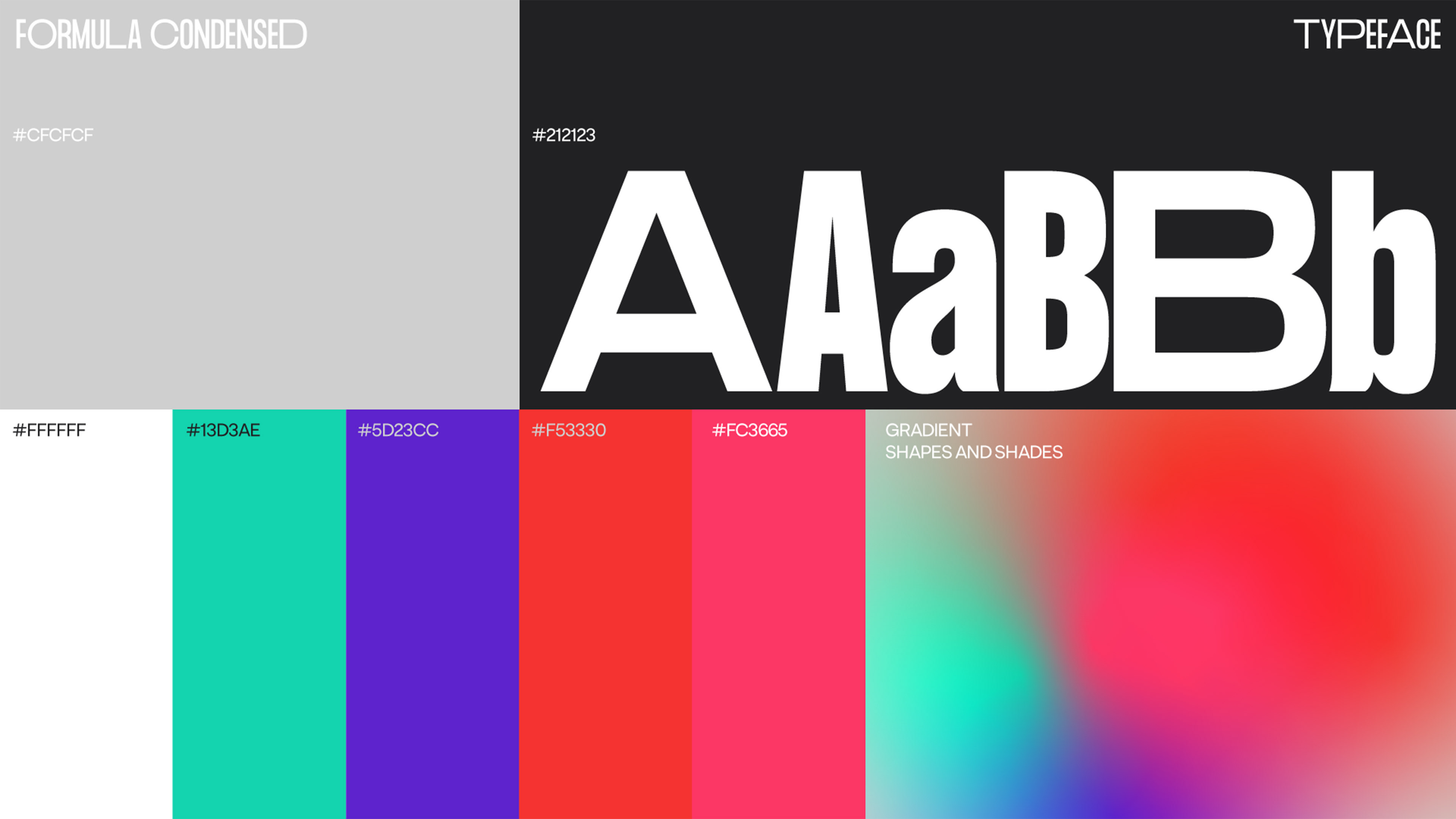
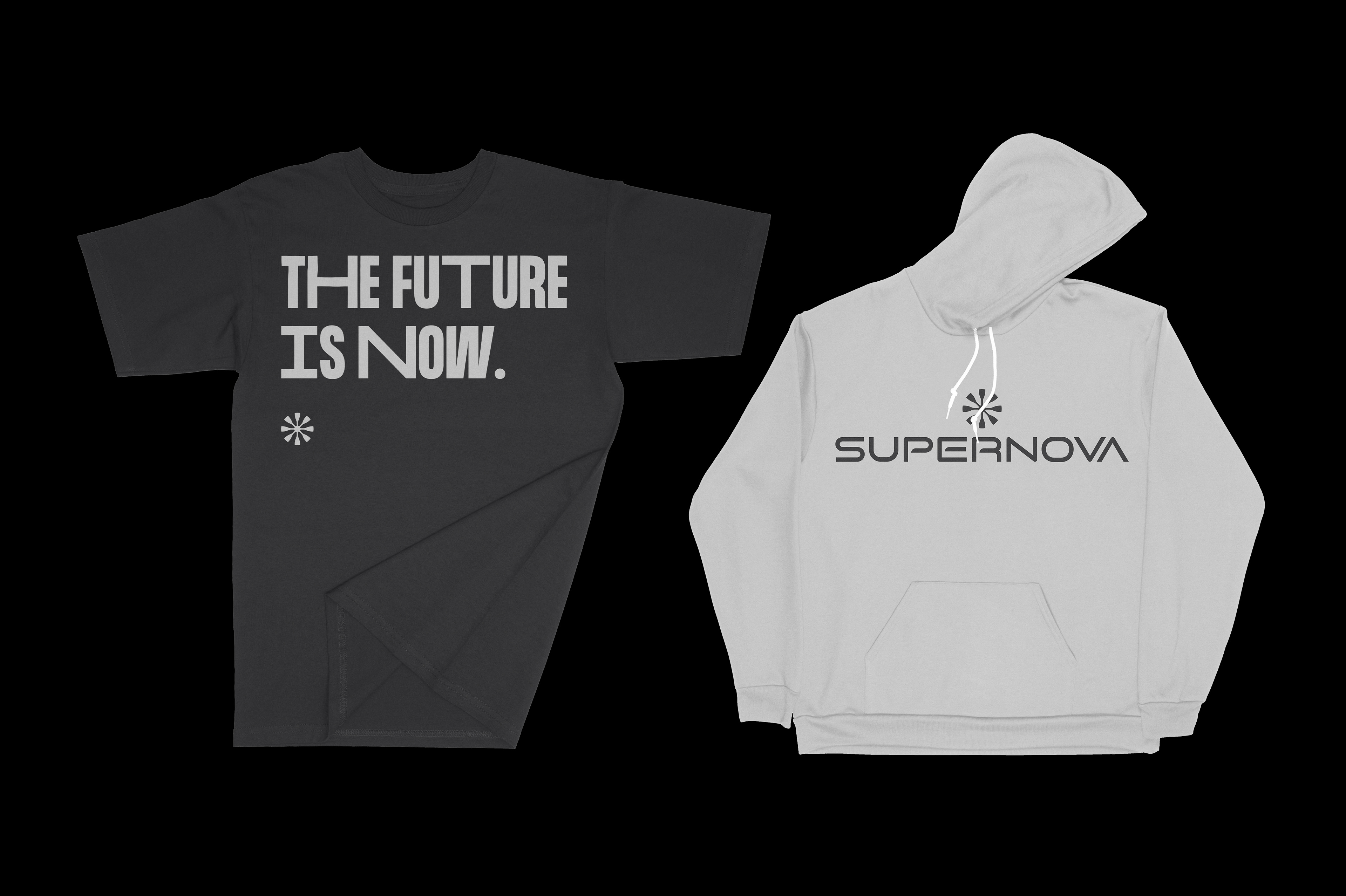
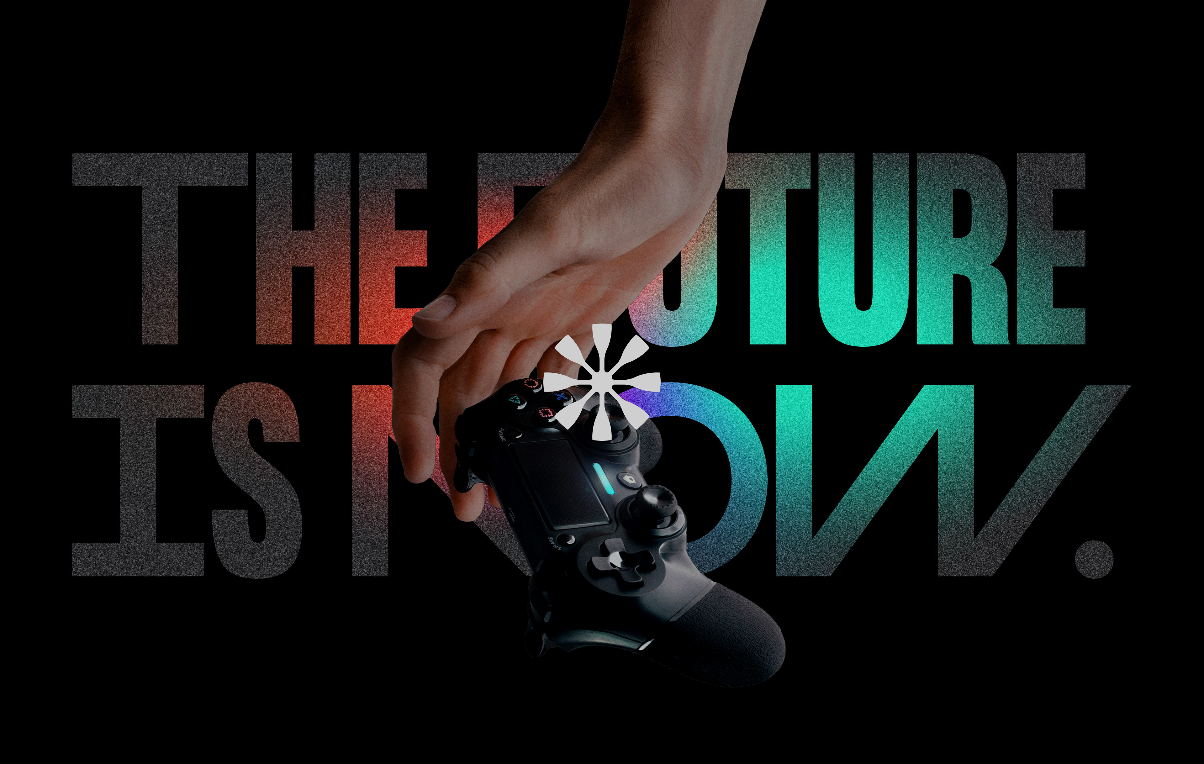
My idea was to create a simple and minimalistic logo, something that was already defined as one of the company's goals. The colors gray and black, speak well with the idea of doing something high-end and the bright colors speak well with the idea of the gaming universe, the RGB colors that are always in everything that gamers use. The proposal for the symbol was to emulate a Supernova explosion and the font speaks for itself: Strong and minimalist.
[For legal reasons in the country, the project cannot go forward.]