
Sobre o Projeto
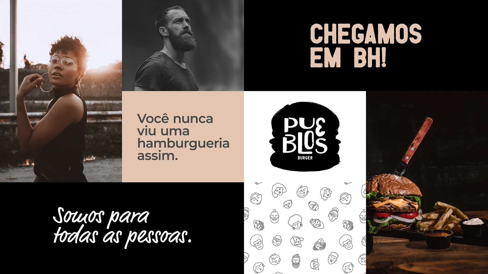
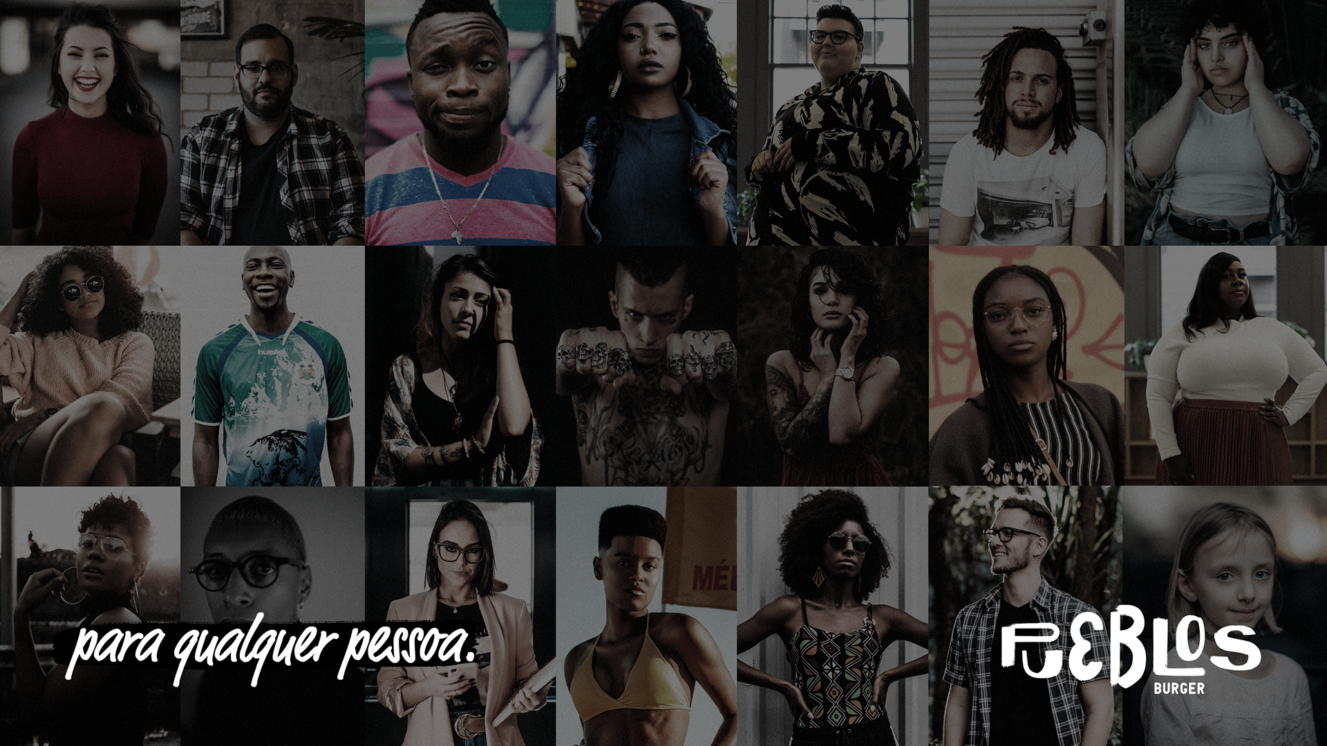
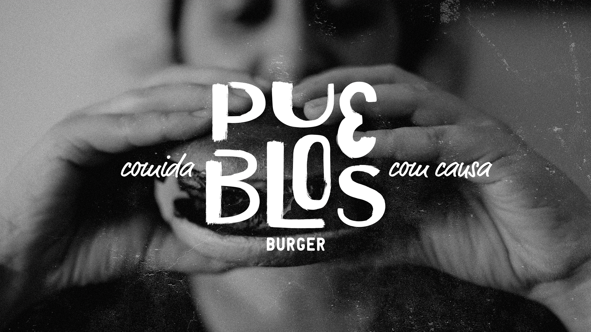
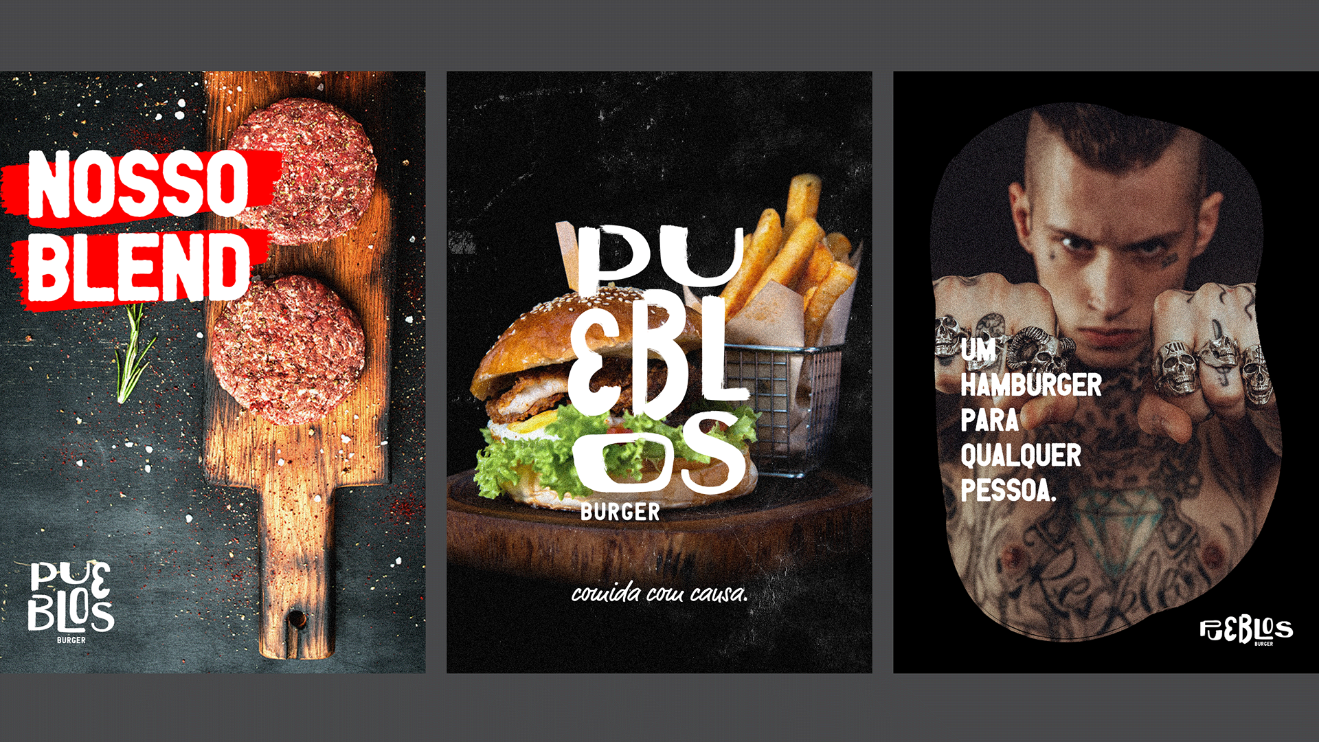
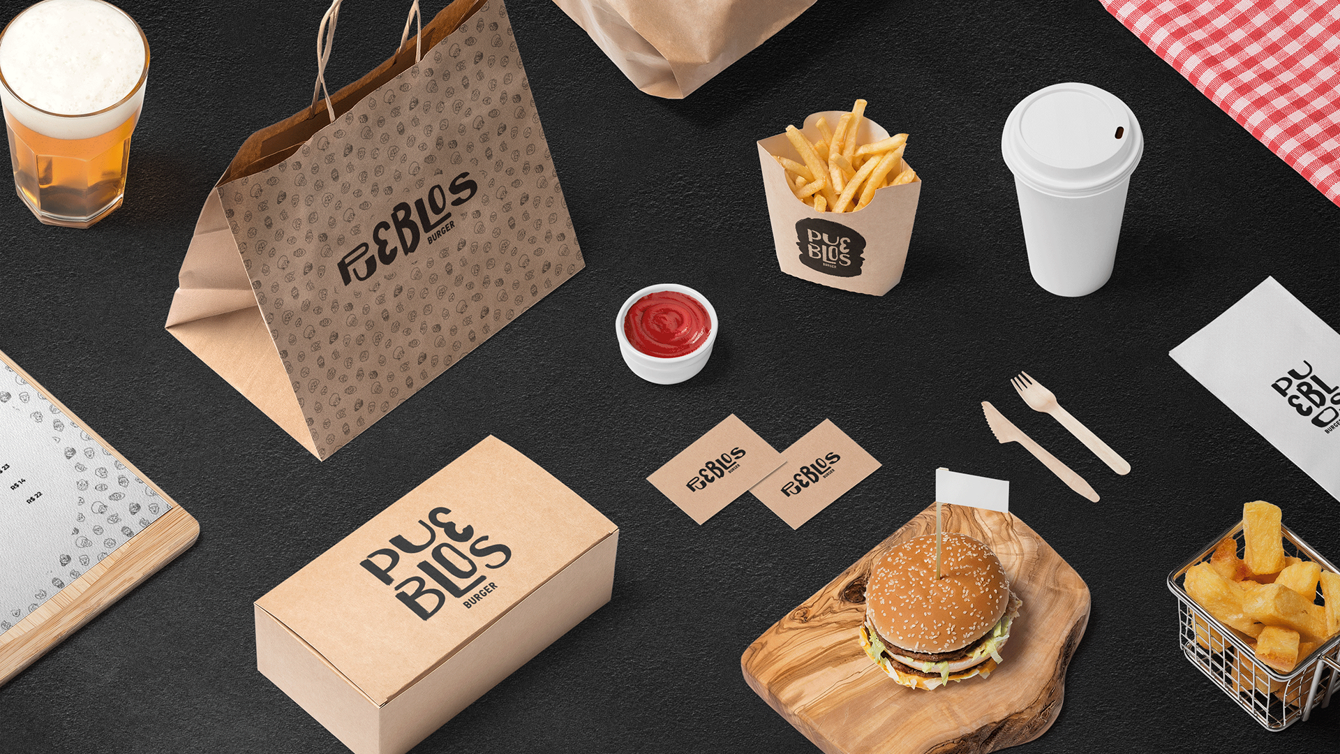
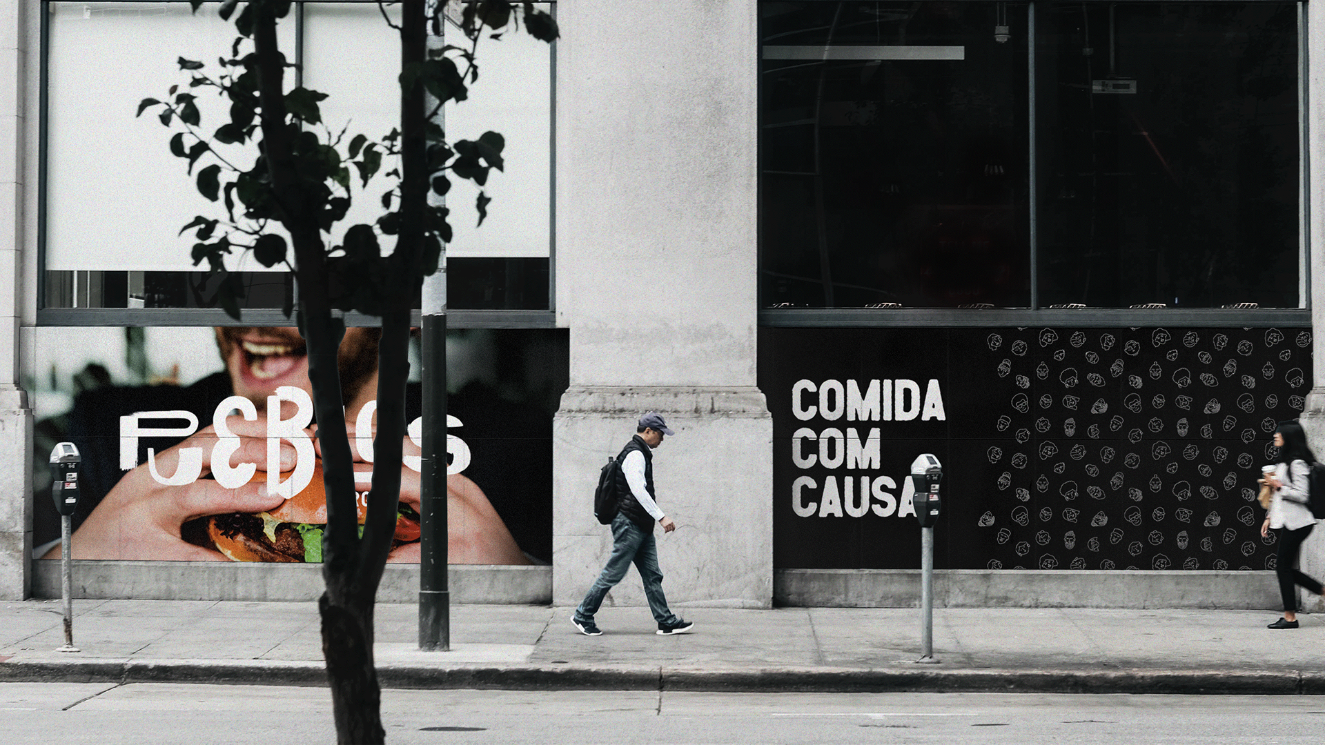
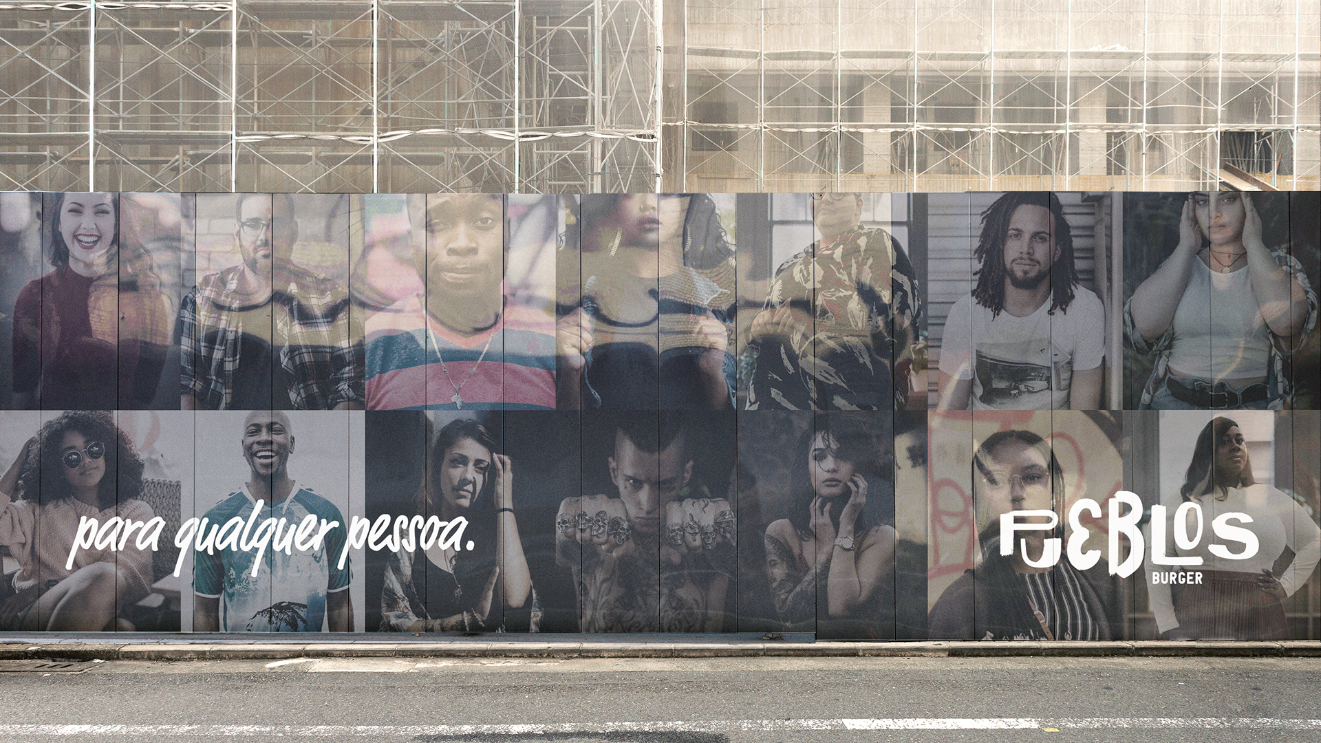
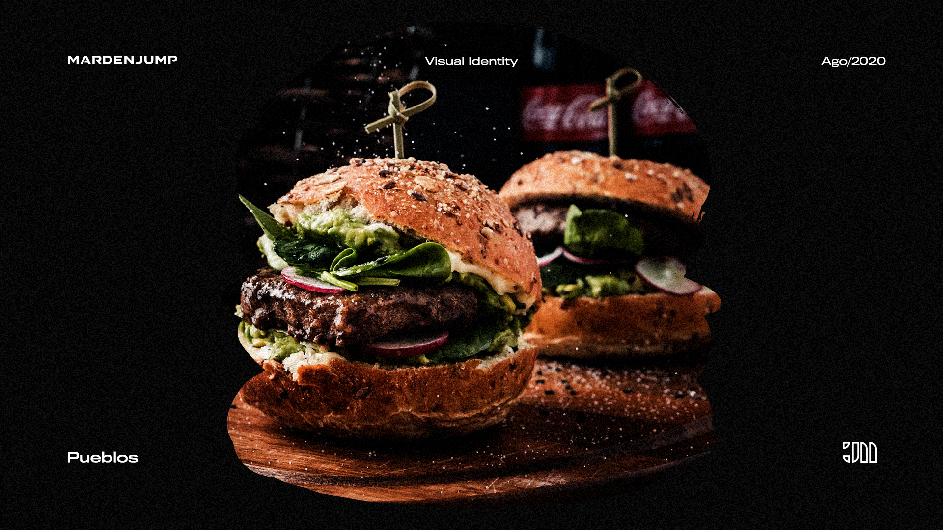
A Pueblos, significa “povos”, transmite uma ideia de que é um projeto coletivo e inclusivo, para todos. Uma hamburgueria 100% delivery que oferece um cardápio enxuto em que os produtos podem ser adquiridos de forma isolada ou em combo (cheese burger, cheese bacon burger e smash + fritas + bebida).
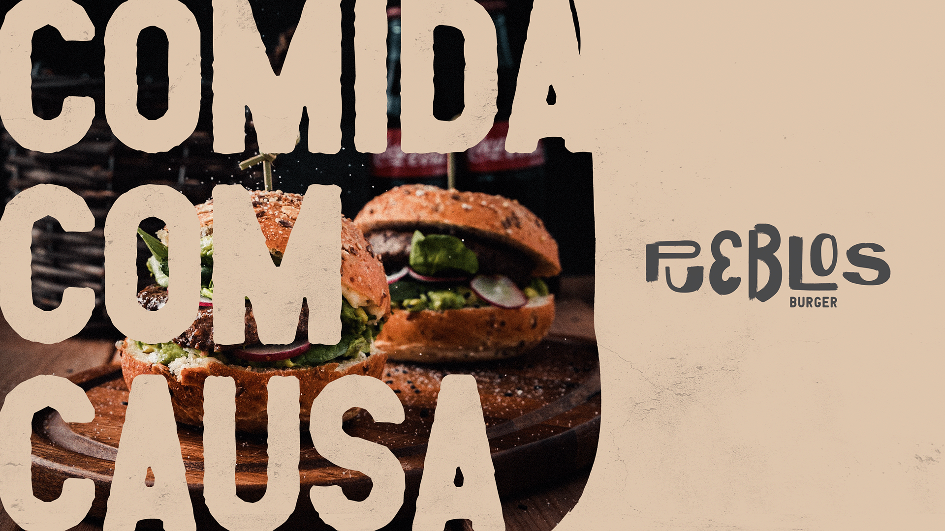
Do valor pago, um percentual é automaticamente revertido como doação para uma instituição social. Ser uma hamburgueria que se preocupa com o bem social, seja doando parte do seu lucro, realizando as suas entregas através de bicicletas elétricas (evitando assim a emissão de CO2) e empregando pessoas de comunidades carentes da cidade de Belo Horizonte.
Oferecemos um produto de qualidade e preço justo, gerando benefícios para a comunidade. Mais que vender hambúrguer, queremos o bem comum. Somos próximos. Fazemos a diferença. Respeitamos as diferenças. Capacitamos, promovemos a igualdade de oportunidades e somos mais inclusivos.
Meu Desafio
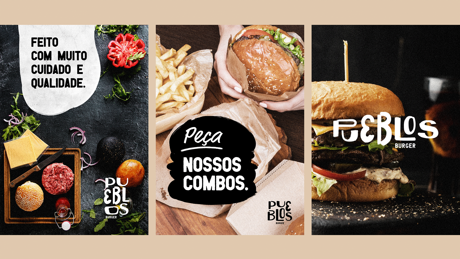
Meu desafio foi criar uma identidade visual moderna e exclusiva, desenvolver uma marca em que se encaixasse nos atributos passados pela cliente tendo como premissa os três mais destacados: Extrovertida, Criativa e Moderna.
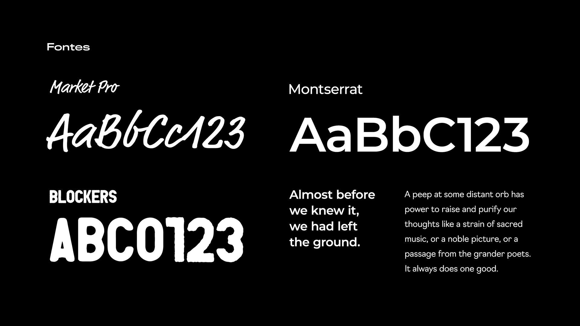
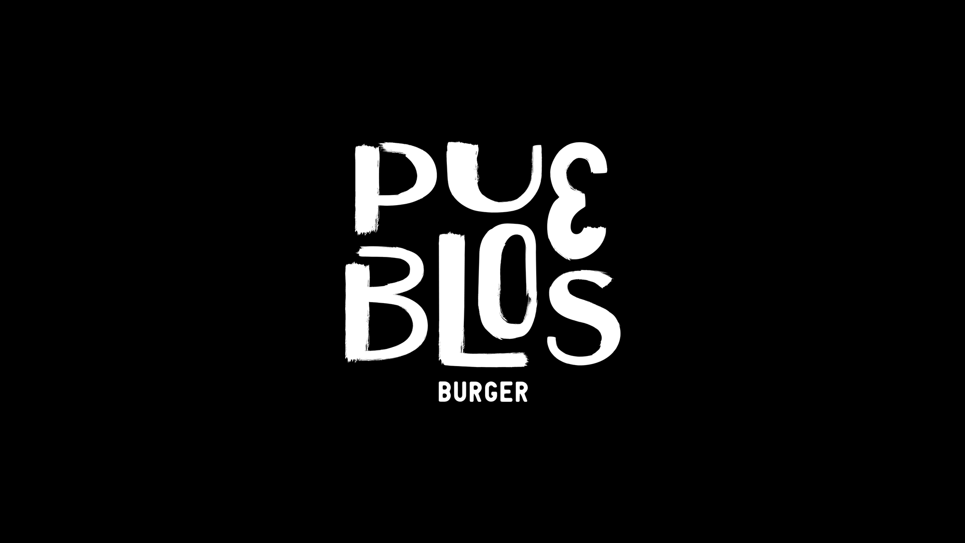
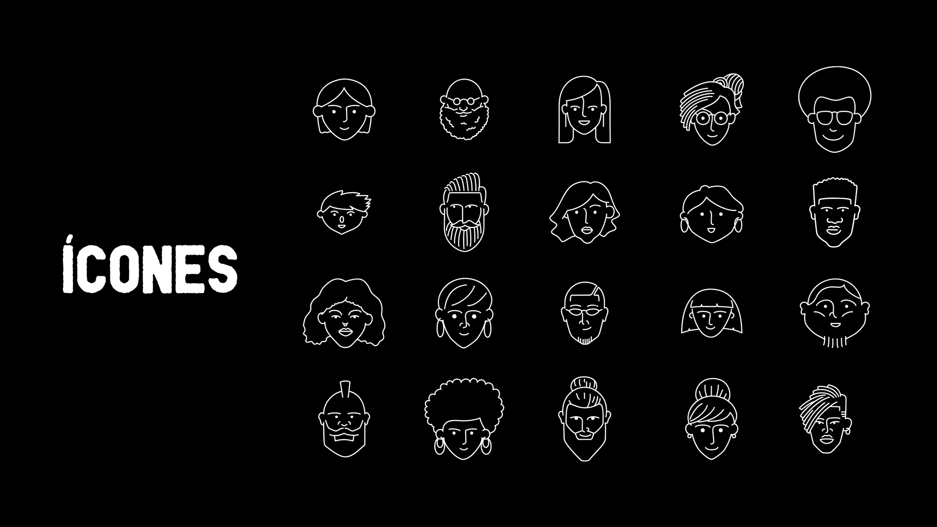
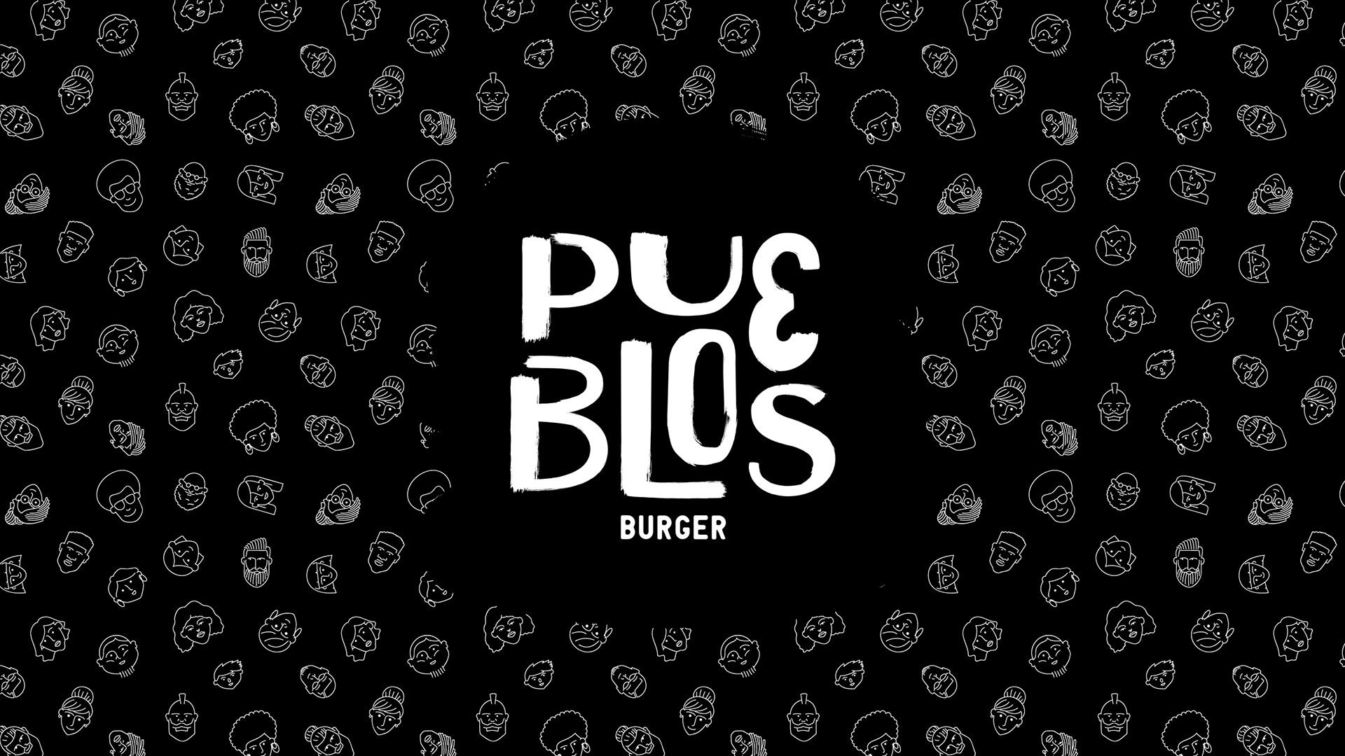
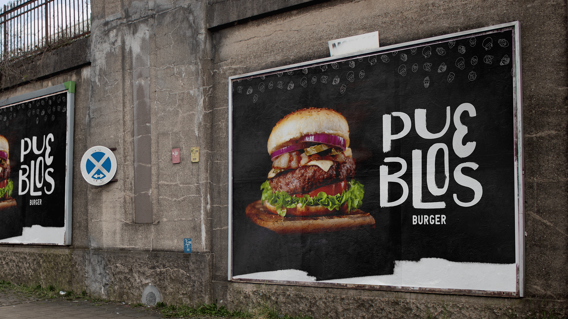
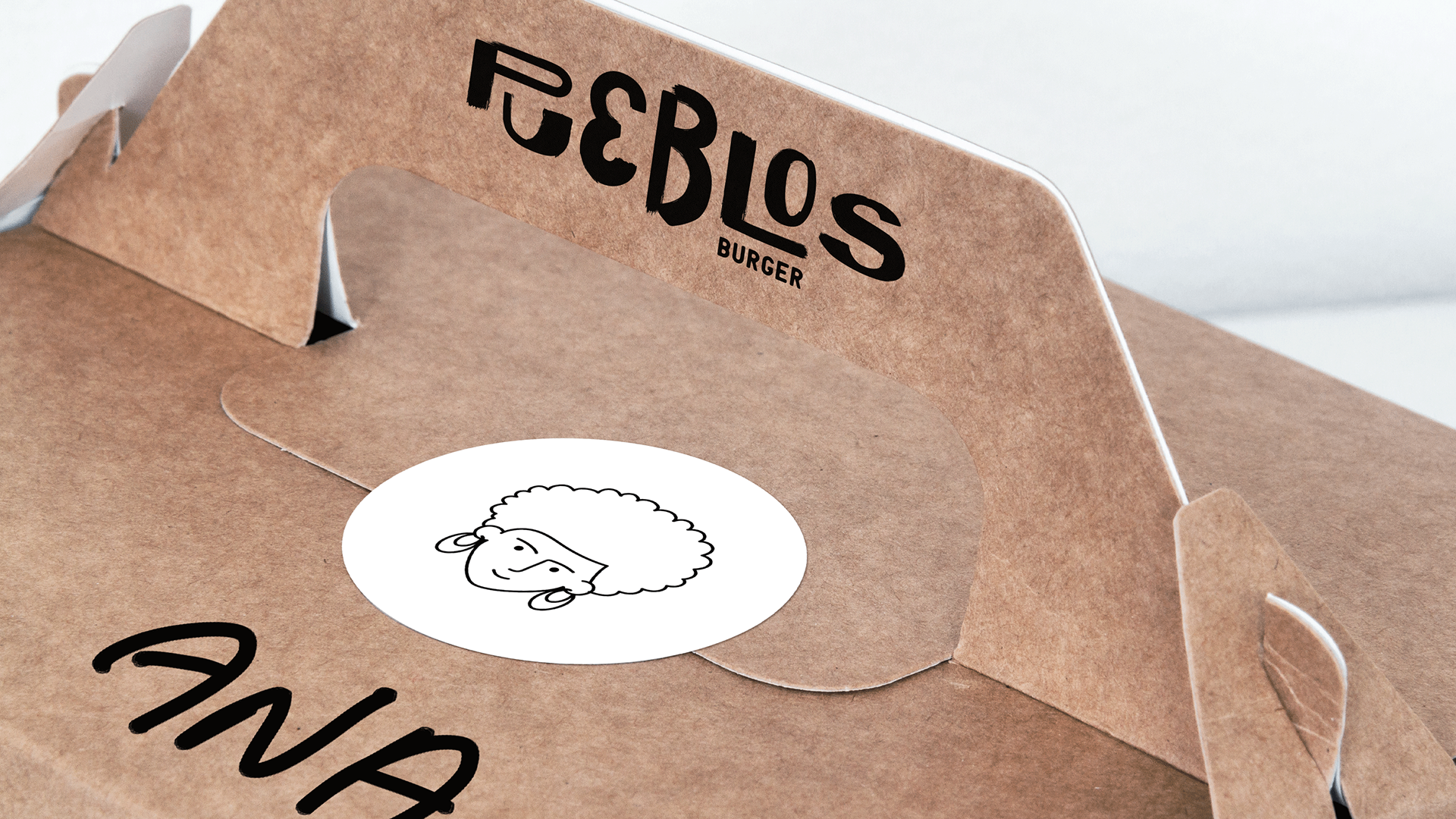
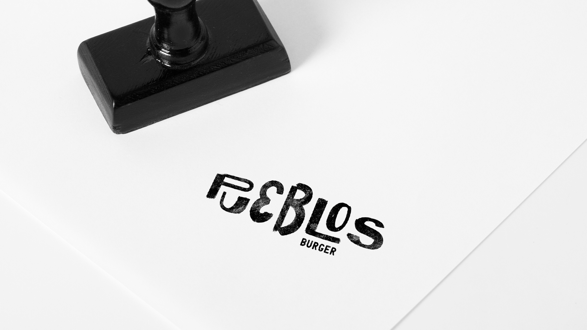
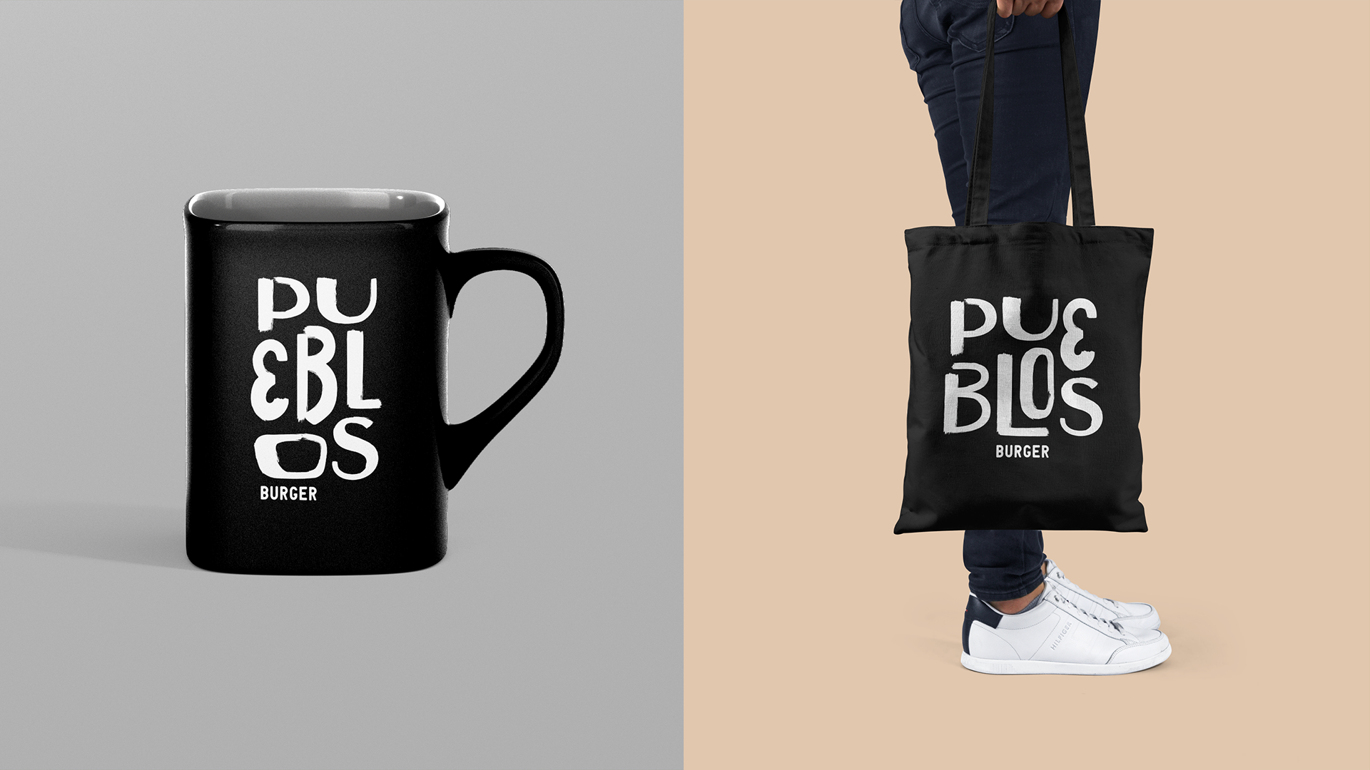
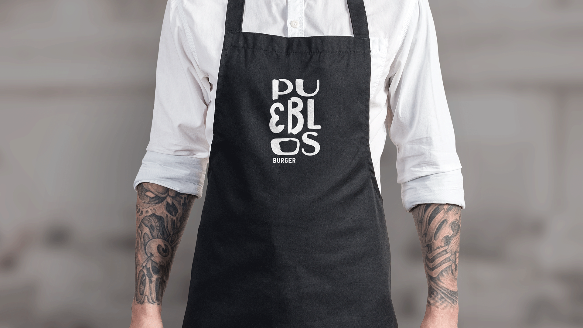
Quando eu conheci a Pueblos e tudo que ela representa, veio na cabeça a palavra diversidade. Senti que precisava direcionar a marca para uma fonte que não tivesse um padrão estético definido e que não houvesse por exemplo o mesmo tamanho geométrico de fonte.
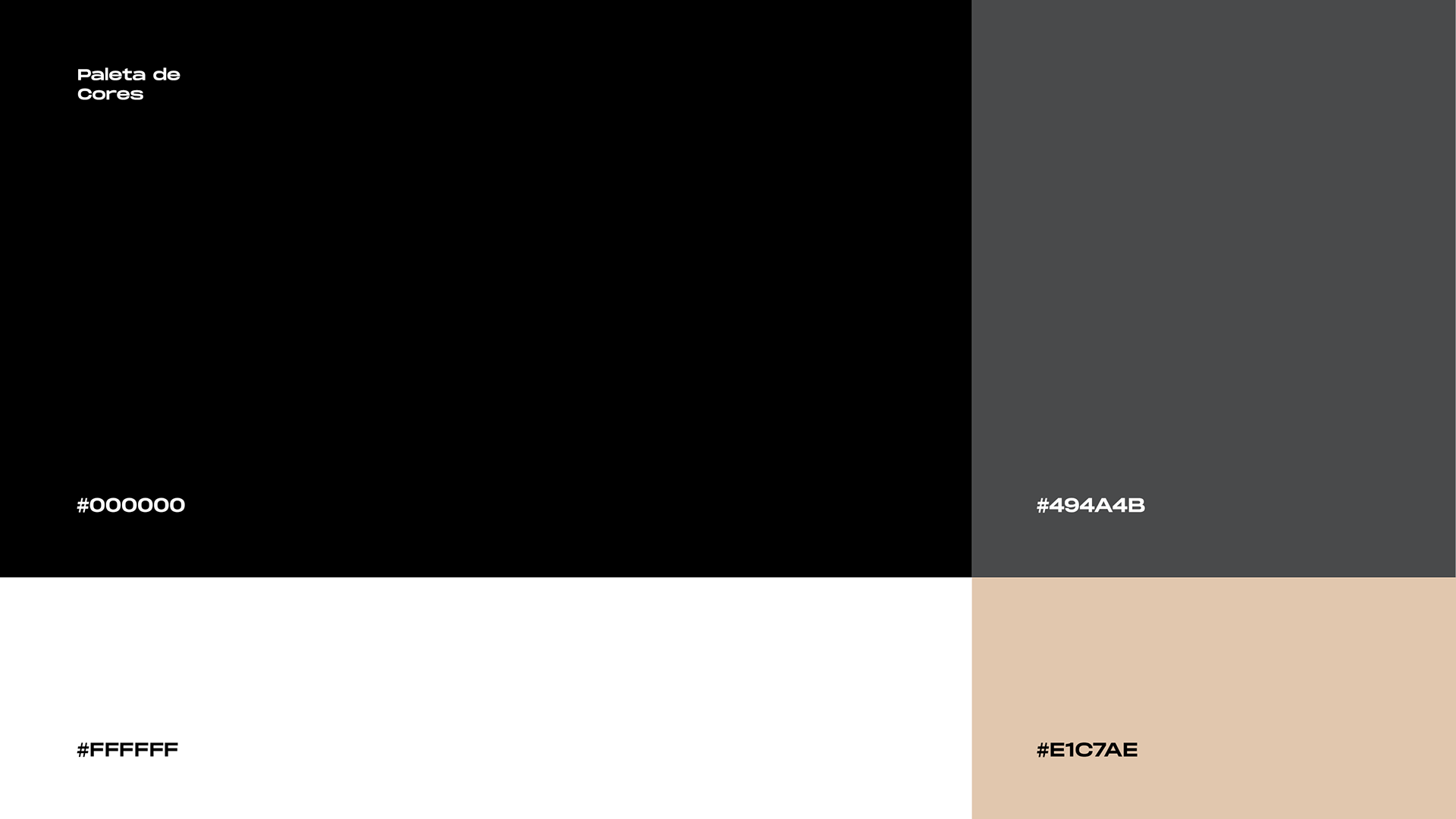
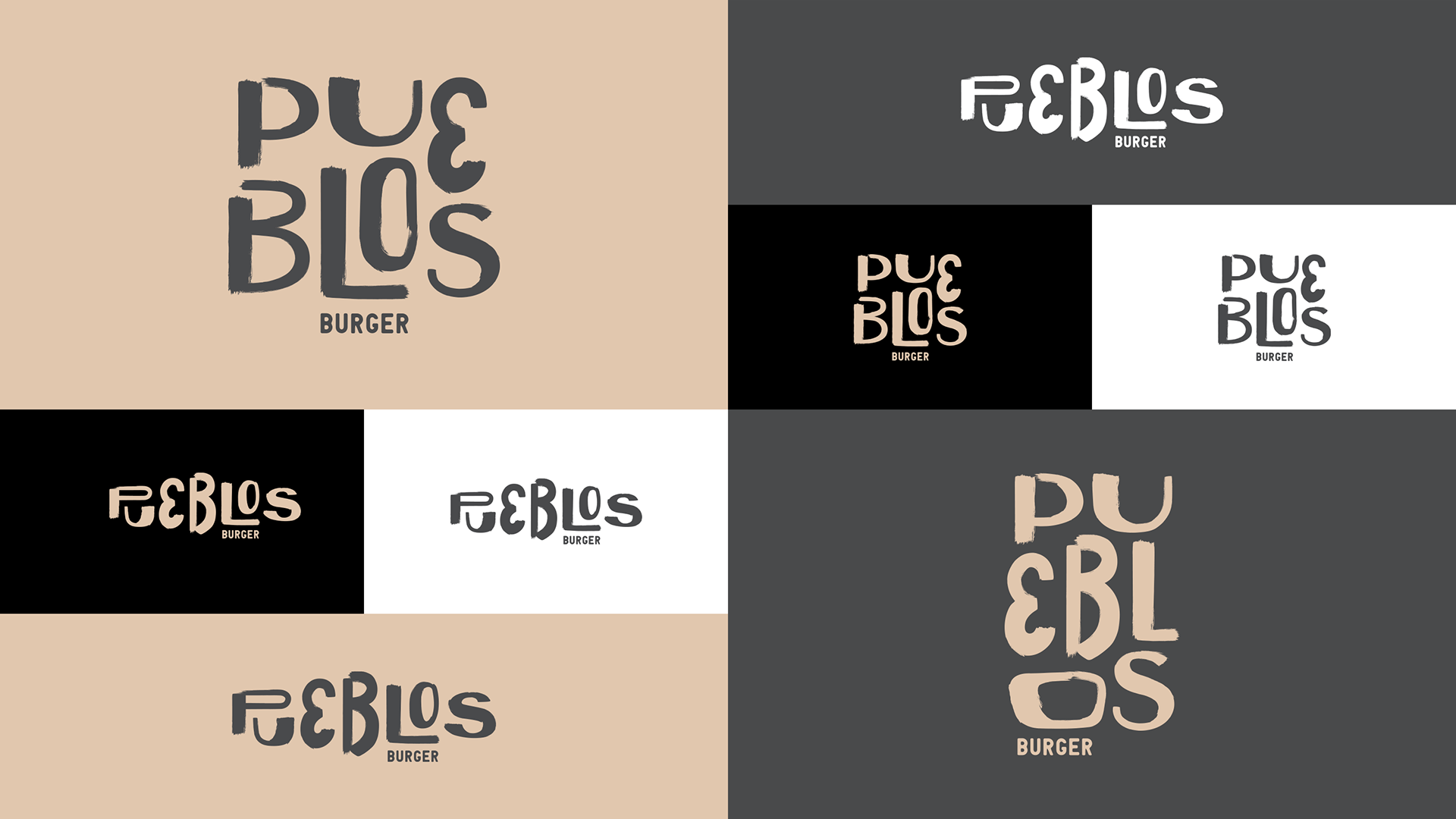
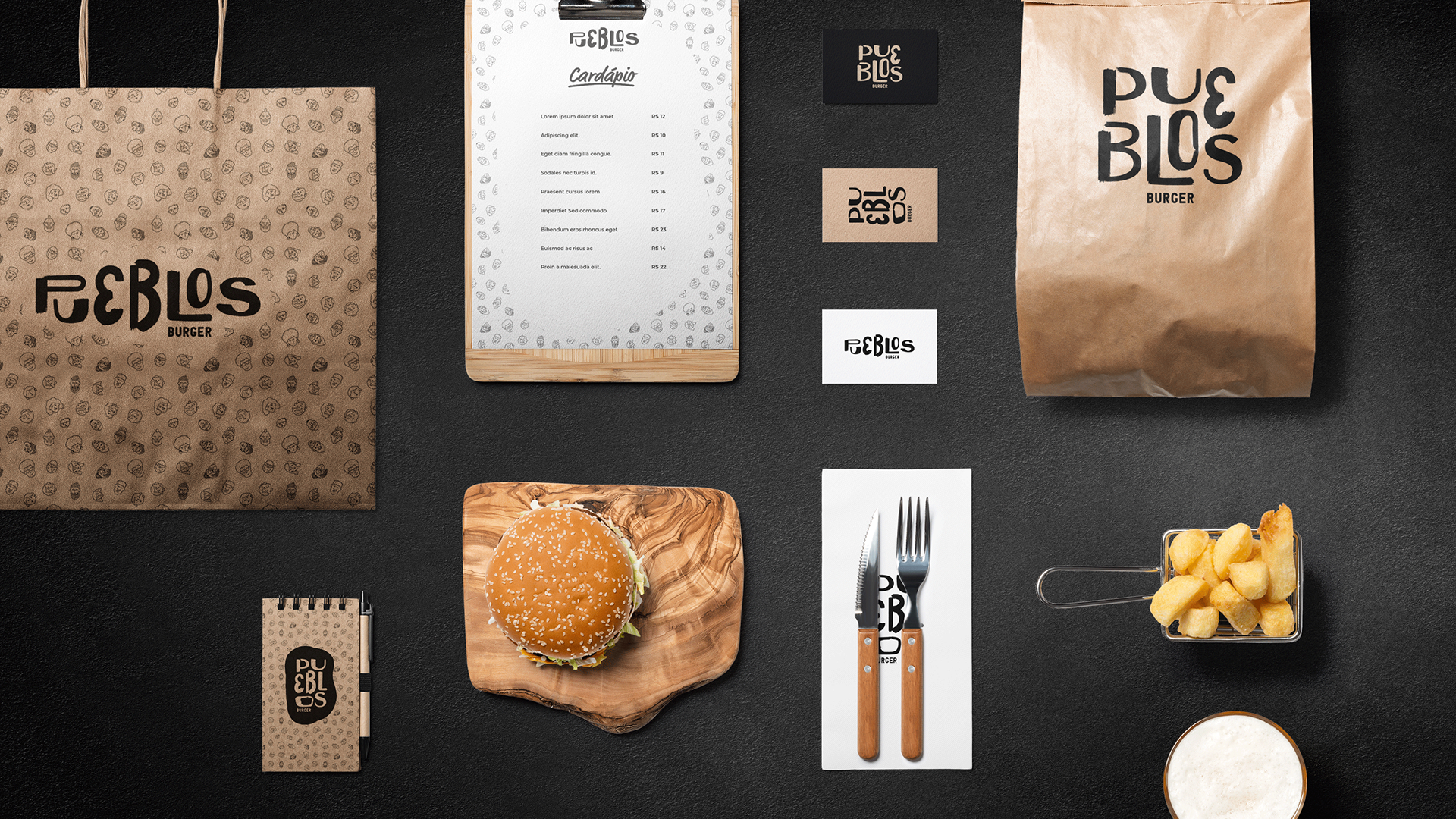
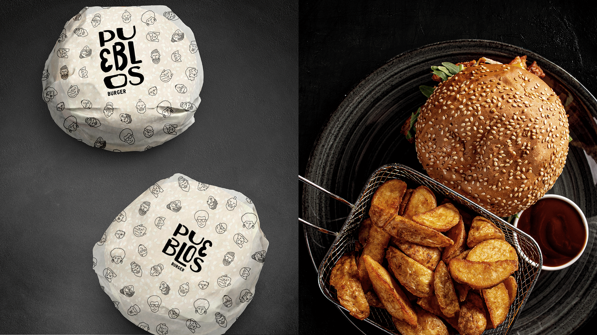
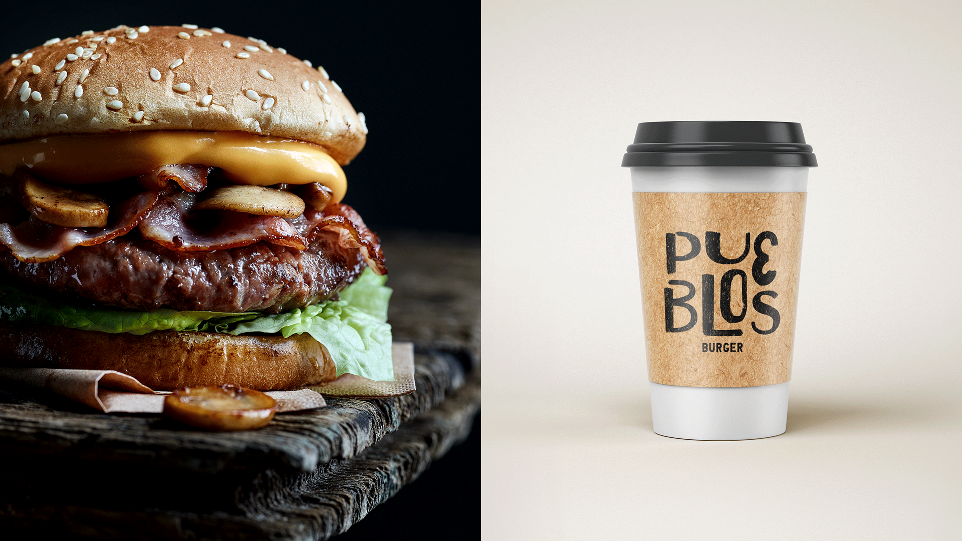
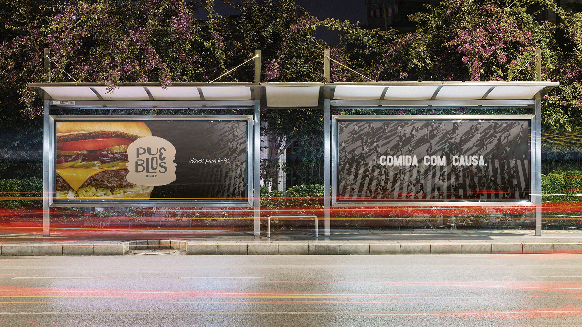
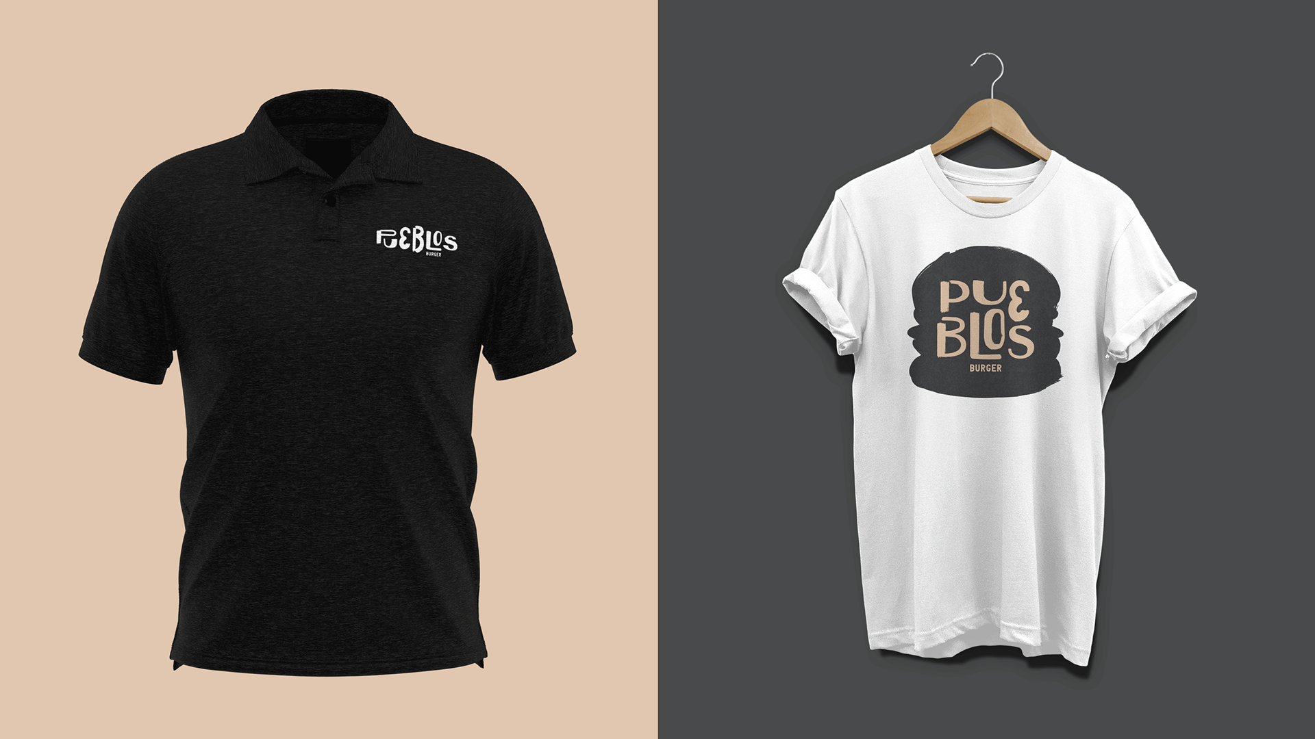
Optei pelas cores a seguir justamente por serem cores que remetem ao craft e o preto por ter uma fácil leitura e aplicação nesse tipo de material. Espero que eu tenha conseguido captar a essência do projeto.
About the Project
The Pueblos, "people" in Spanish, transmits an idea of the collective and inclusive project, for everyone. A 100% delivery hamburger shop that offers a lean menu in which products can be bought separately or in combos (cheeseburger, cheese bacon burger, and smash + fries + drink).
A percentage of the value of the products is automatically reverted as a donation to a social institution. The Pueblos is a hamburger shop that is concerned with social wellbeing: it donates part of its profit, makes its deliveries through electric bicycles (thus avoiding the emission of CO2), and employs people from Belo Horizonte's poor communities.
Pueblo offers good quality products at a fair price, besides generating benefits to the community. More than selling hamburgers, they want the common good. Being close. Making a difference. Respecting the differences. Training people, promoting equal opportunities, and being inclusive.
My Challenge
My challenge was to create a modern and exclusive visual identity, to develop a brand that would fit the attributes chosen by the client, having as a premise the three most outstanding traits: Extroversion, Creativity, and Modernity.
When I first met Pueblos and everything it represents, the word "diversity" came to mind. I felt I needed to direct the brand to a font that did not have a defined aesthetic pattern and that did not have, for example, the same geometric font size.
I chose the following colors precisely because they are colors that refer to the "craft" and because black is easy to read and apply on this type of material. I hope I was able to capture the essence of the project.