
Oliveira Tintas
Setembro 2021 . Brand design and Visual Identity . Brazil
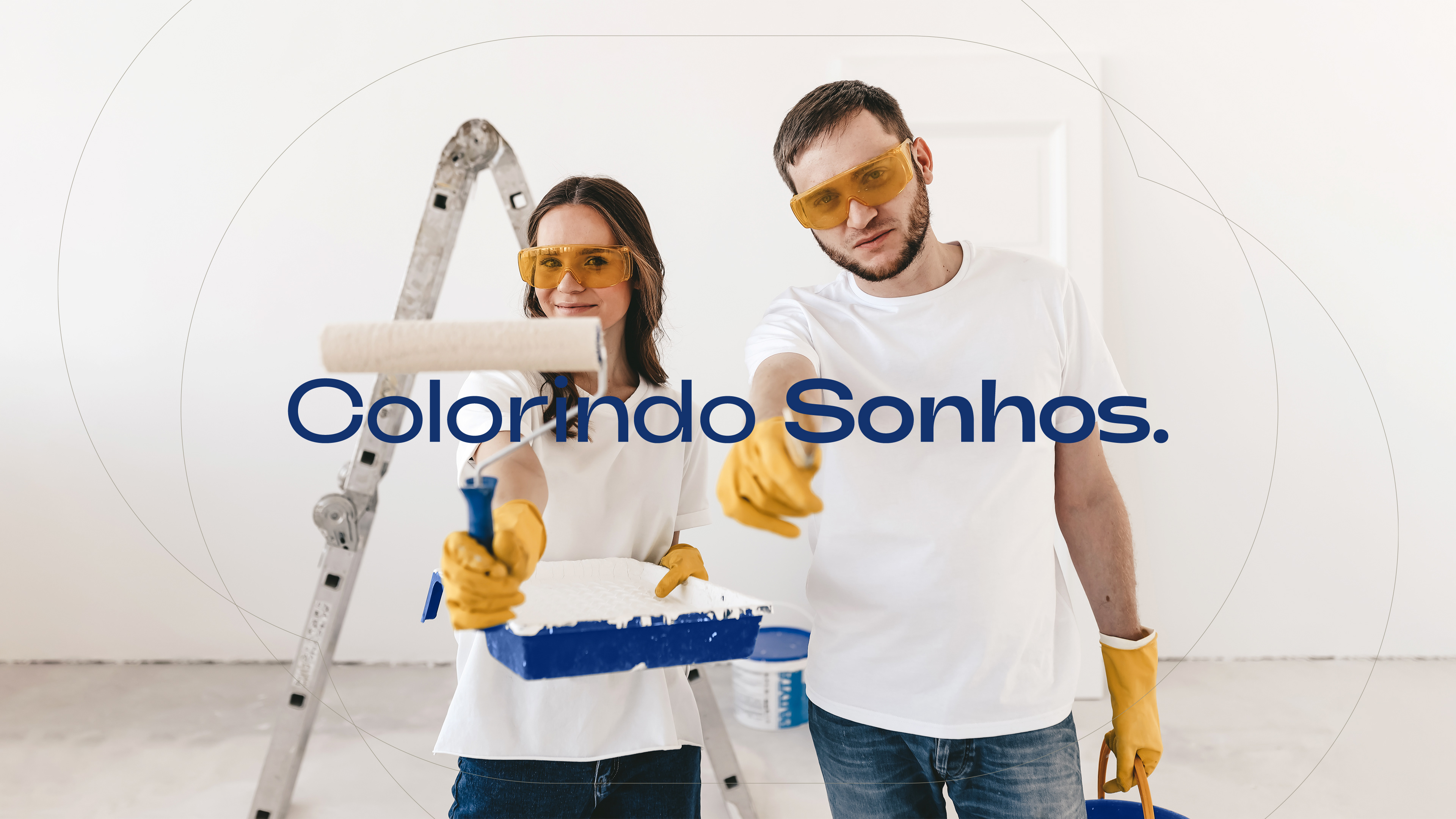
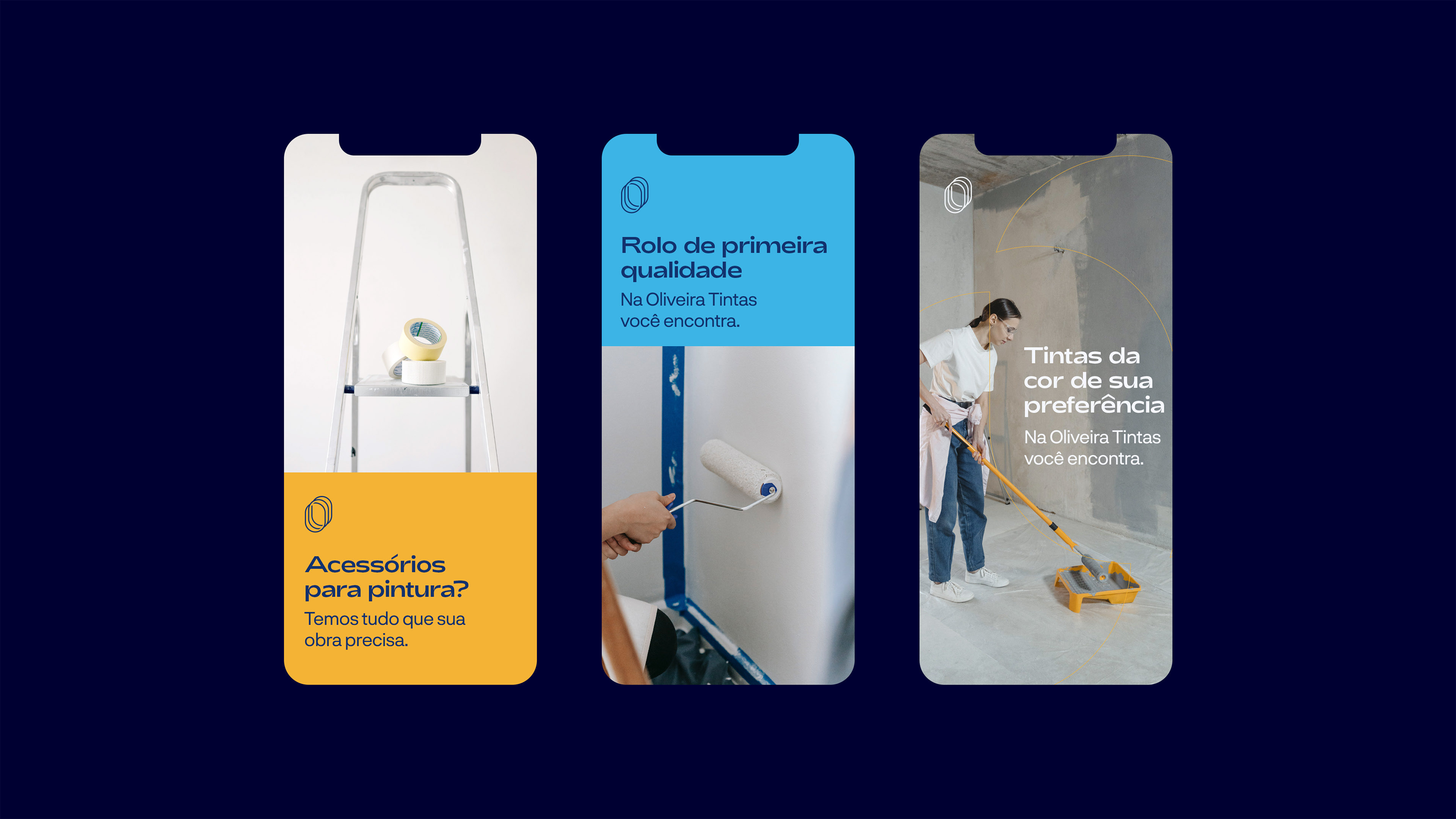
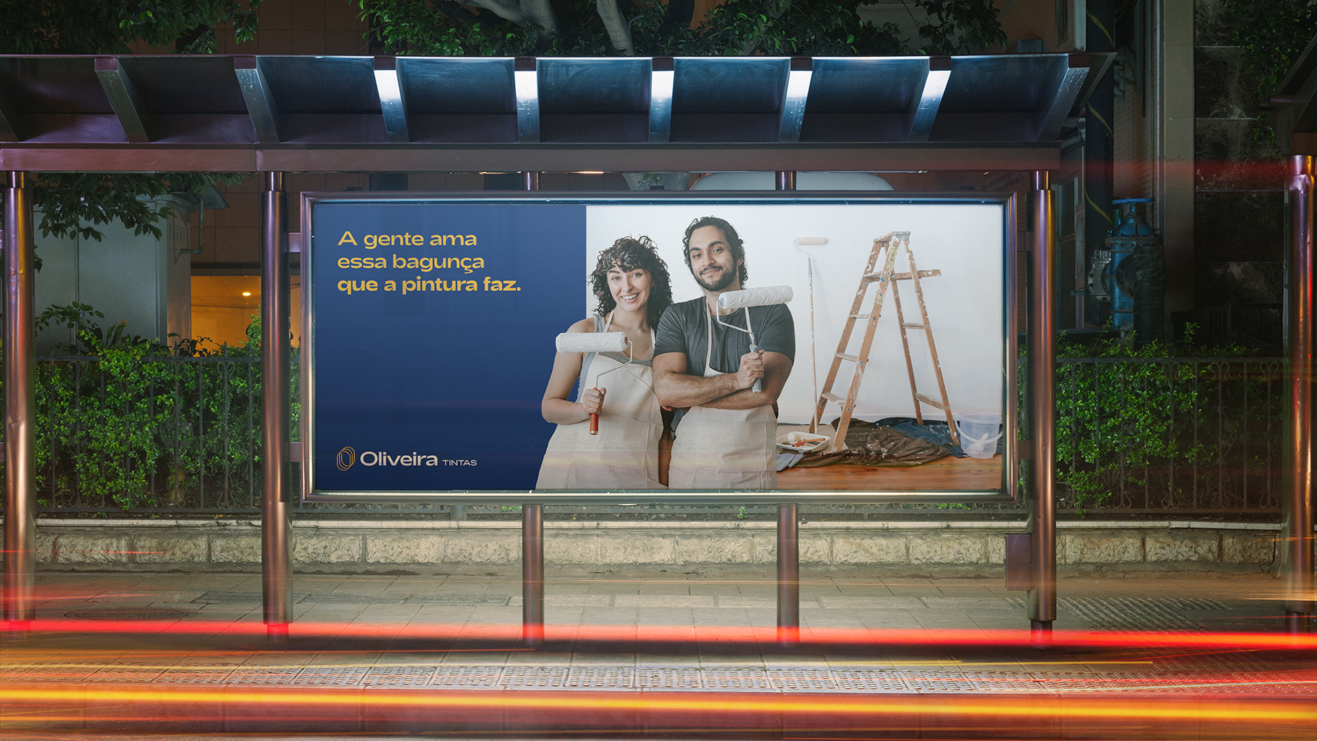
Paint store and specialized products for painting that is starting its history in the year 2021 in the city of Barão de Cocais.
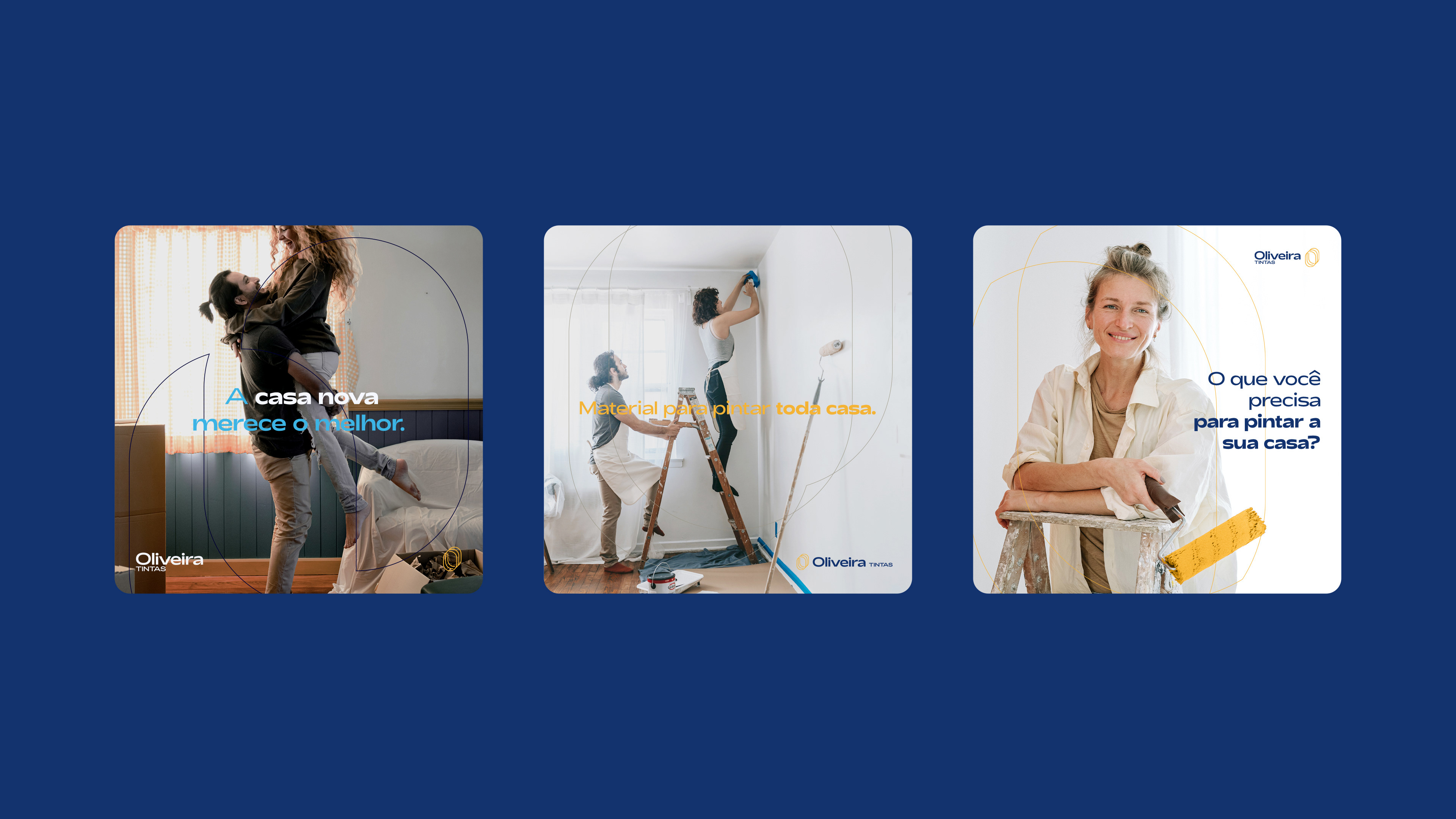
The public of Oliveira Tintas is quite varied, are painters, architects, and people who work in construction. In addition, the target audience is also composed of individuals who want to paint their houses, rooms, or walls by themselves.
They are people of both genders, middle and middle/lower class people, above 35 and below 50.
They are people of both genders, middle and middle/lower class people, above 35 and below 50.
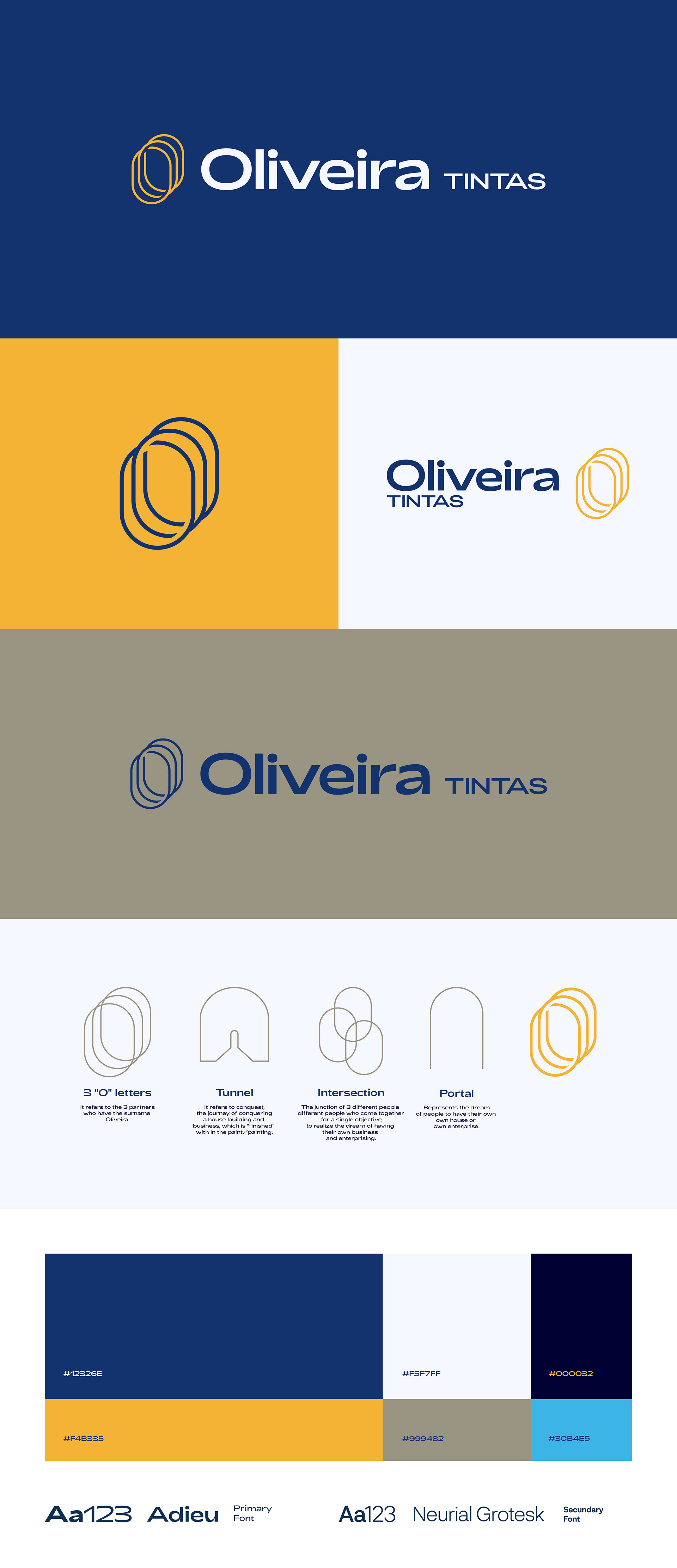
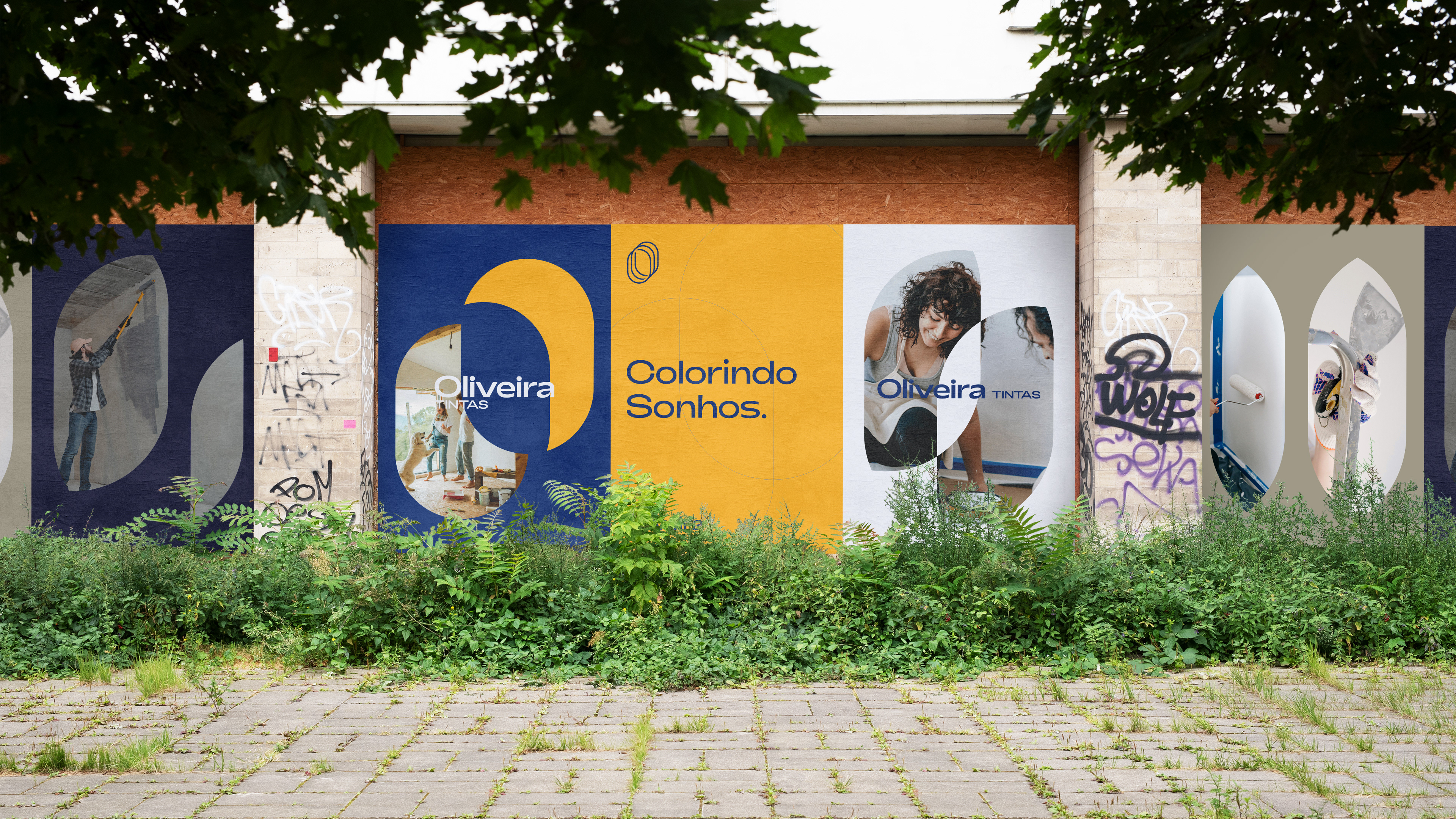
I tried to create a symbol that was modern, innovative, that had symbolism (I explain below), but that was not so in-your-face or so explicit, as companies or businesses in the construction industry usually are.
The font has a strength, it's not a delicate font, but it has strokes that make it happier, friendlier, it doesn't pass a hardness, but clarity and joy.
The font has a strength, it's not a delicate font, but it has strokes that make it happier, friendlier, it doesn't pass a hardness, but clarity and joy.
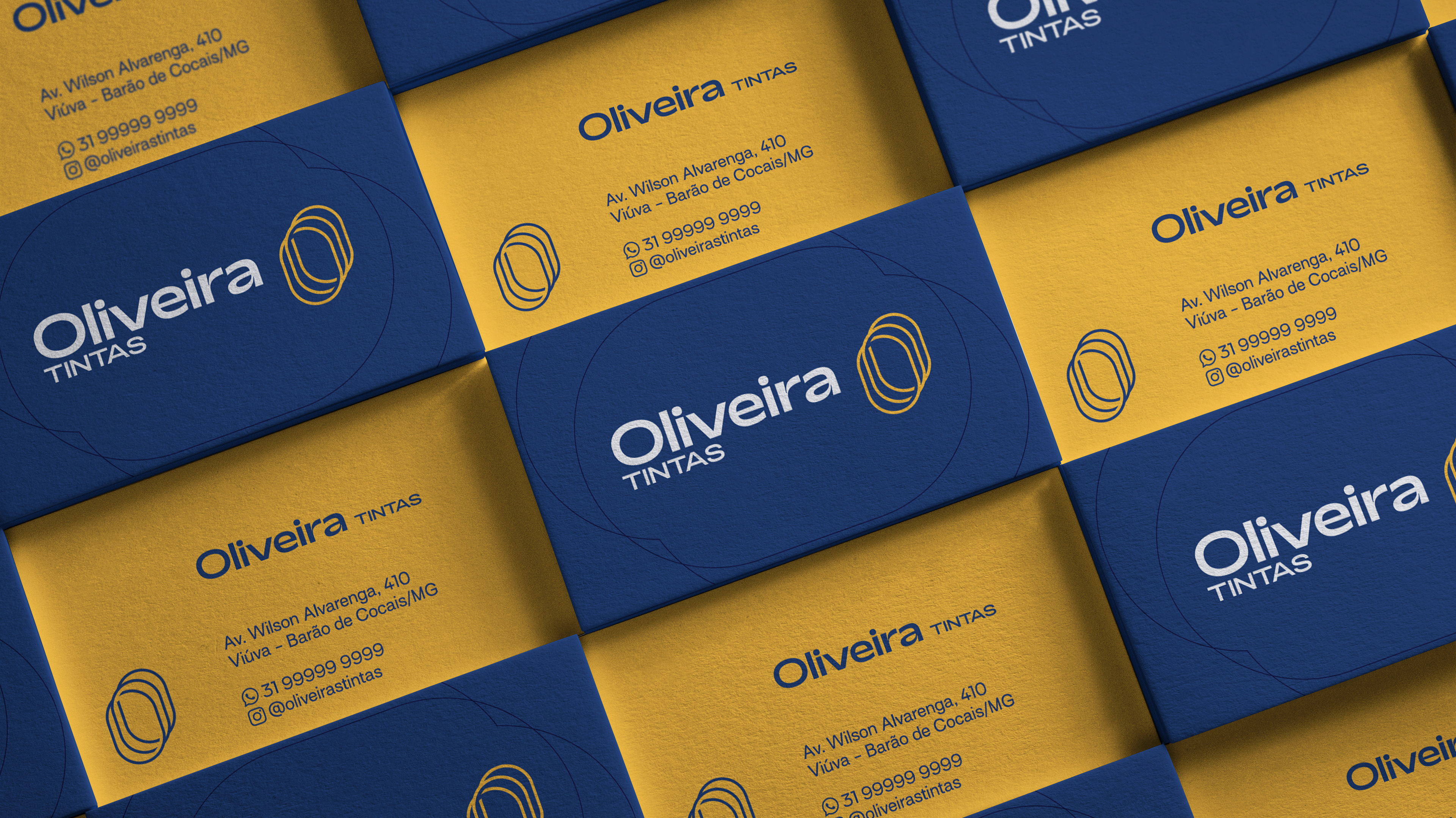
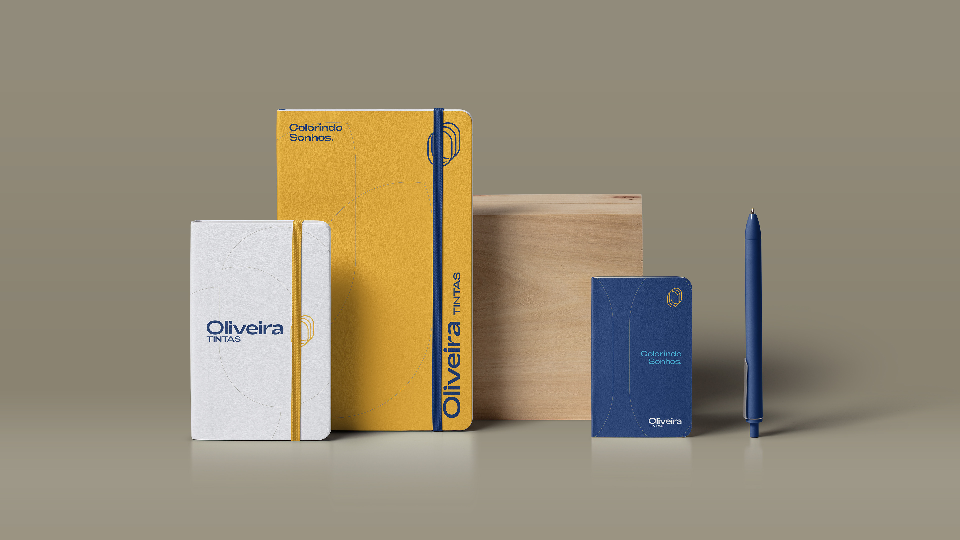
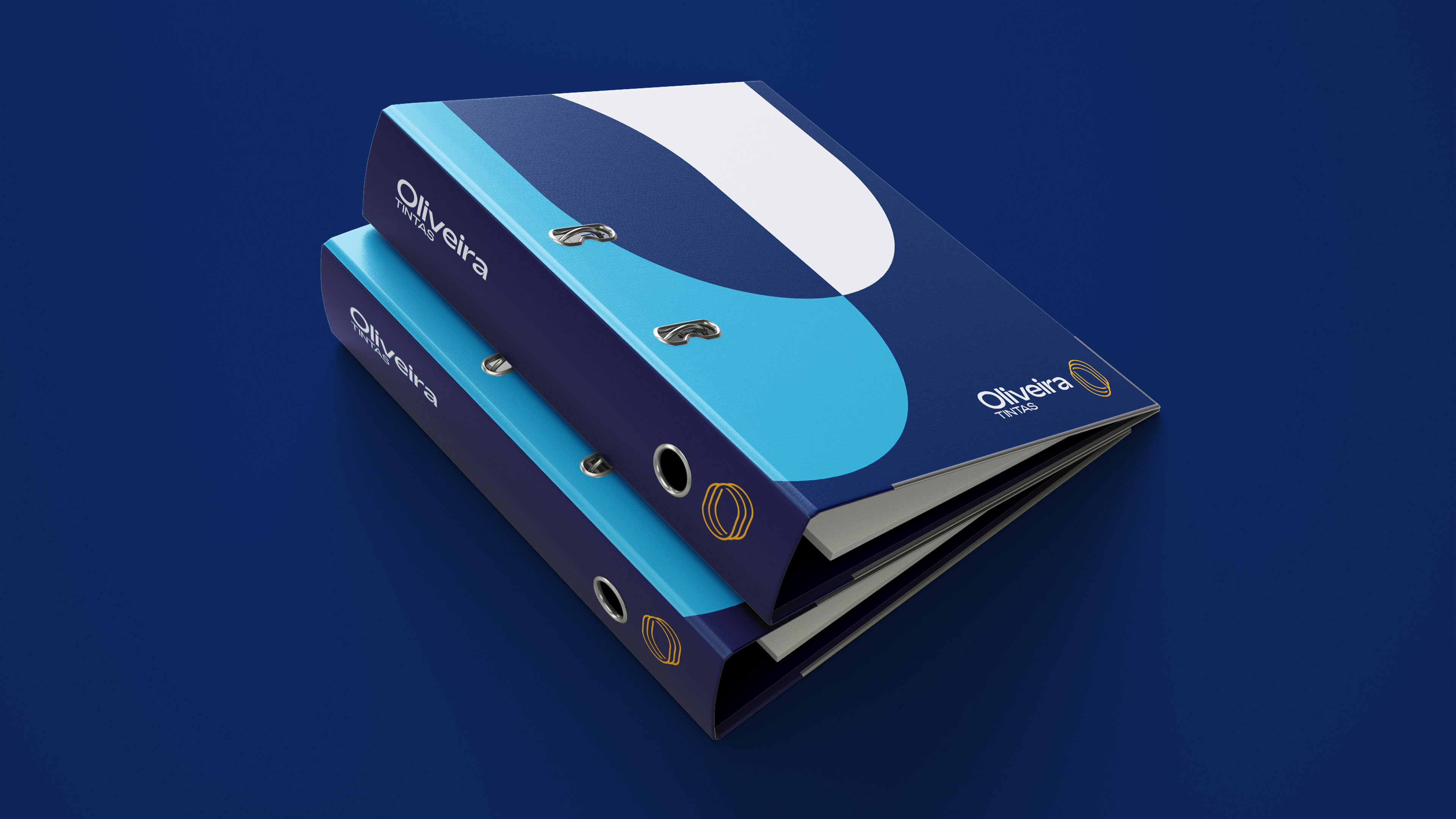
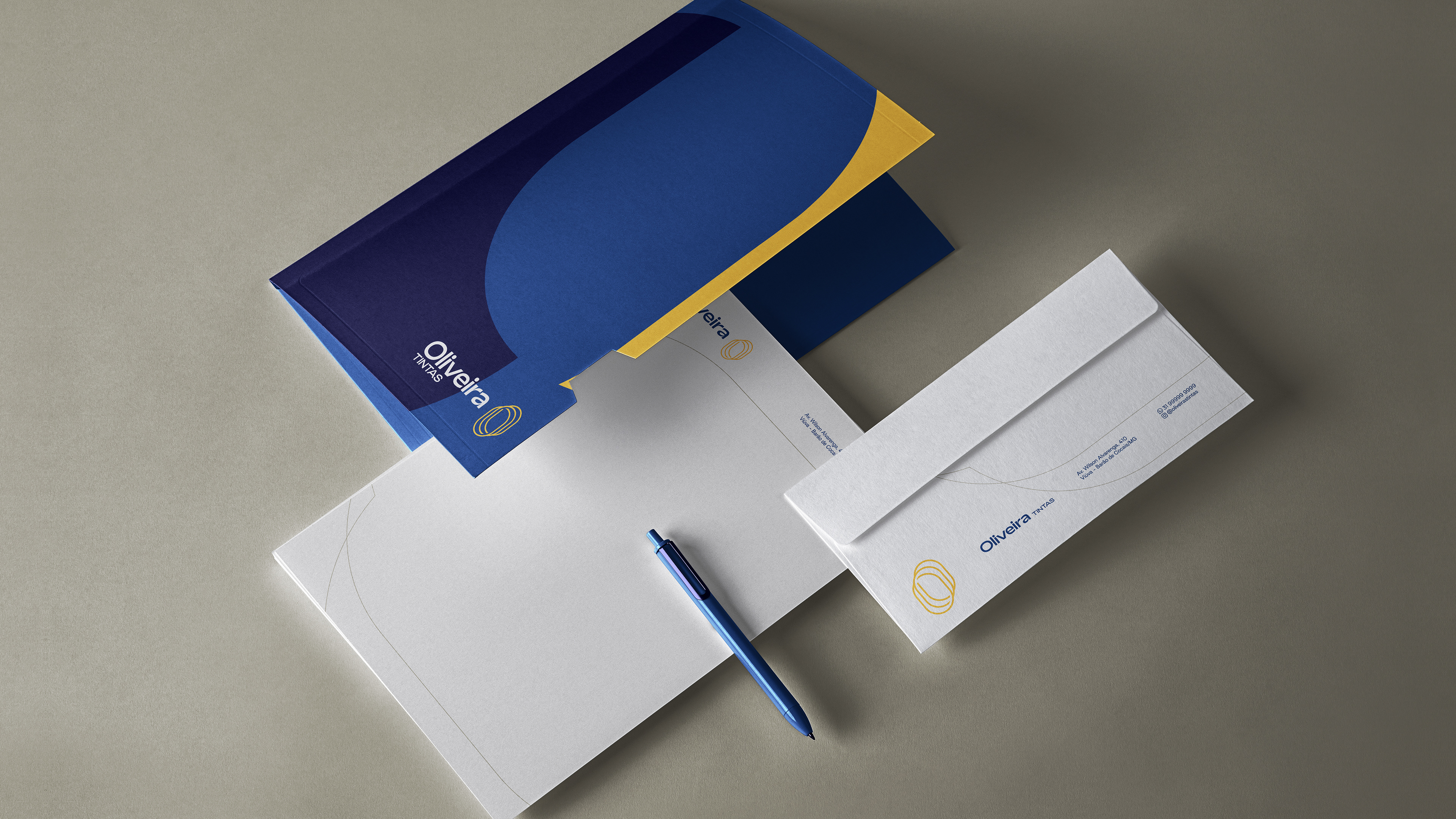
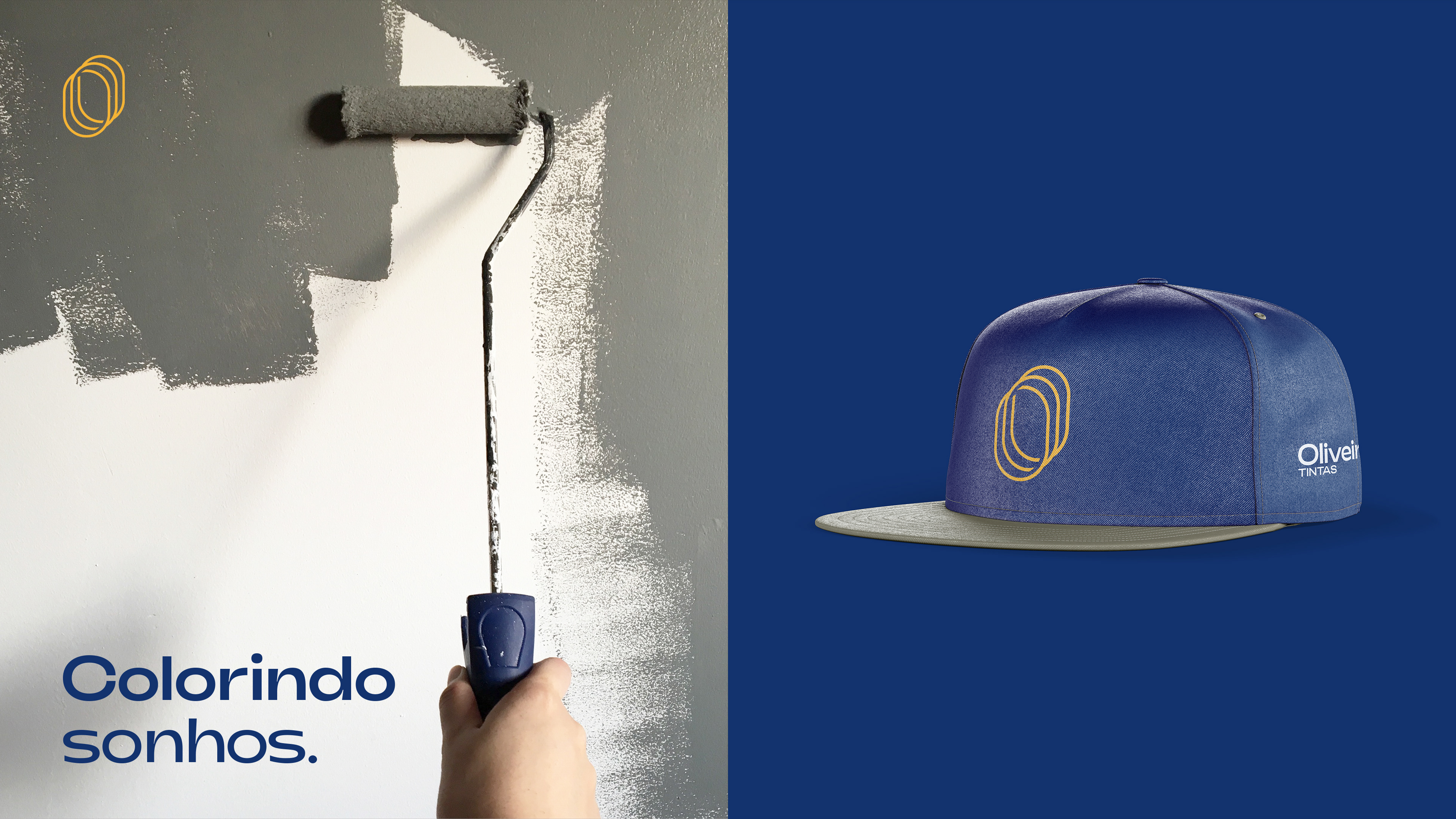
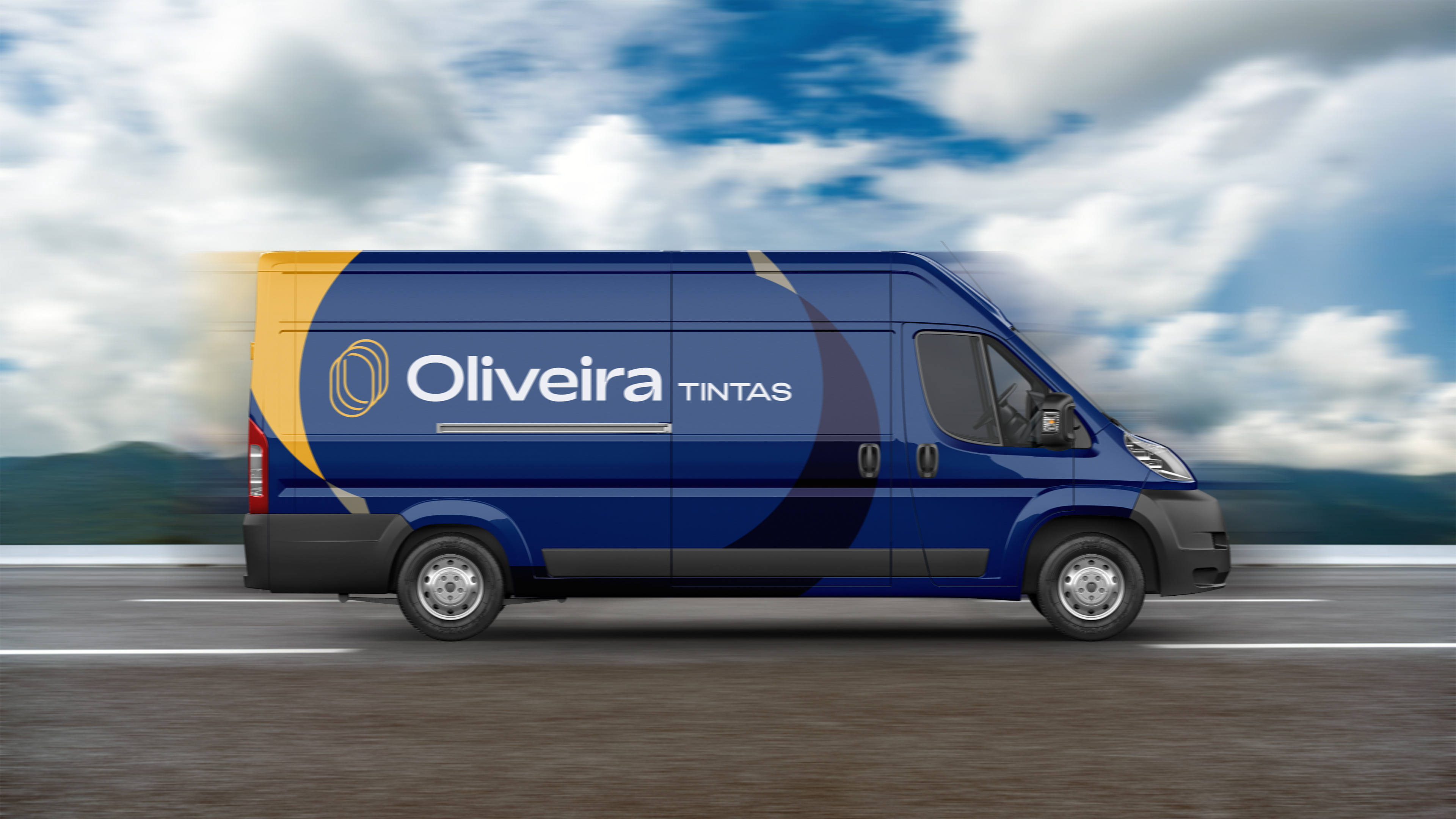
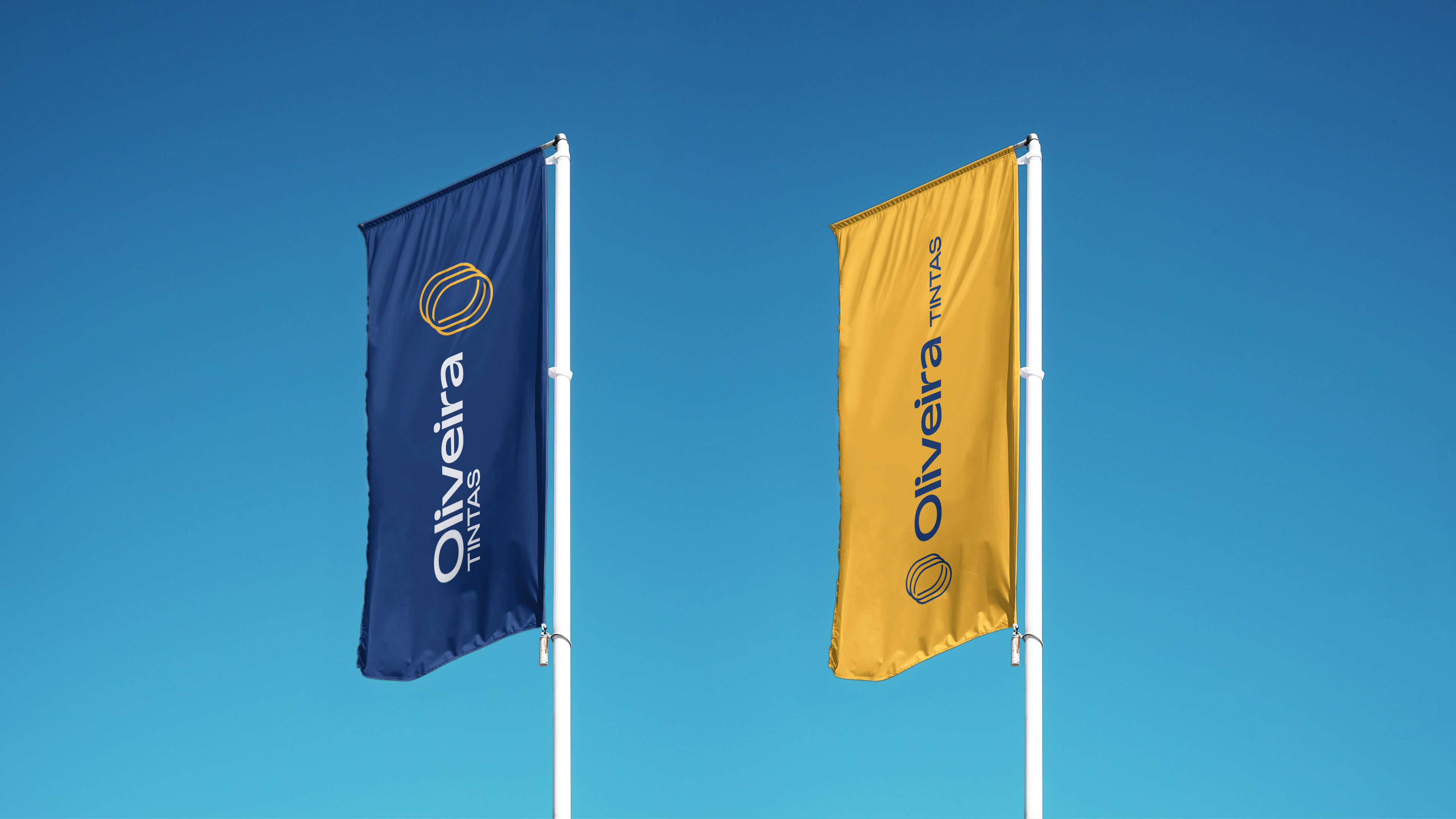
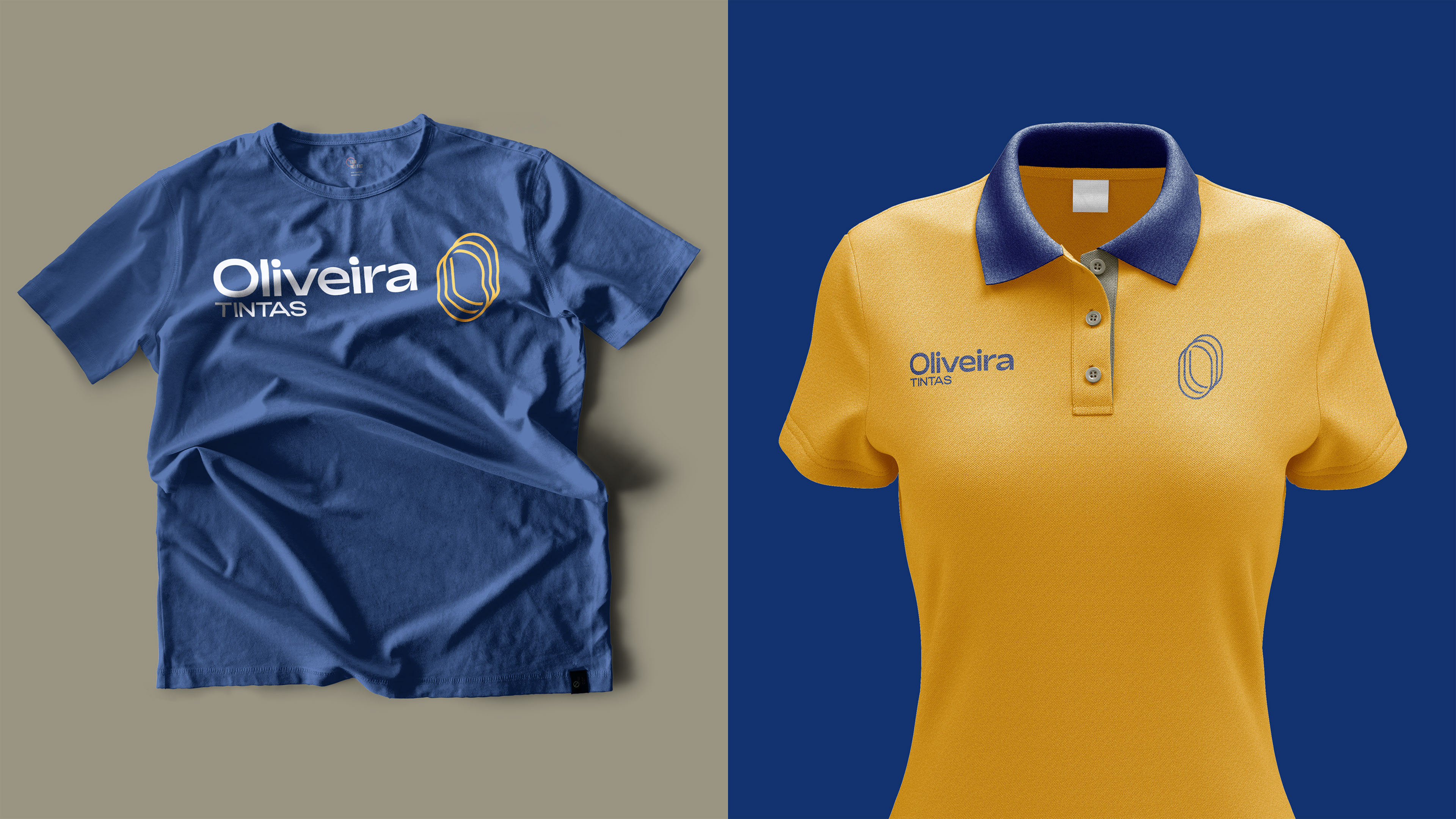
The colors are colors commonly used in the industry, but the shades and contrast of the entire palette are quite different from the local competitors.