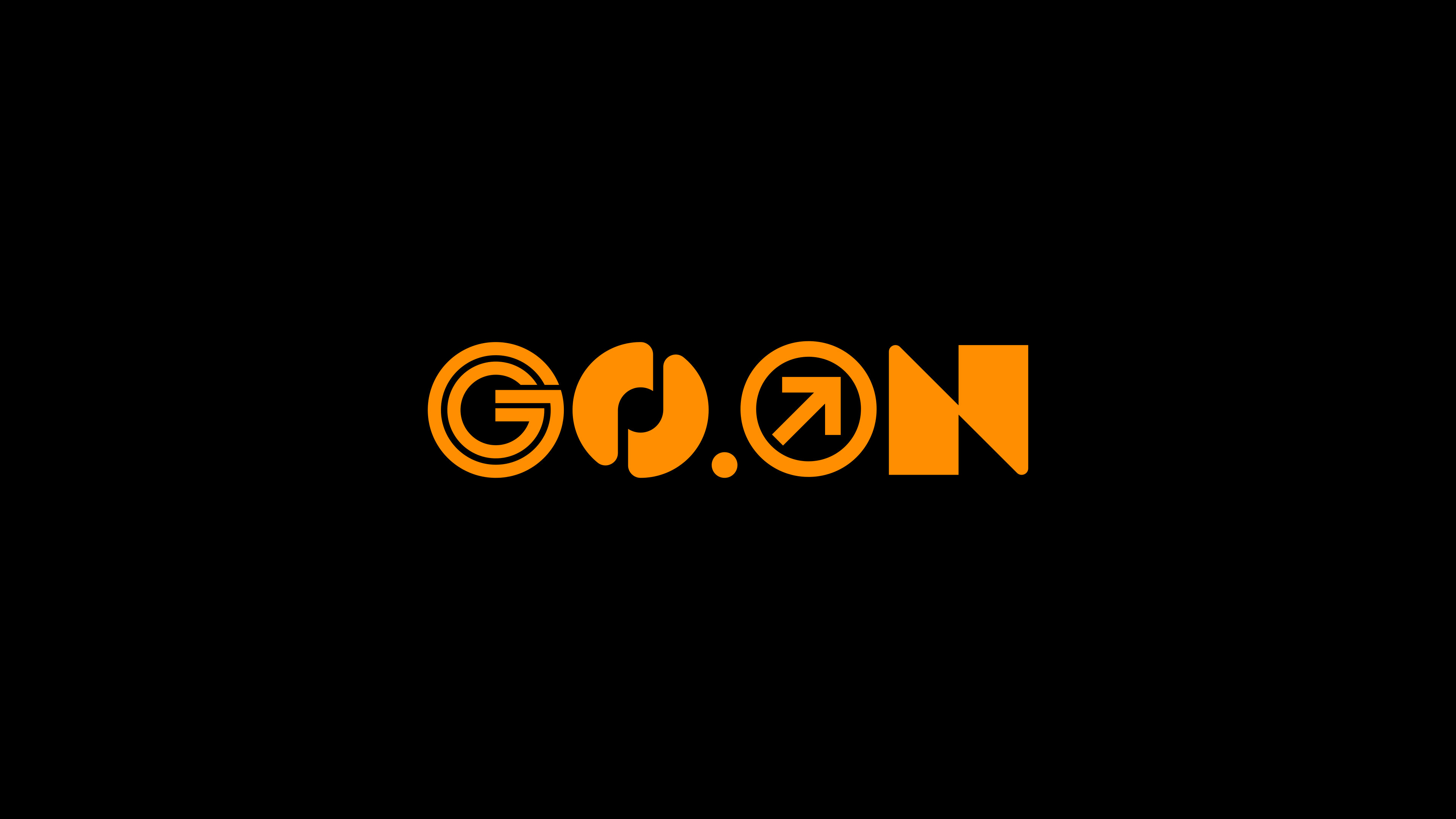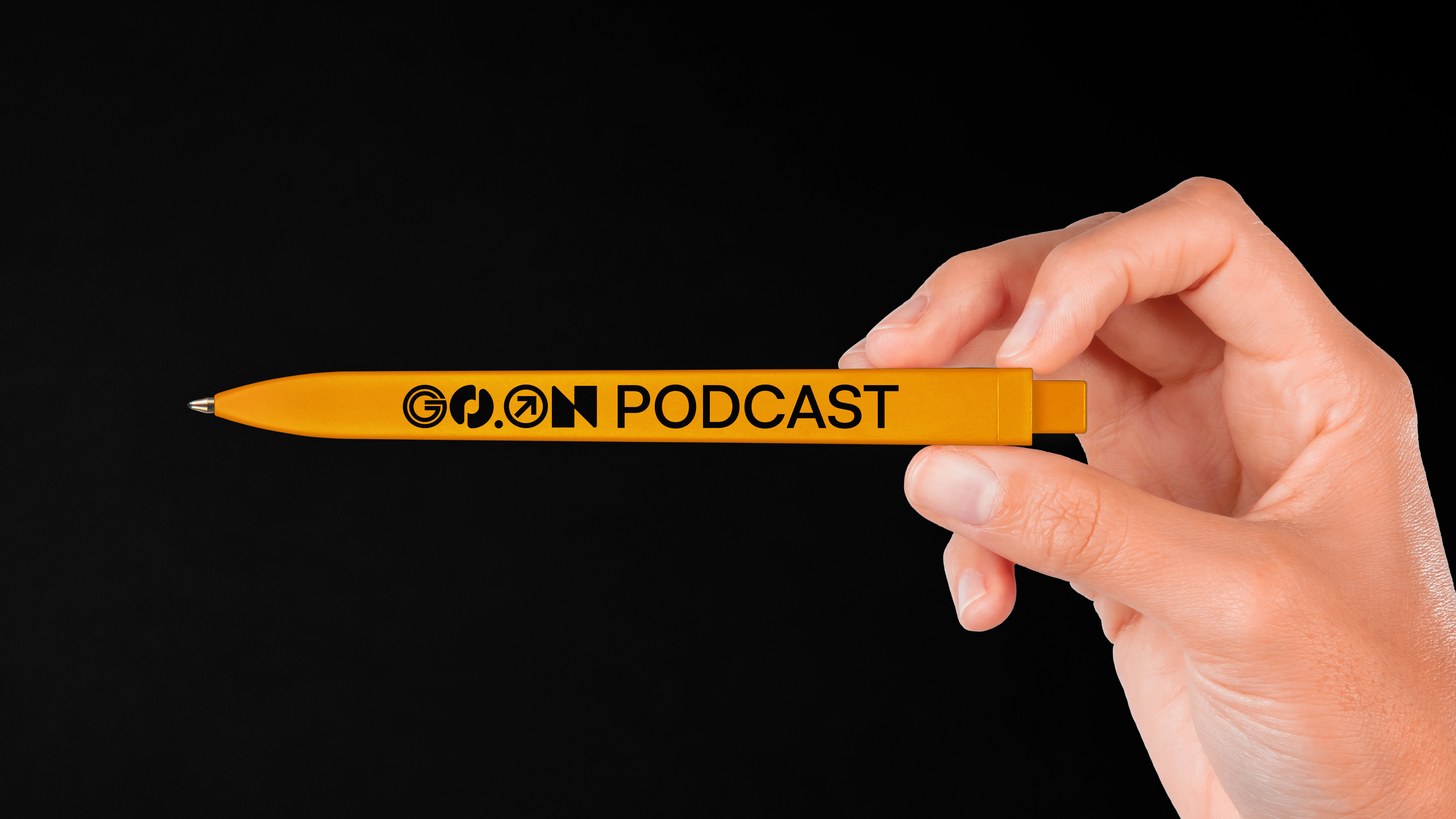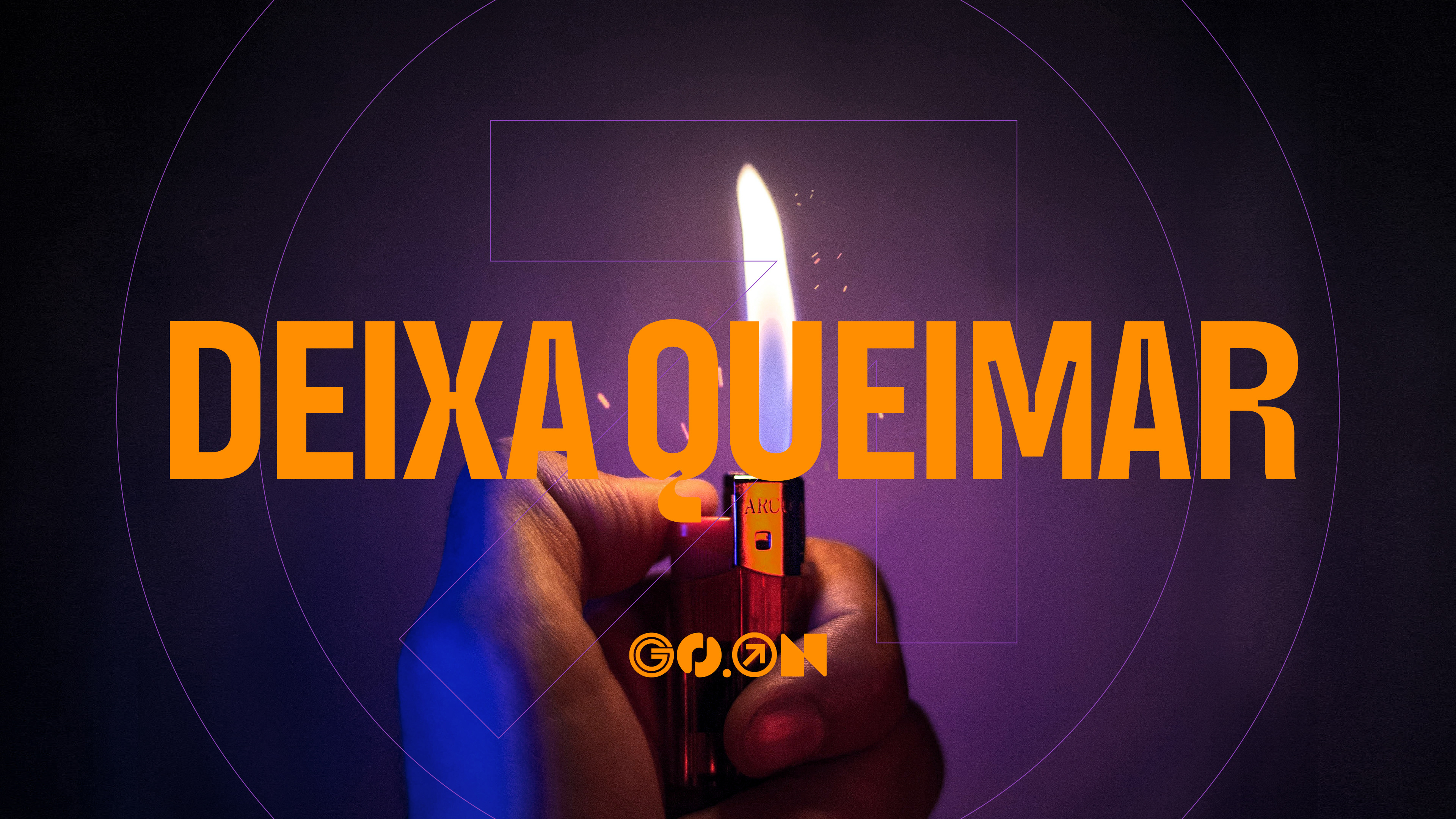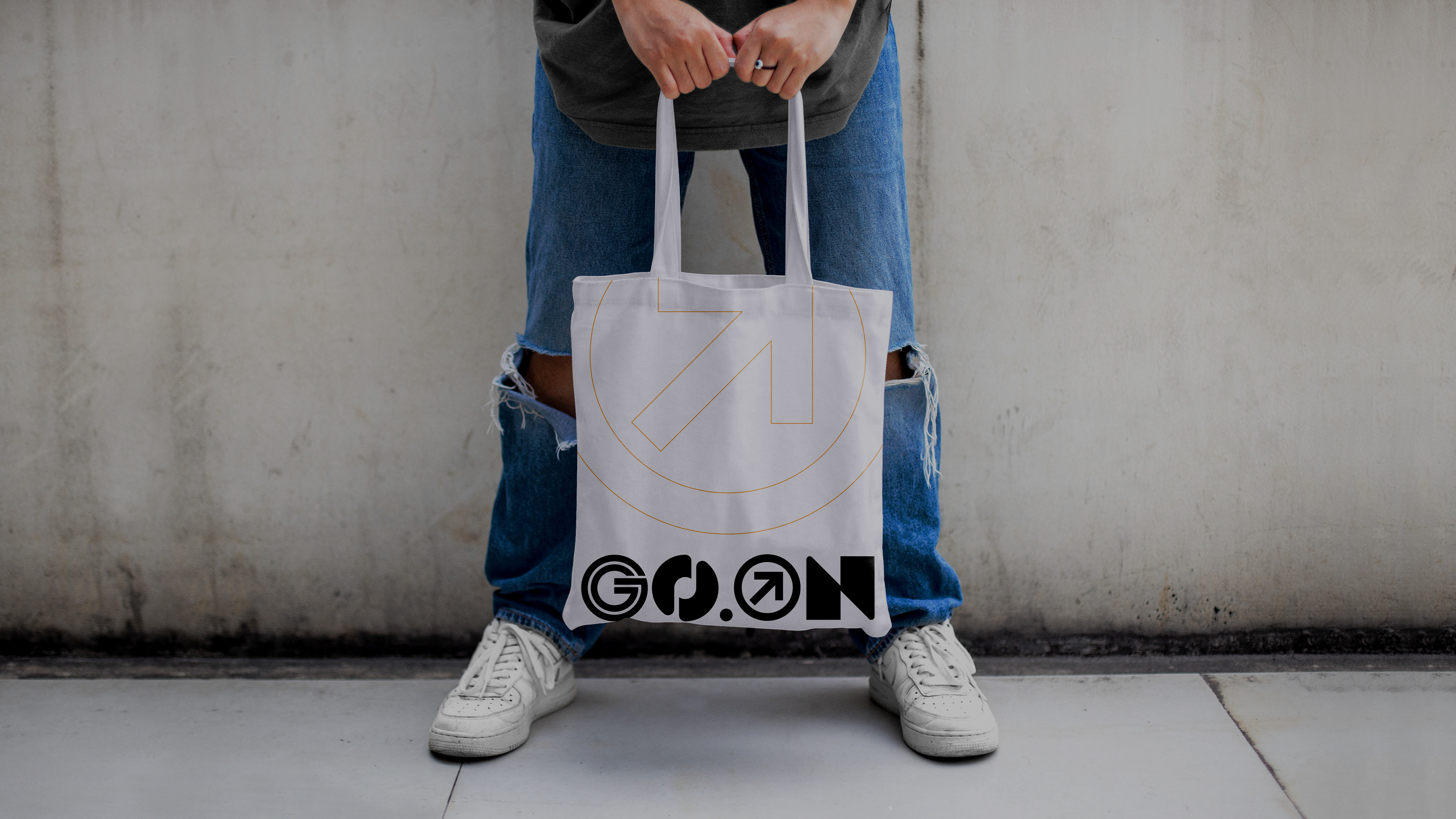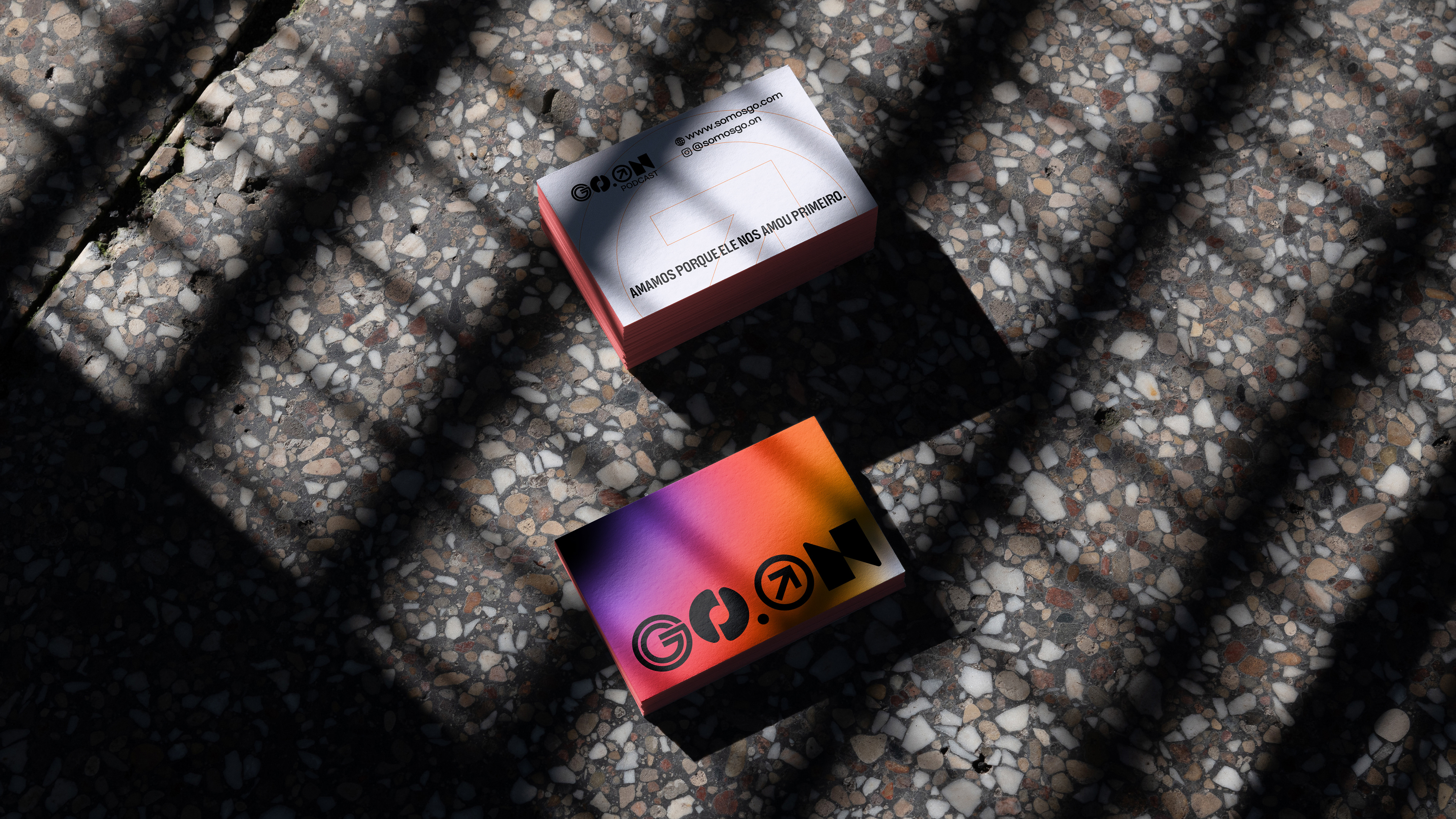

Go.On
November 2021 . Brand design and Visual Identity . Brazil
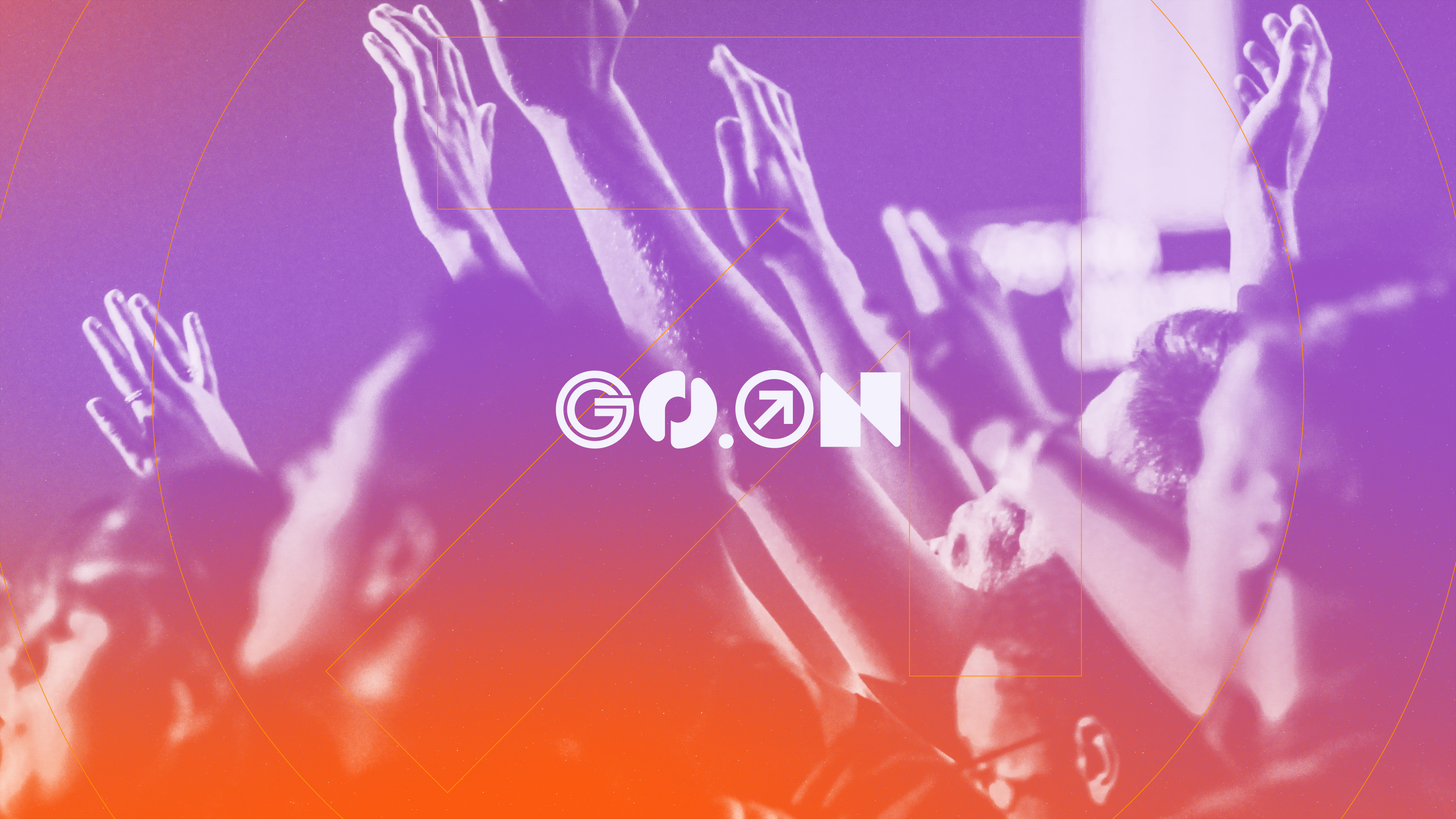
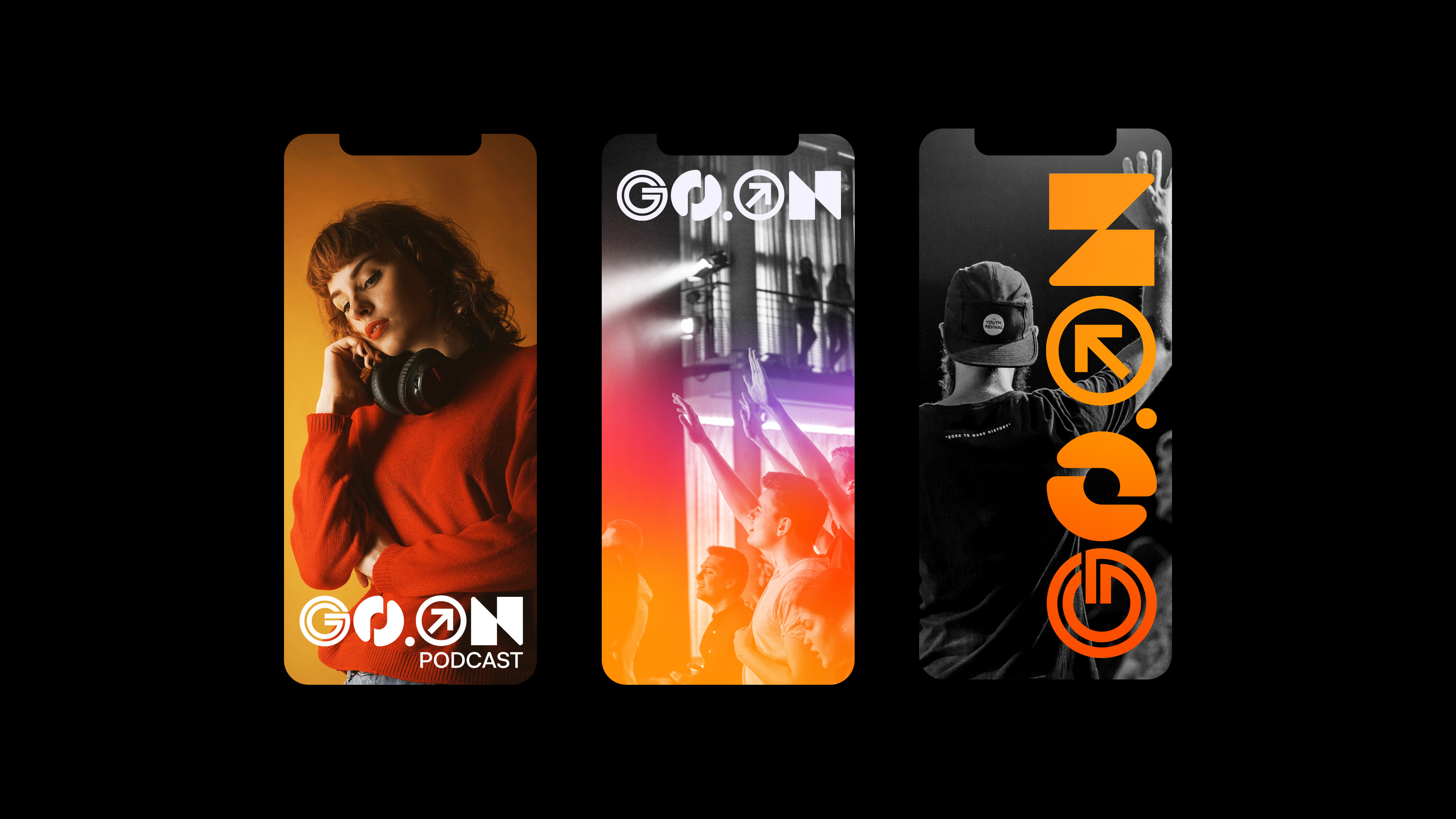
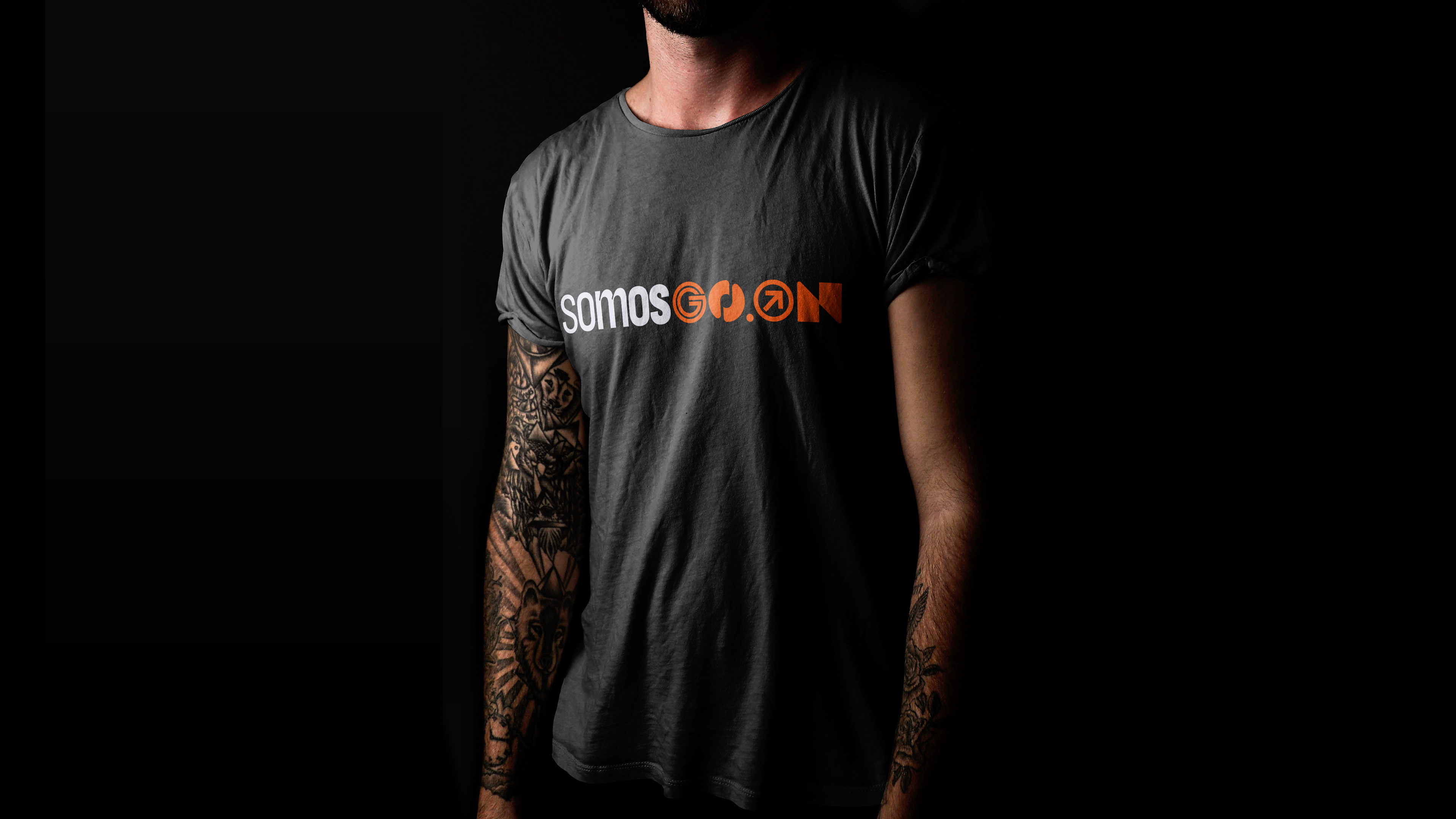
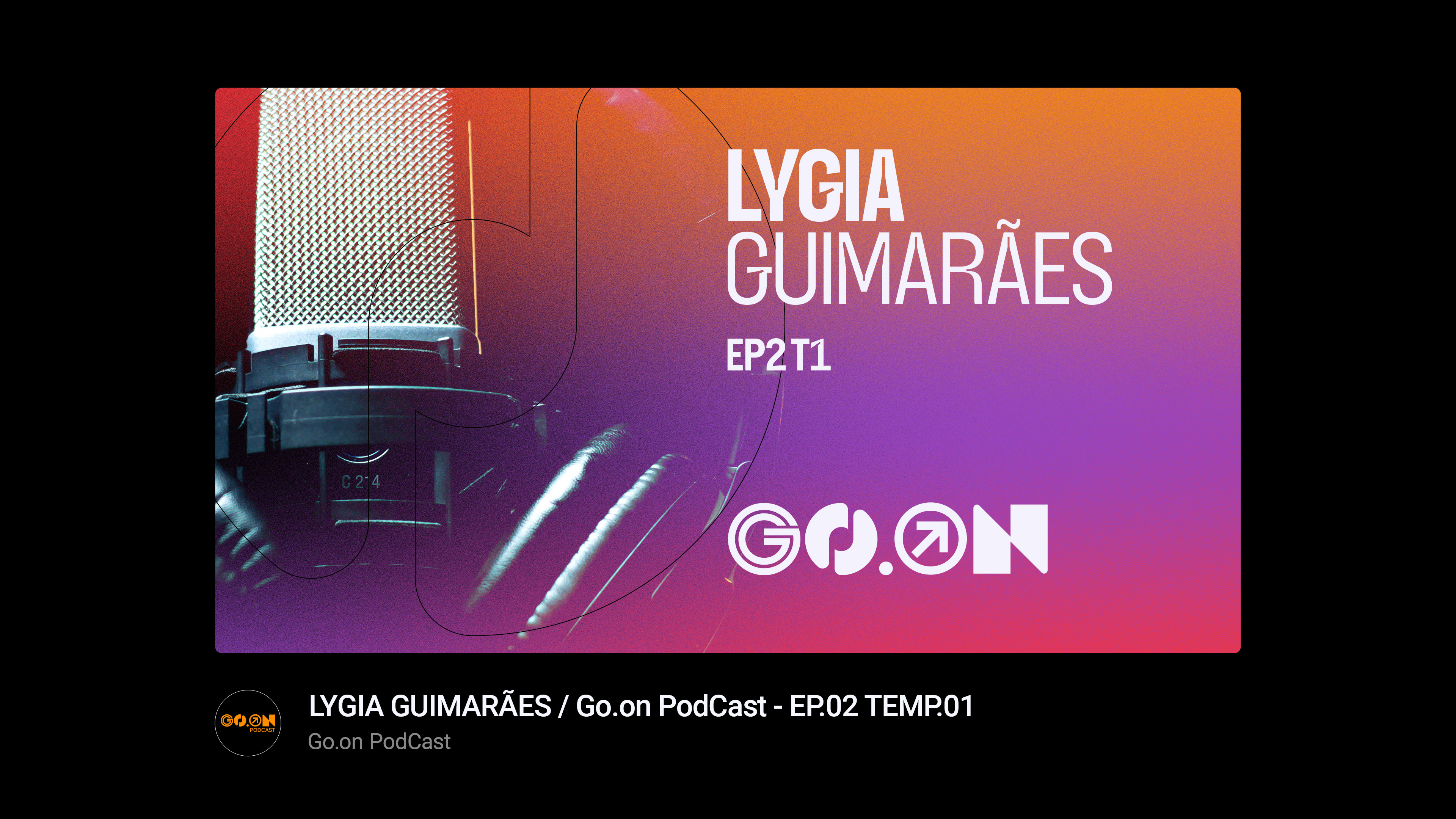
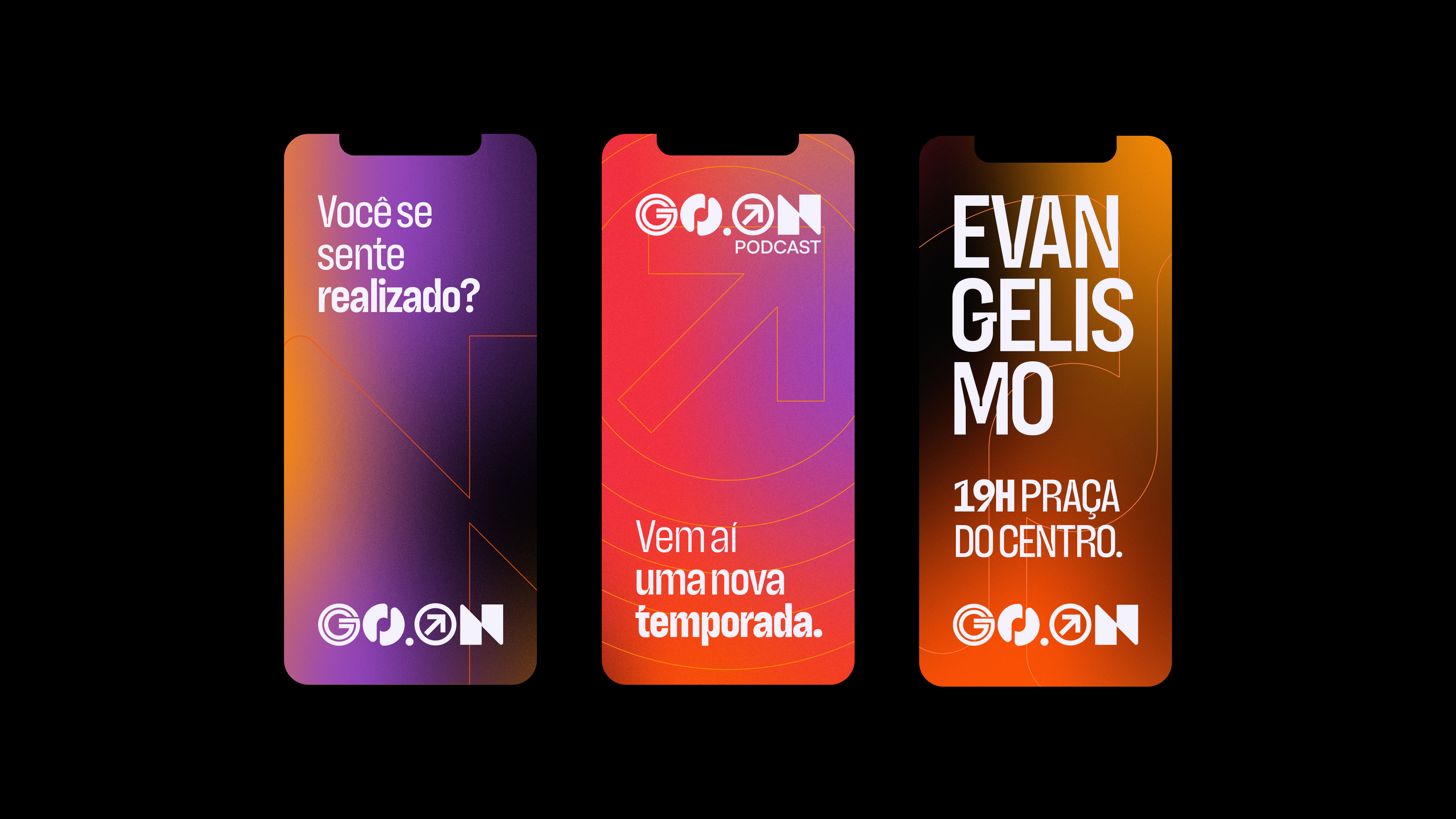
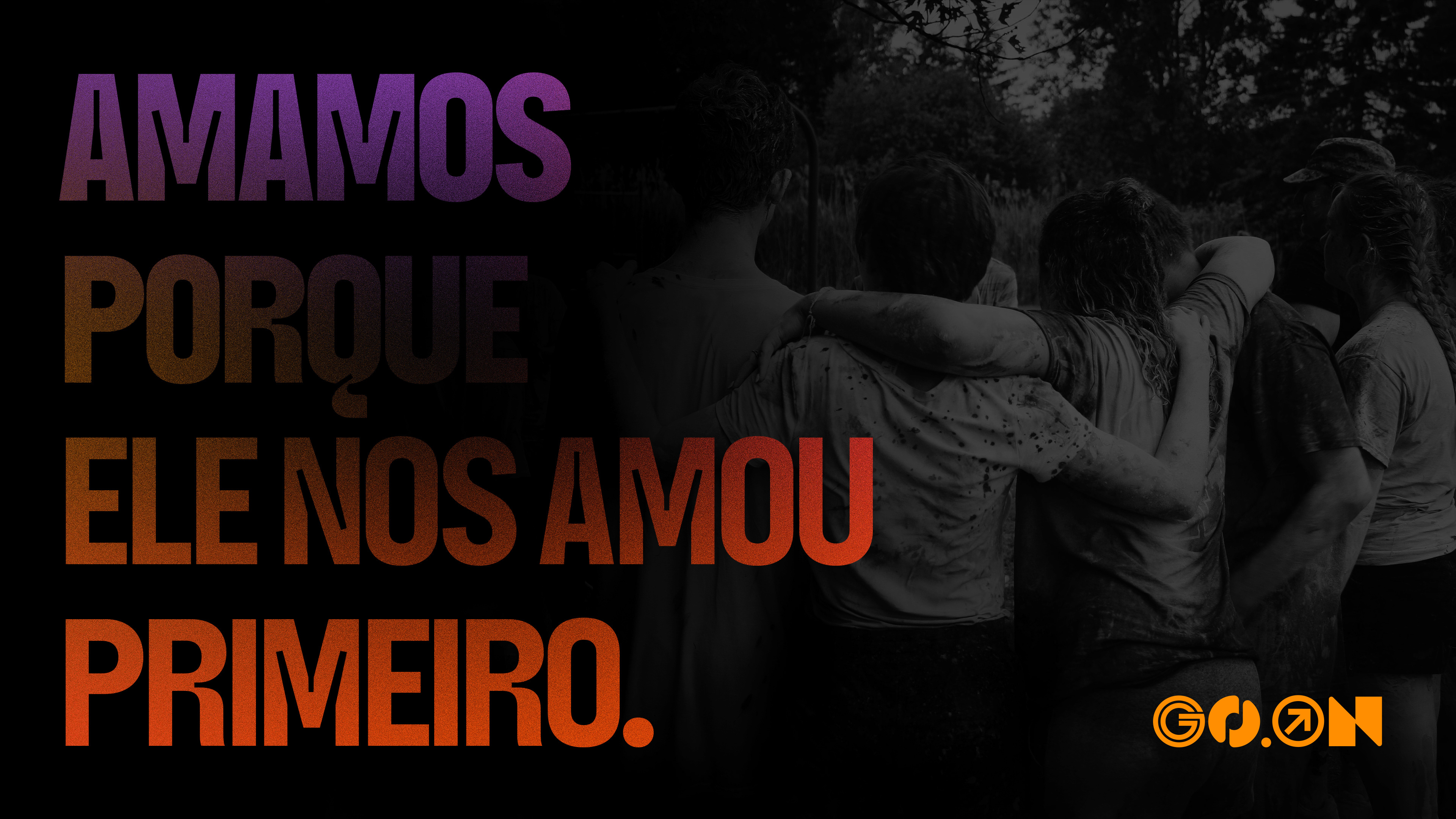
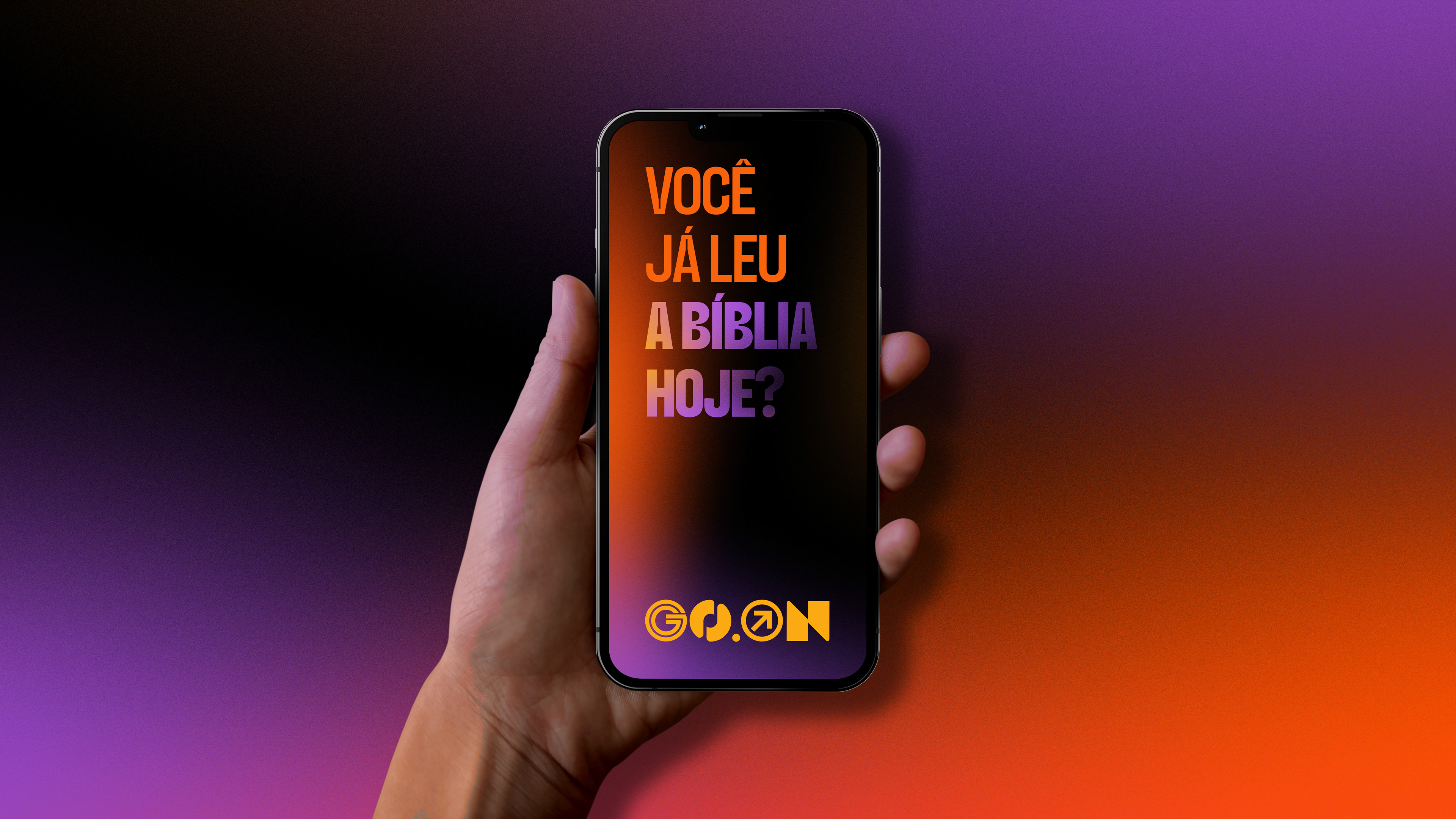
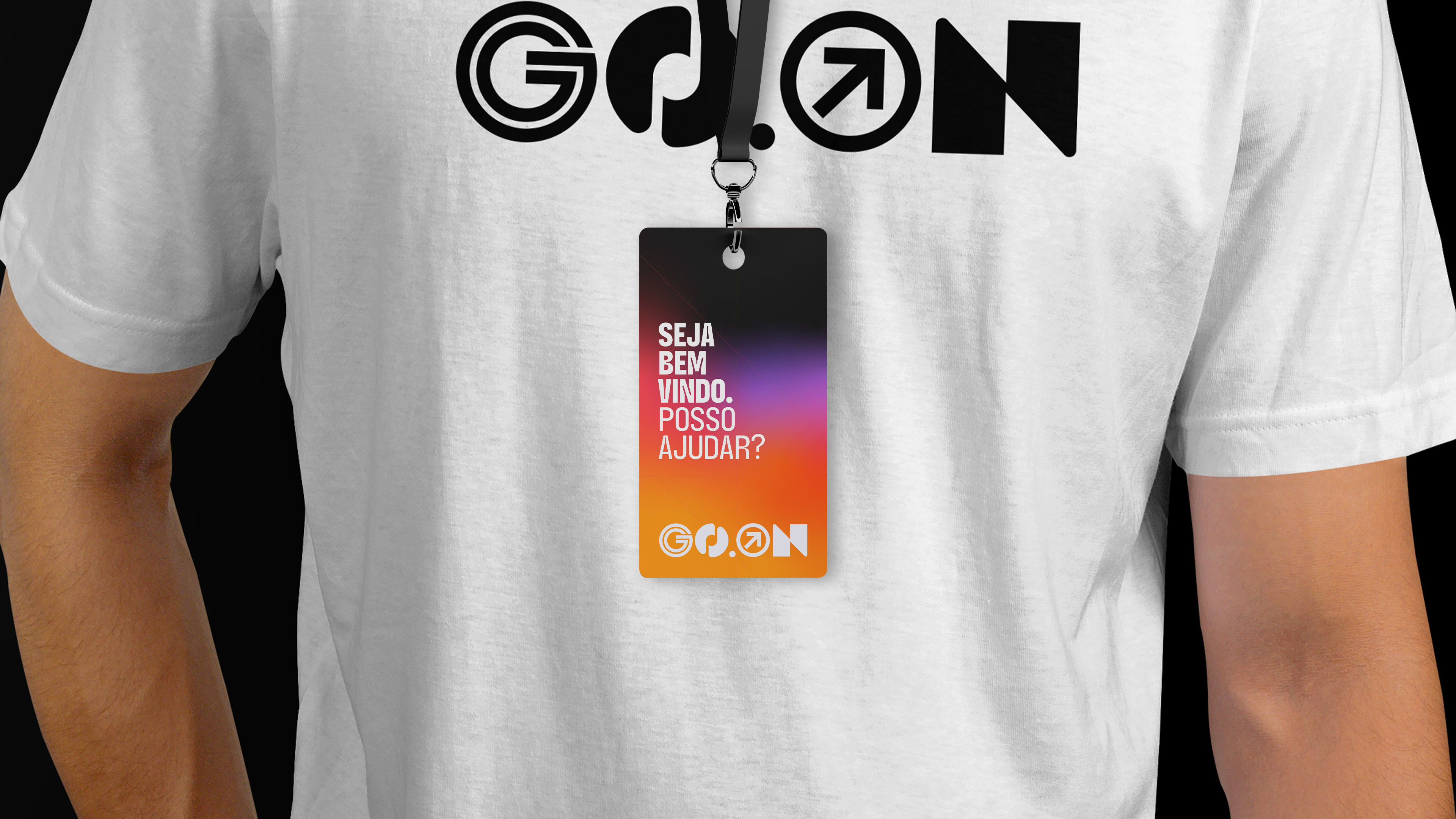
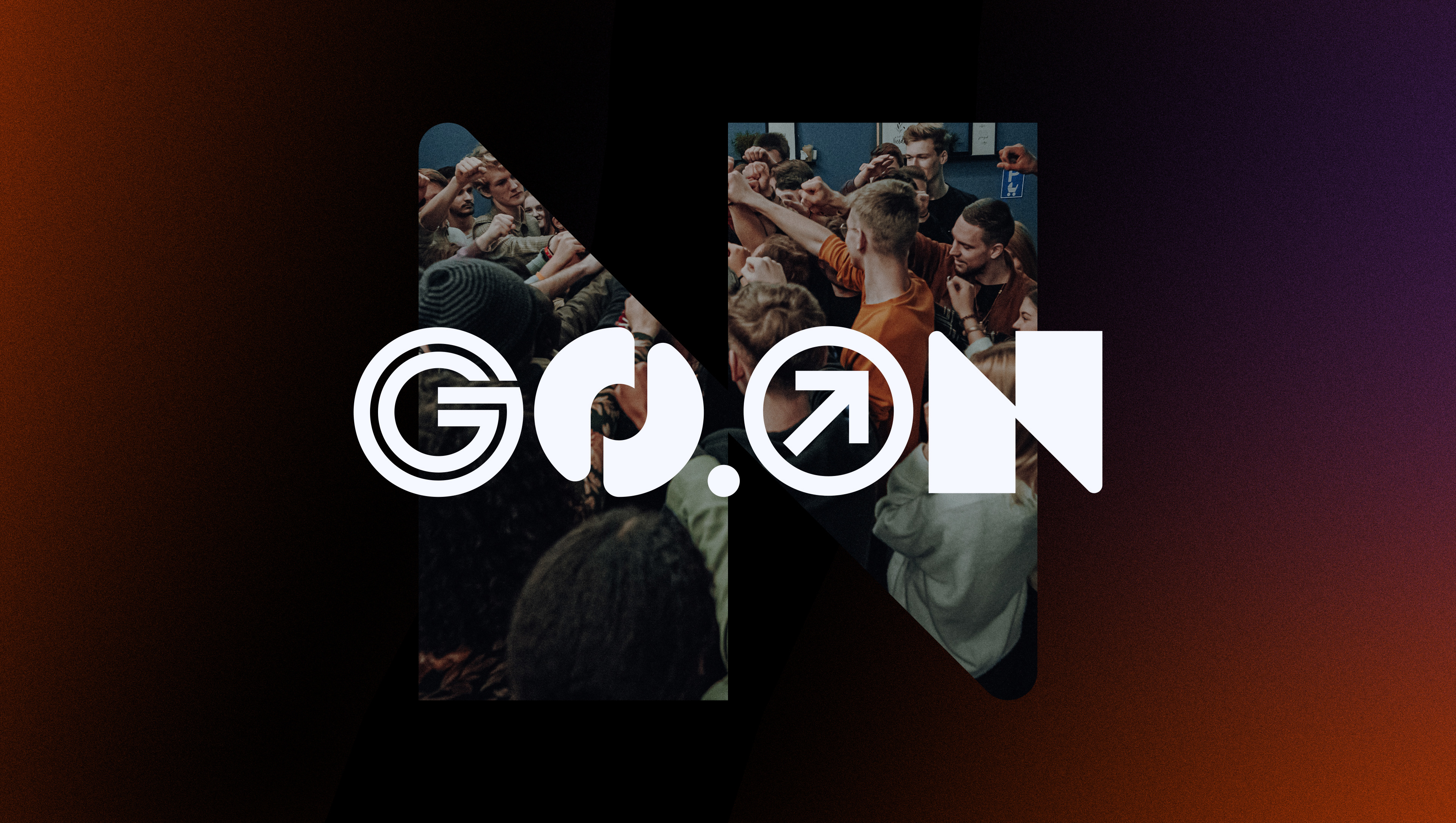
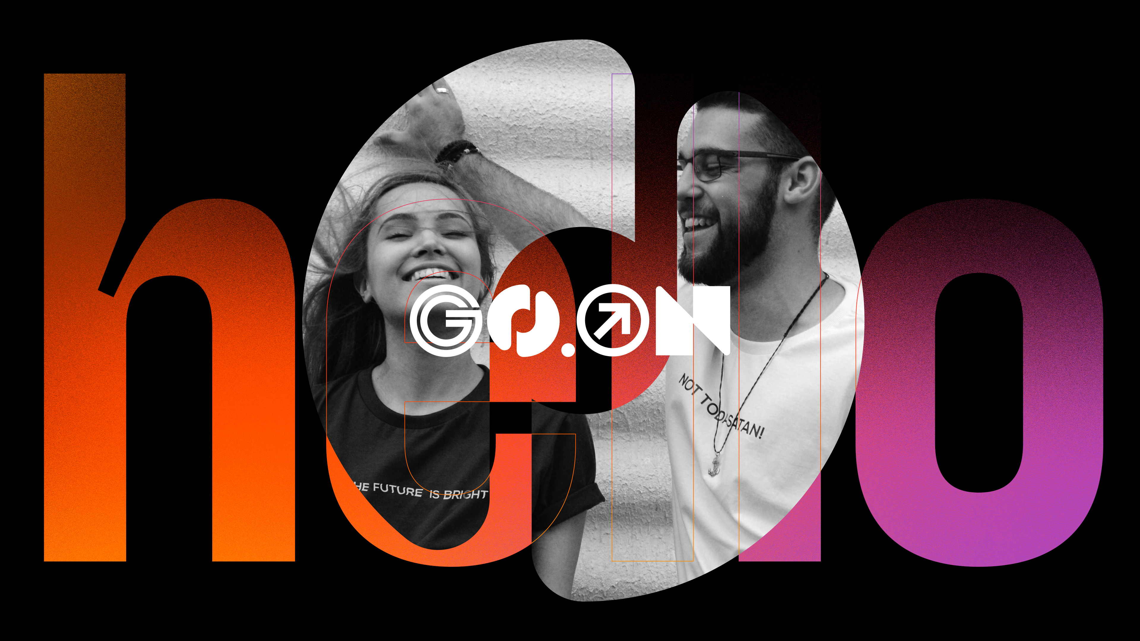
Go.On is the youth ministry of the Methodist Church in Barão de Cocais and also a Podcast of these young people.
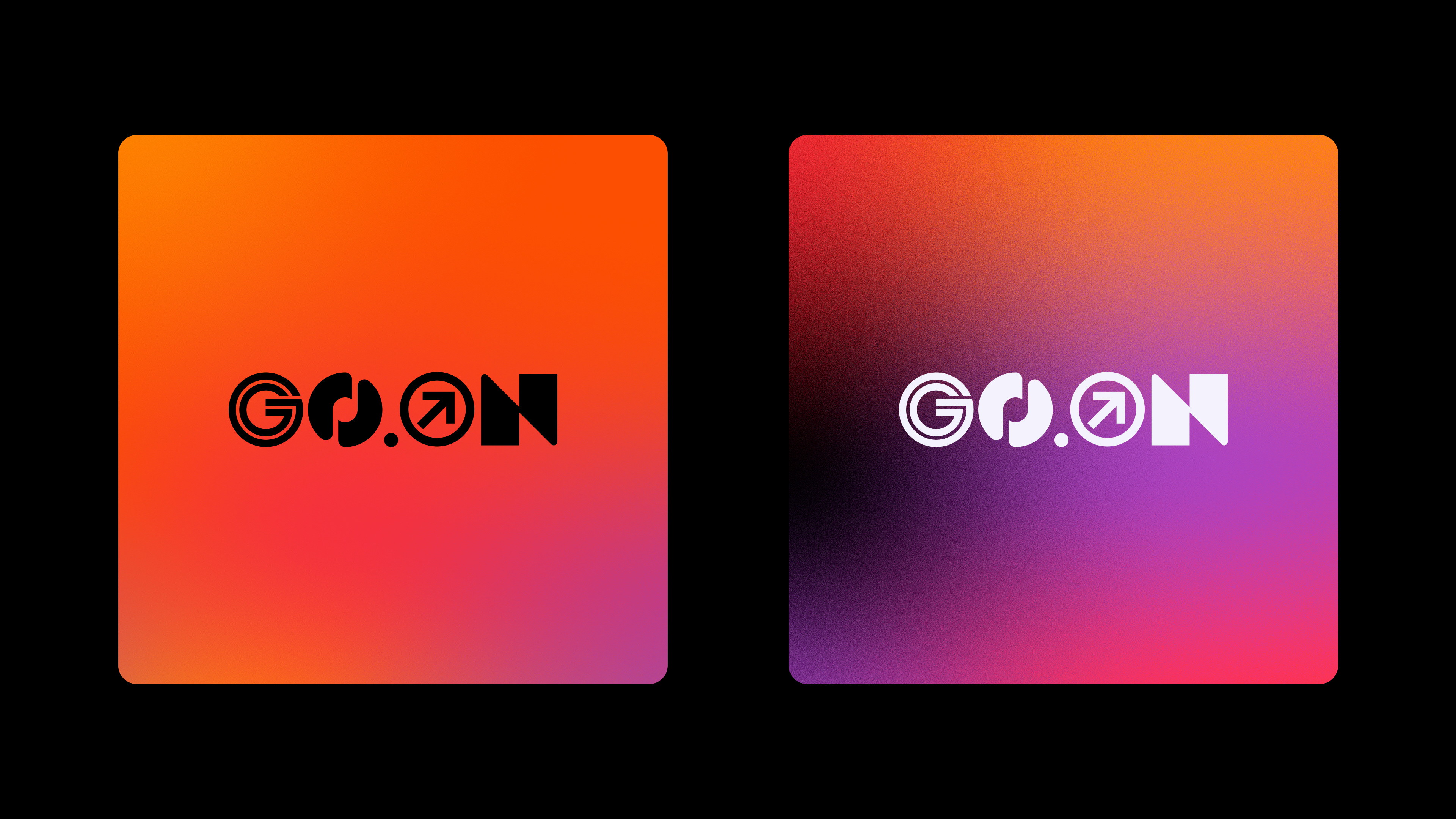
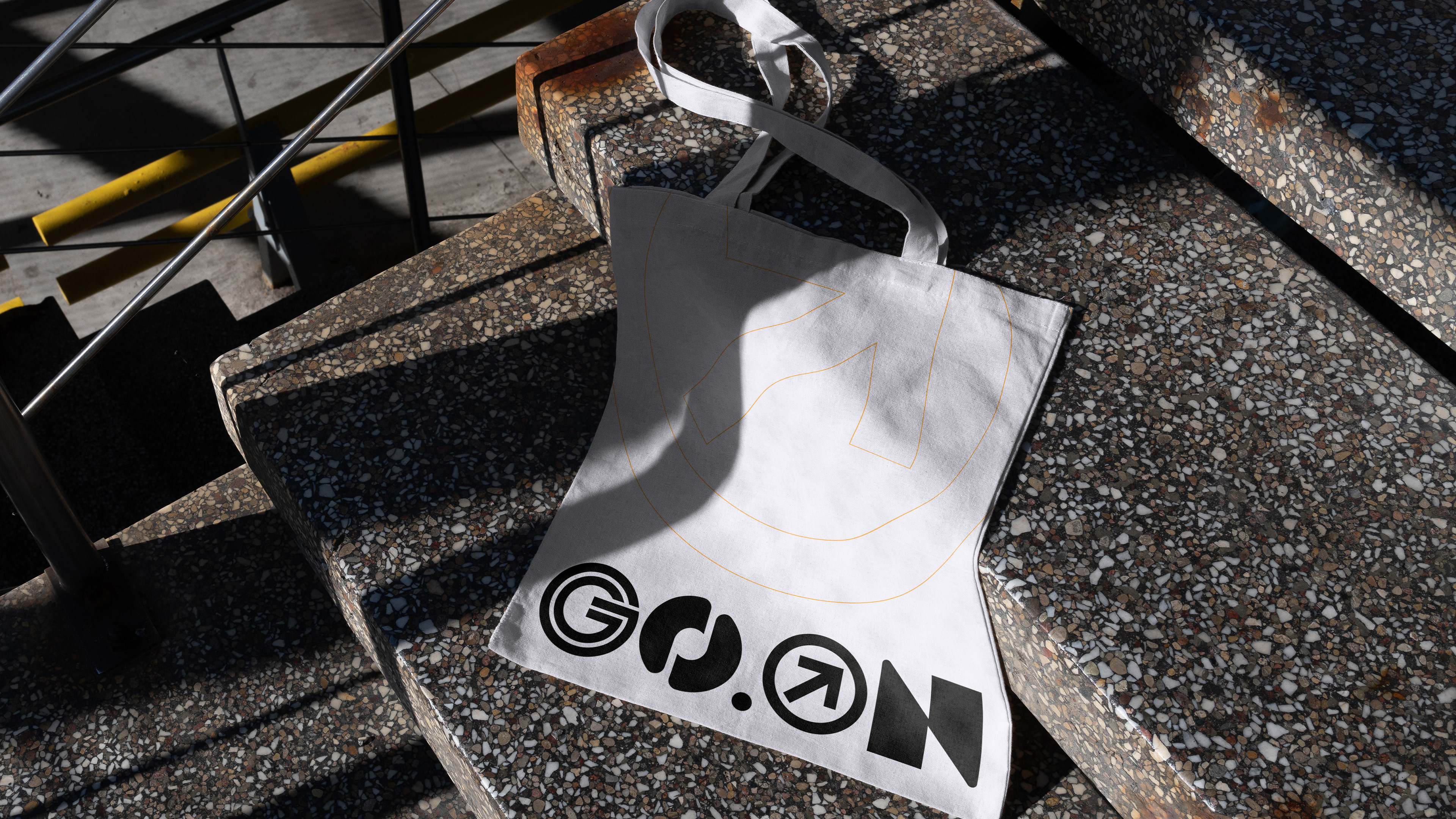
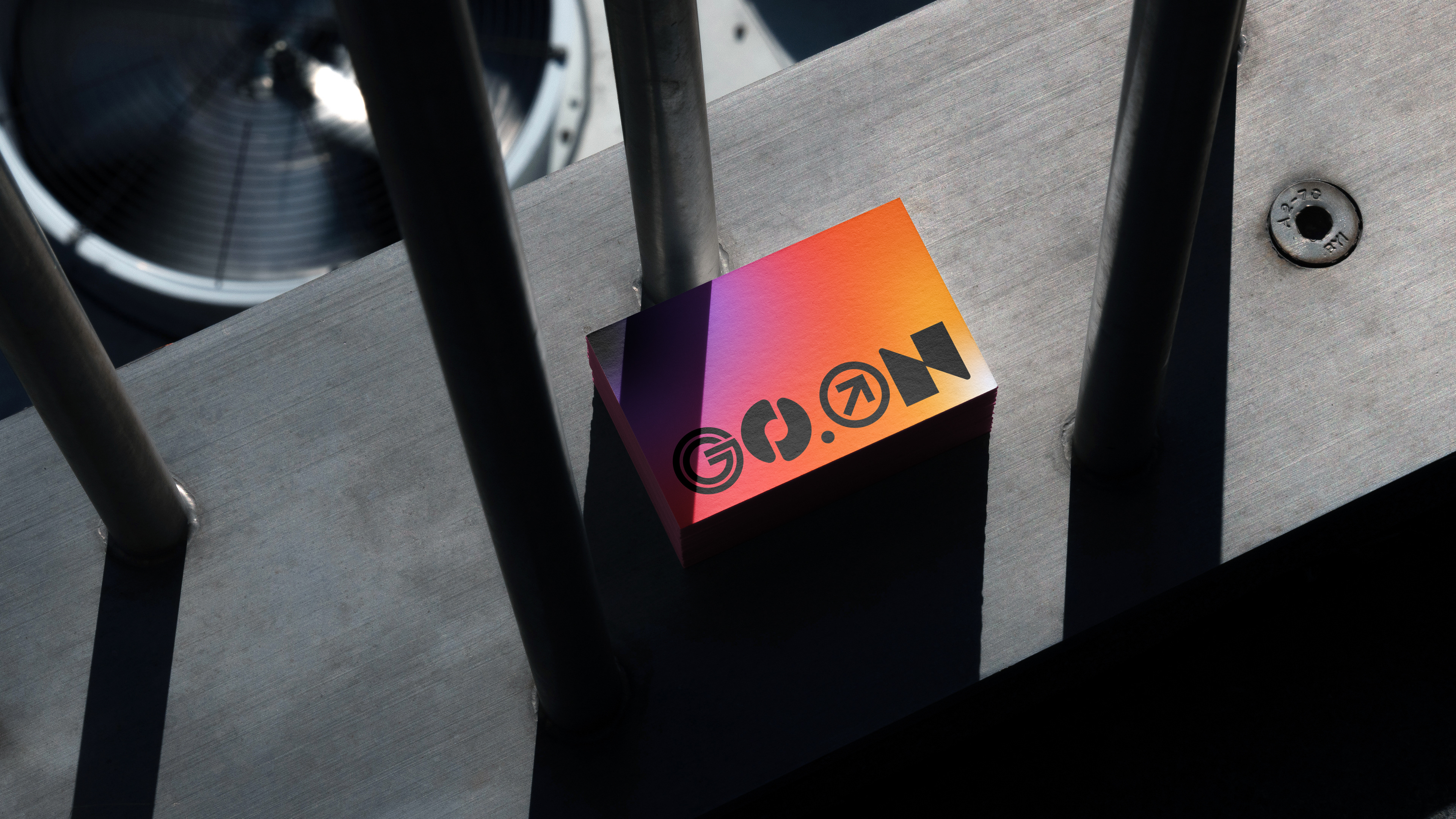
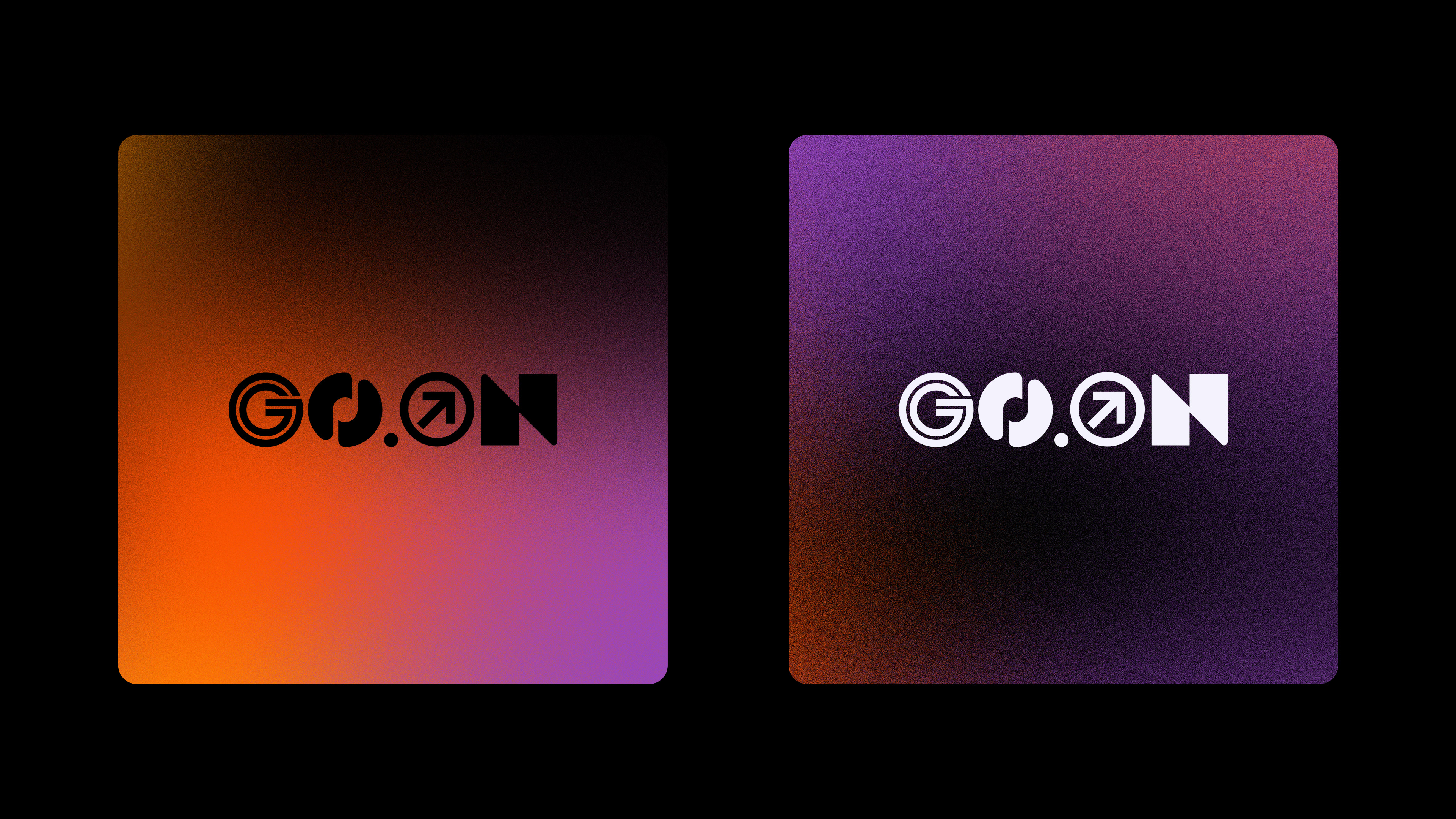
The choice of the name Go.On comes from avance, prossiga, vai...All this is what this youth movement wants to encourage and activate, they are young people of various different ages who seek to connect and activate more young people to walk in a life with purpose. For the construction of the logo I sought to use a modernist and minimalist aesthetic. The letter "G" is based on this idea, the first letter "O" represents the junction of musical notes together with a headphone symbol. The second letter "O" represents an arrow that symbolizes moving forward and growing. All this represents Go.On.