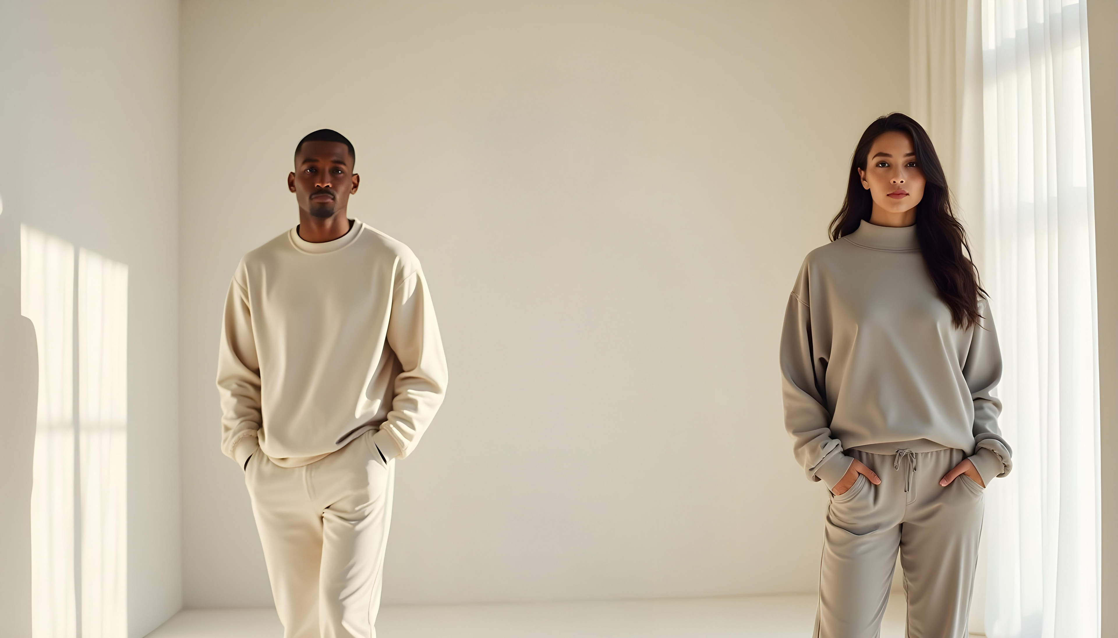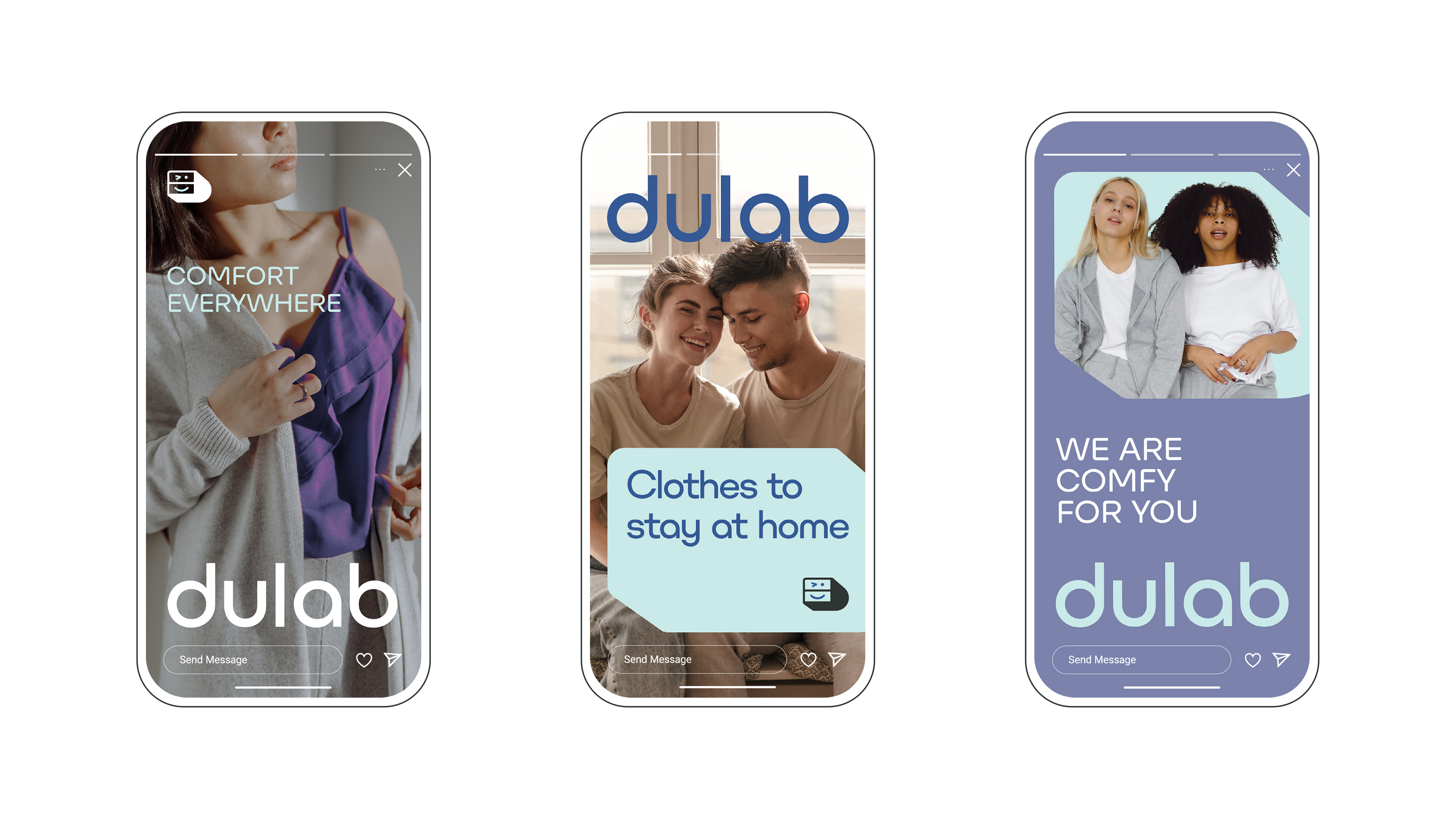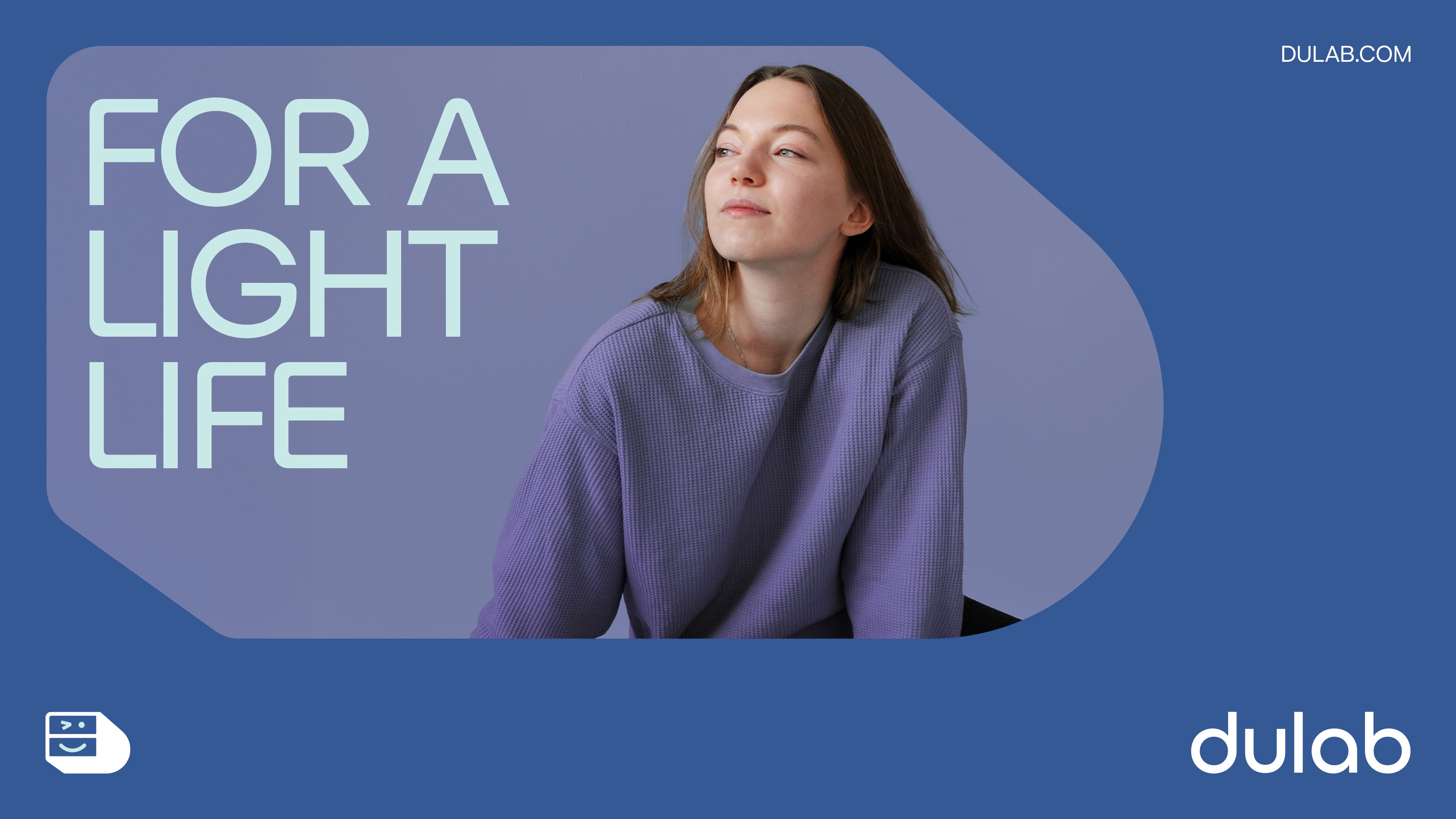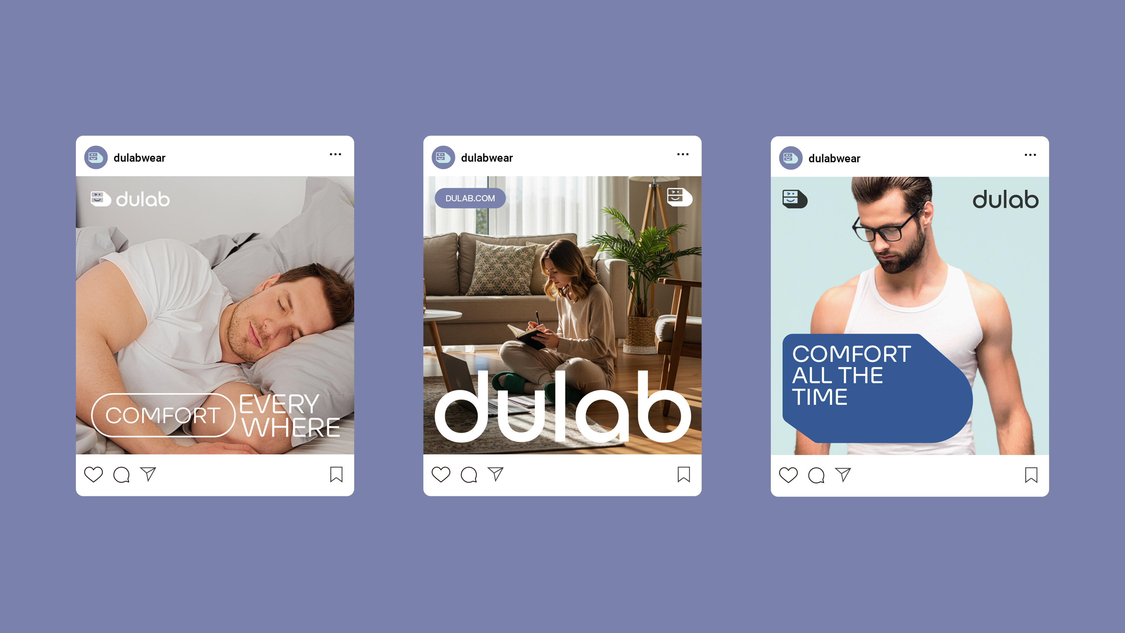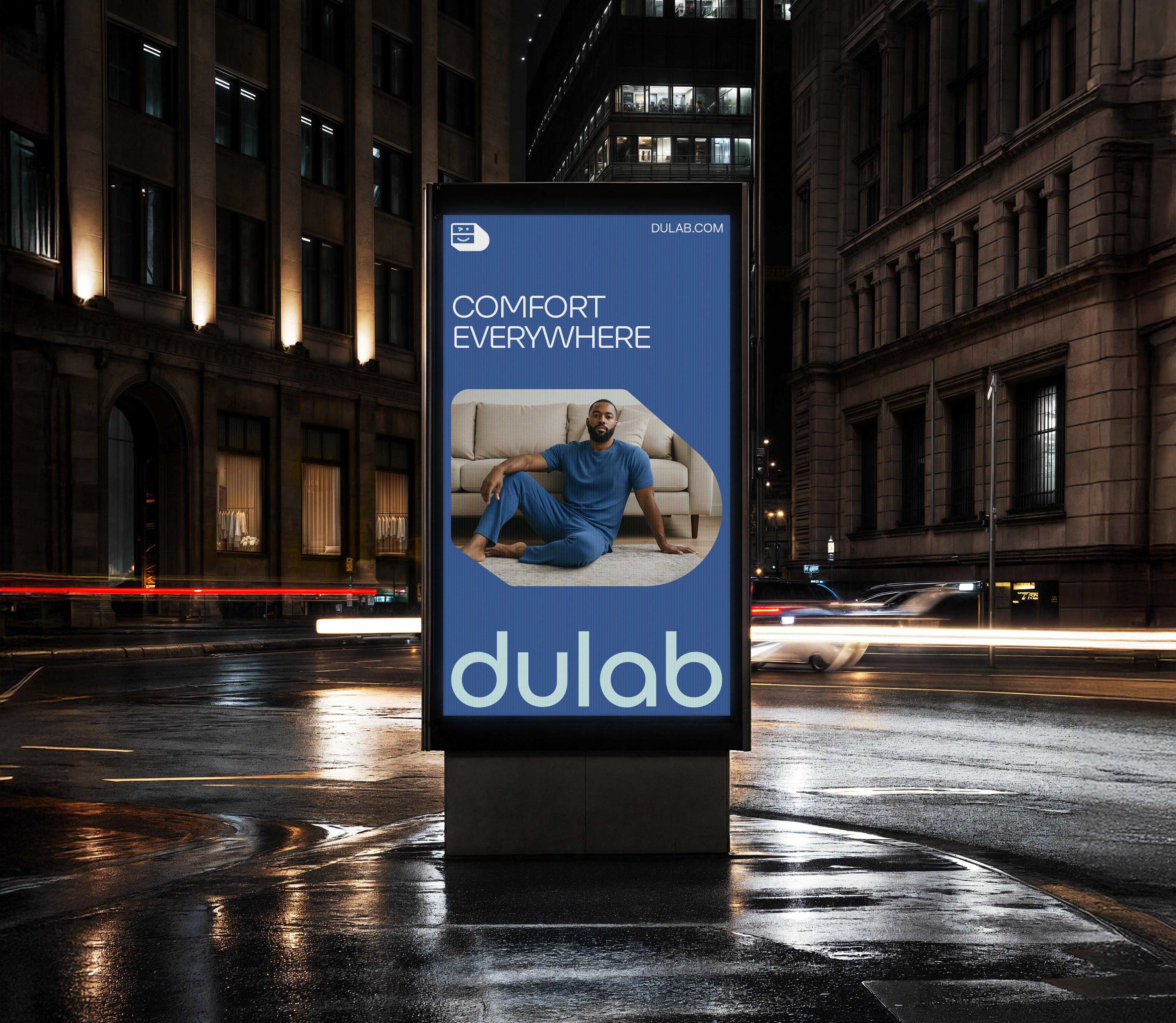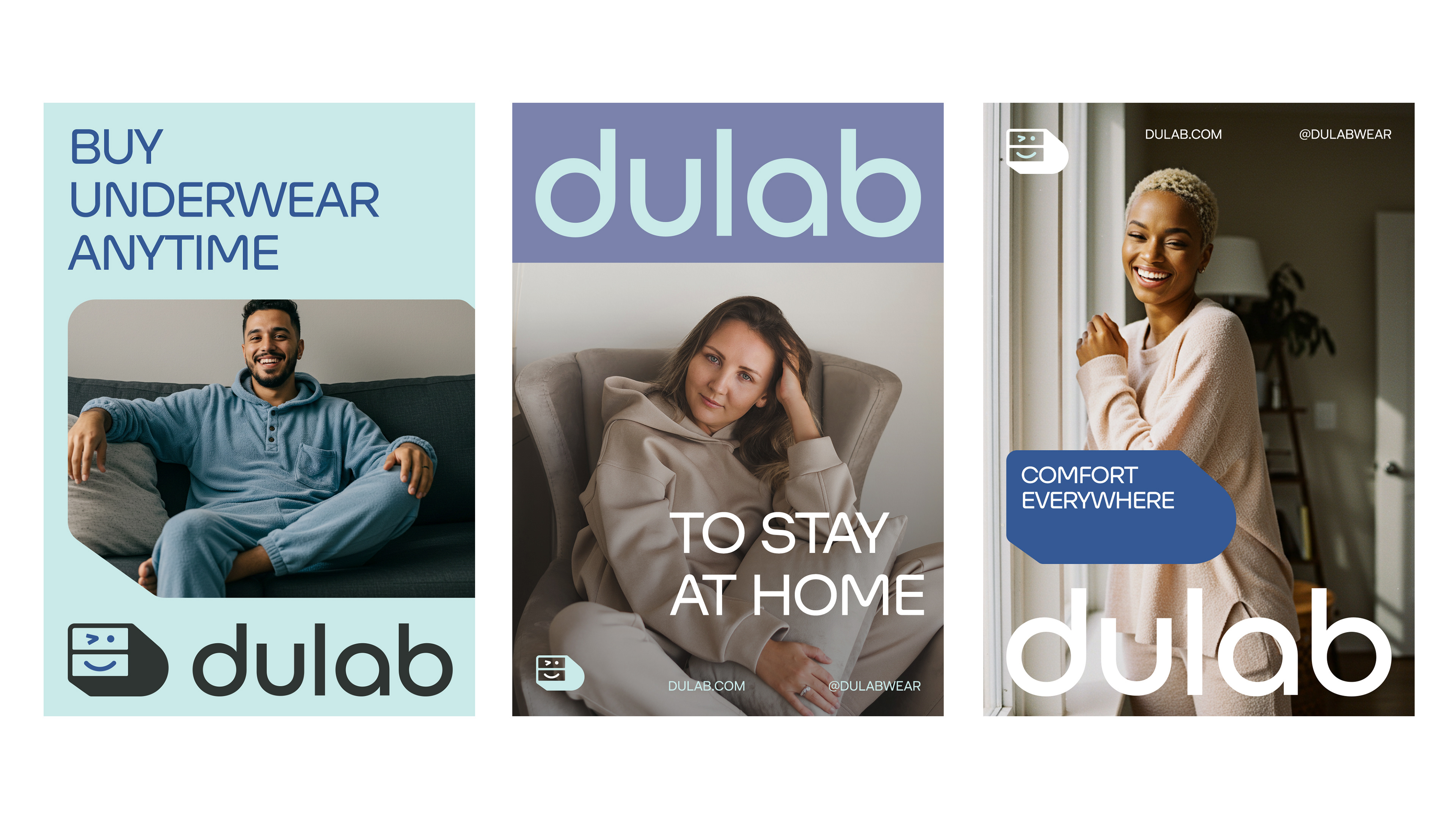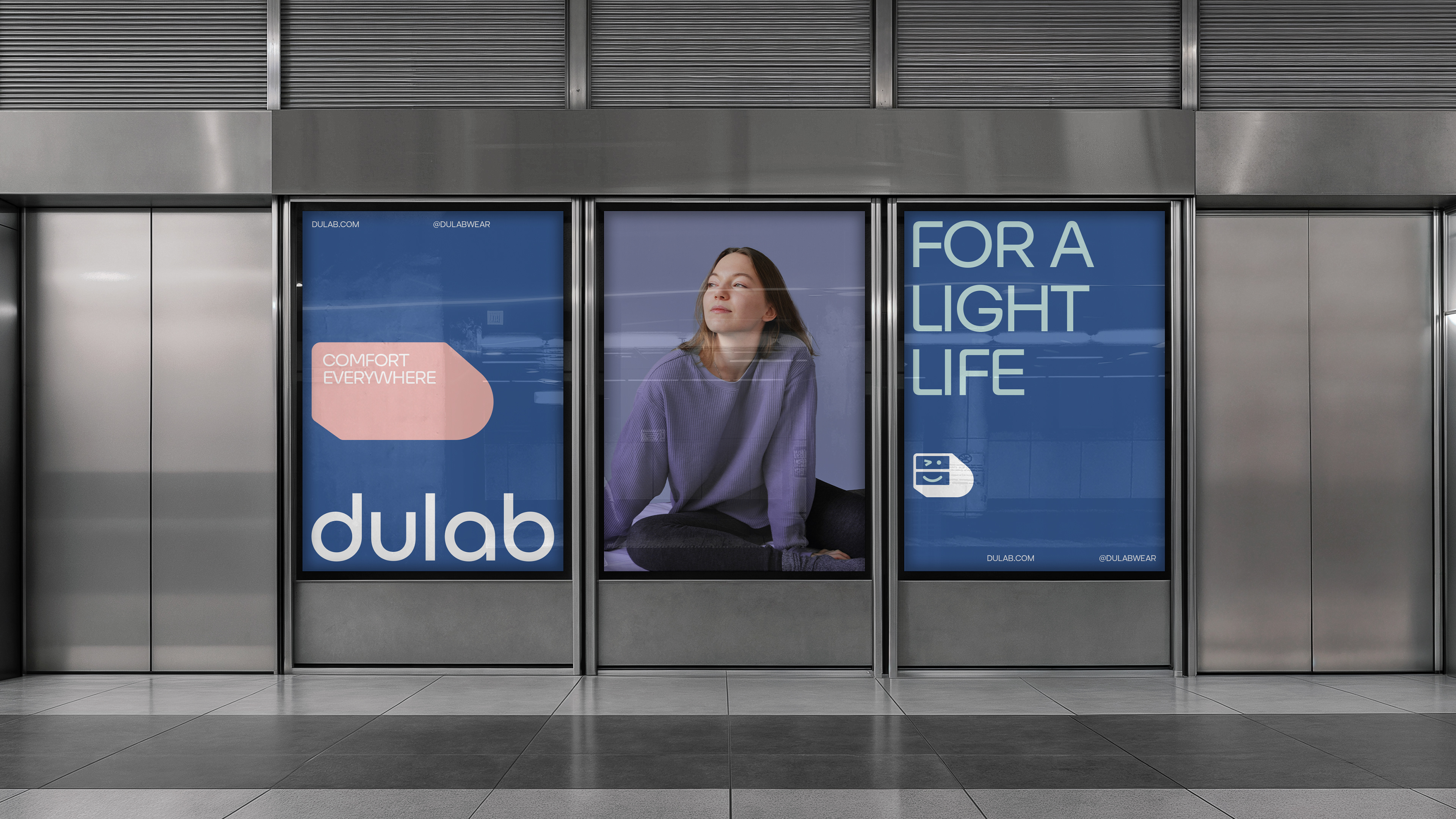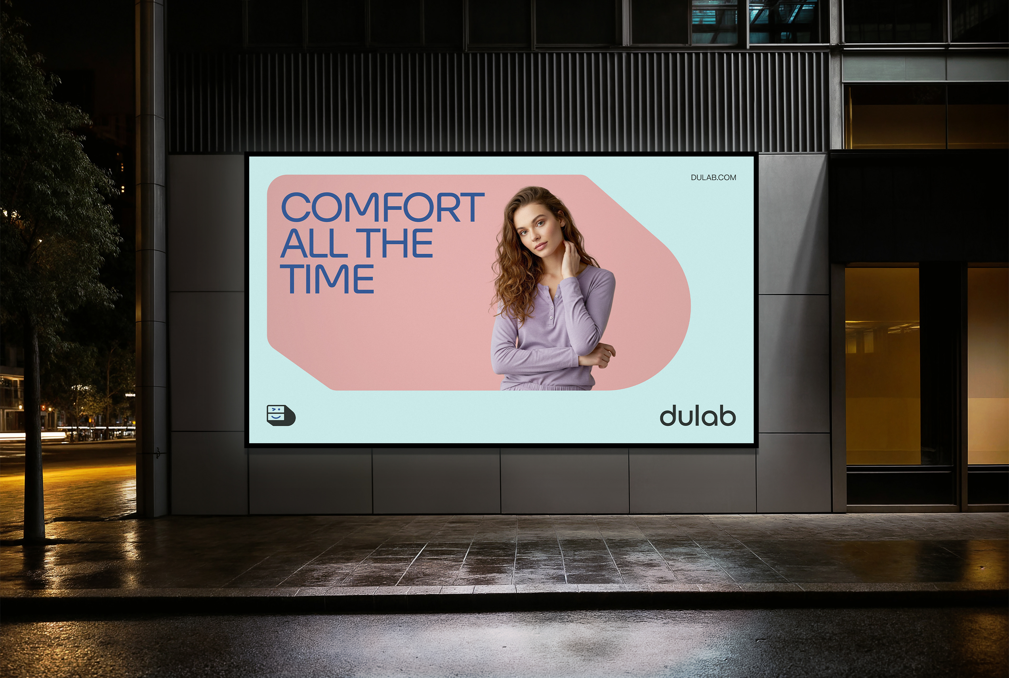

Dulab brings simplicity to everyday life with lightness in comfortable clothes for you to wear at home, at work or anywhere.
Dulab is a loungewear brand from Kuwait, created to turn the act of dressing at home into a lighthearted, stylish, and comfortable experience. Targeting men and women between the ages of 25 and 40 from a middle to upper-class background, the brand was born with the purpose of offering cozy, feel-good pieces that embrace a more relaxed lifestyle — without sacrificing visual appeal or personal expression.
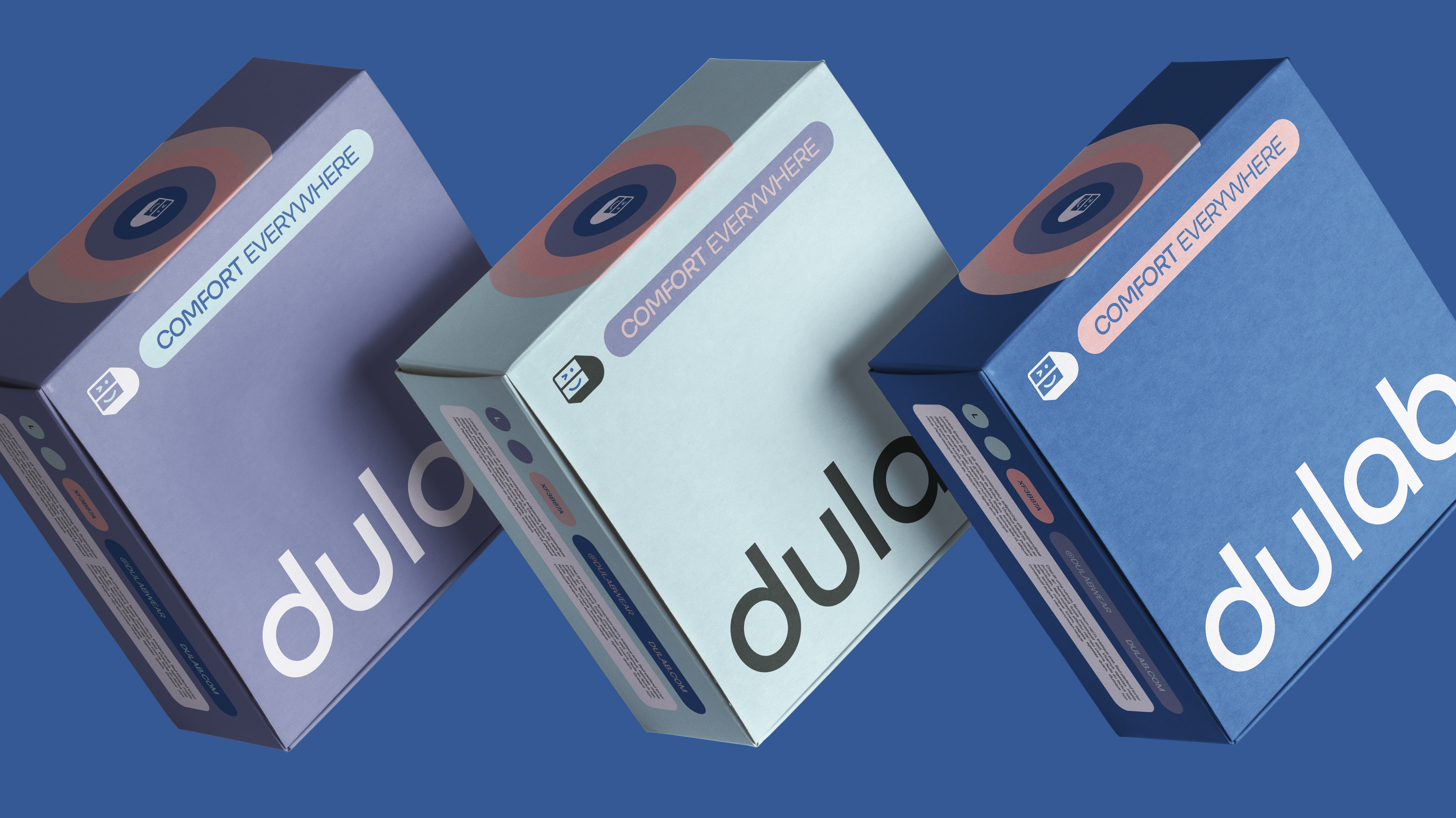
The name Dulab, which means “drawer” or “cabinet” in Arabic, carries a sense of intimacy, comfort, and the familiar organization of home — a concept that beautifully aligns with the brand’s core values. With a playful yet refined tone, Dulab steps away from the clichés of traditional loungewear, inviting people to experience comfort everywhere with joy, color, and a touch of charm.
More than just a clothing brand, Dulab is a celebration of everyday life and all the simple, essential moments that make us feel good — inside and out.
The challenge was to visually express comfort in a way that felt modern, vibrant, and memorable, without falling into overly literal or cliché representations.
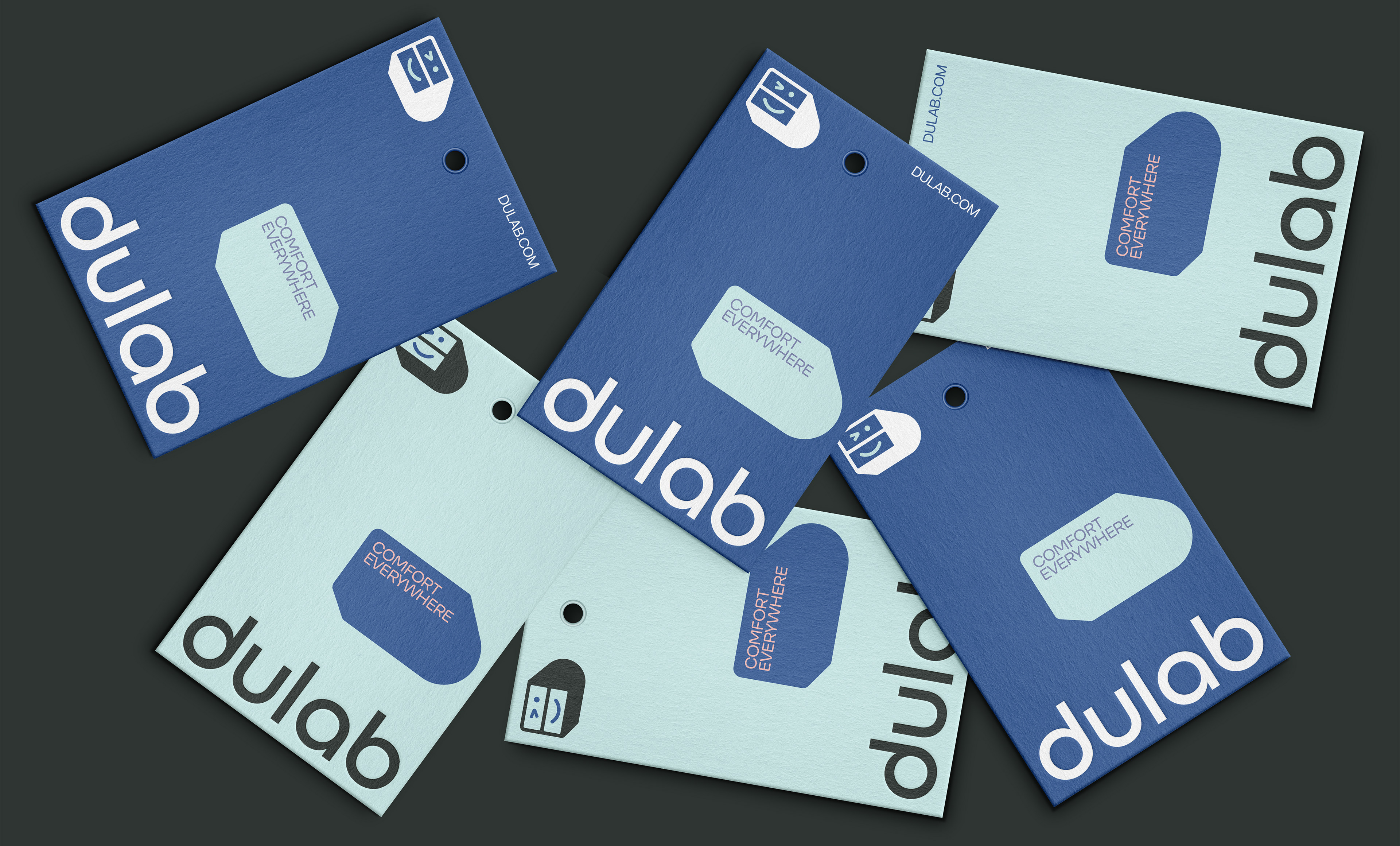
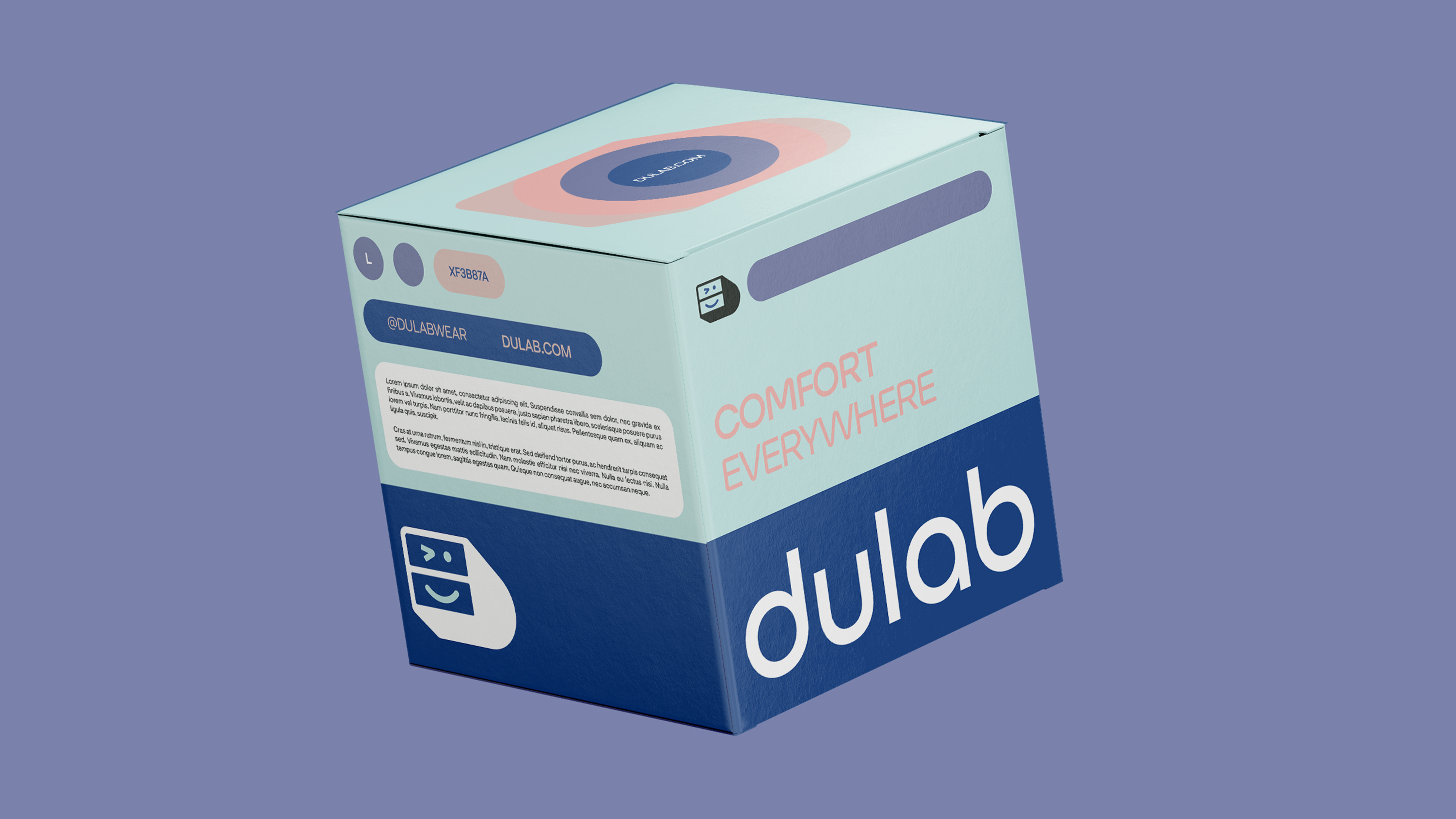
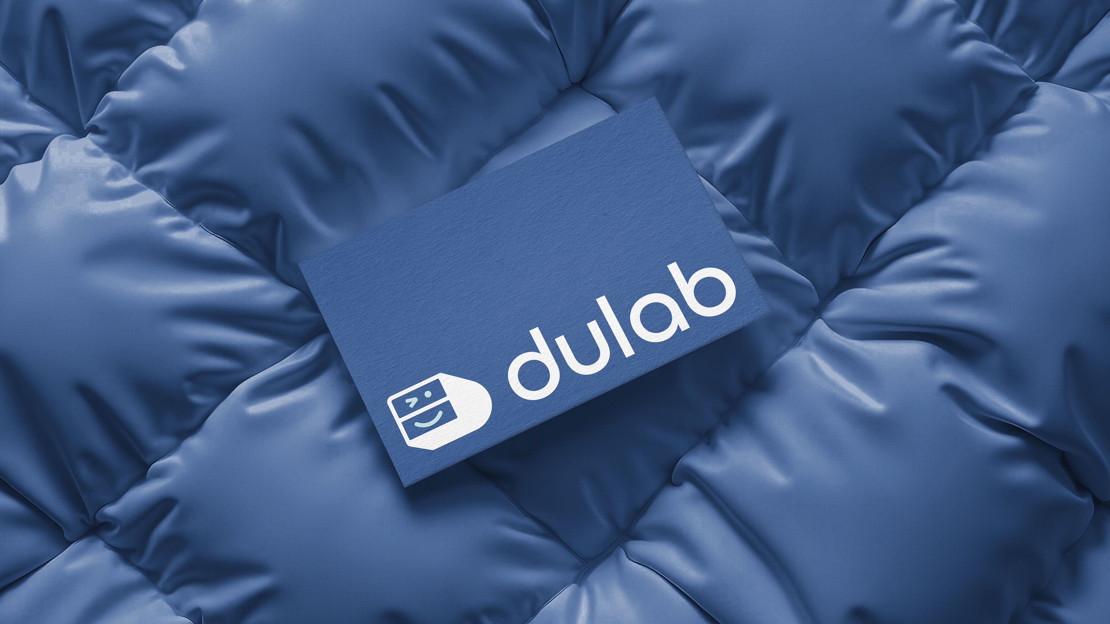
The logo’s symbol is a key element in this narrative. Inspired by the Arabic word dulab — meaning “drawer” — the icon was designed to resemble a stylized cabinet, bringing an immediate connection to the brand name and to the cozy, private spaces of the home. At the same time, the symbol subtly forms the letter D, reinforcing brand recognition in a clean and clever way.
But there’s more: the minimalist structure and rounded shapes give the symbol a soft, friendly personality, even evoking a gentle facial expression — almost like a character. This adds a touch of charm and human warmth, perfectly reflecting Dulab’s tone of voice: lighthearted and colorful, but never exaggerated.

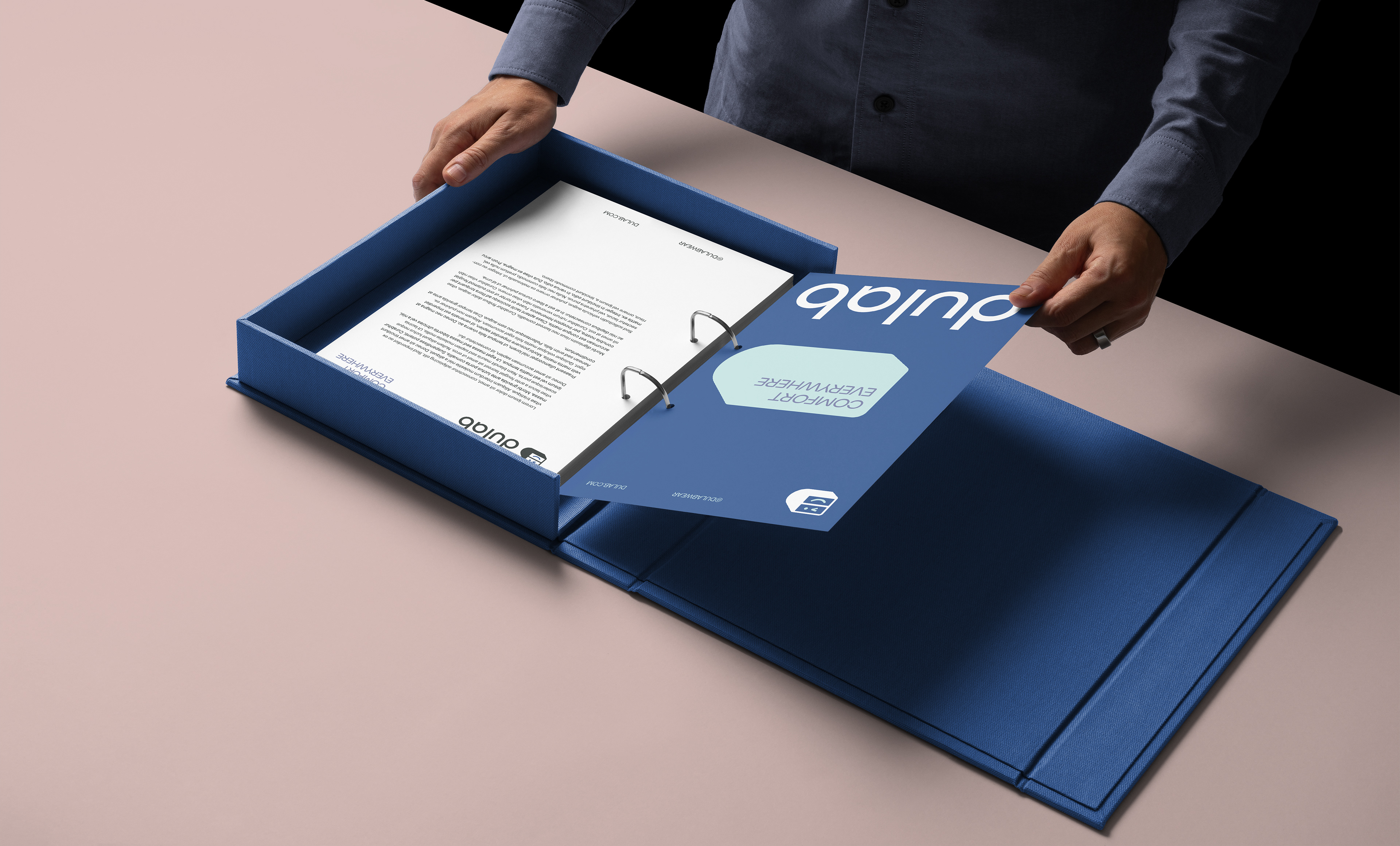
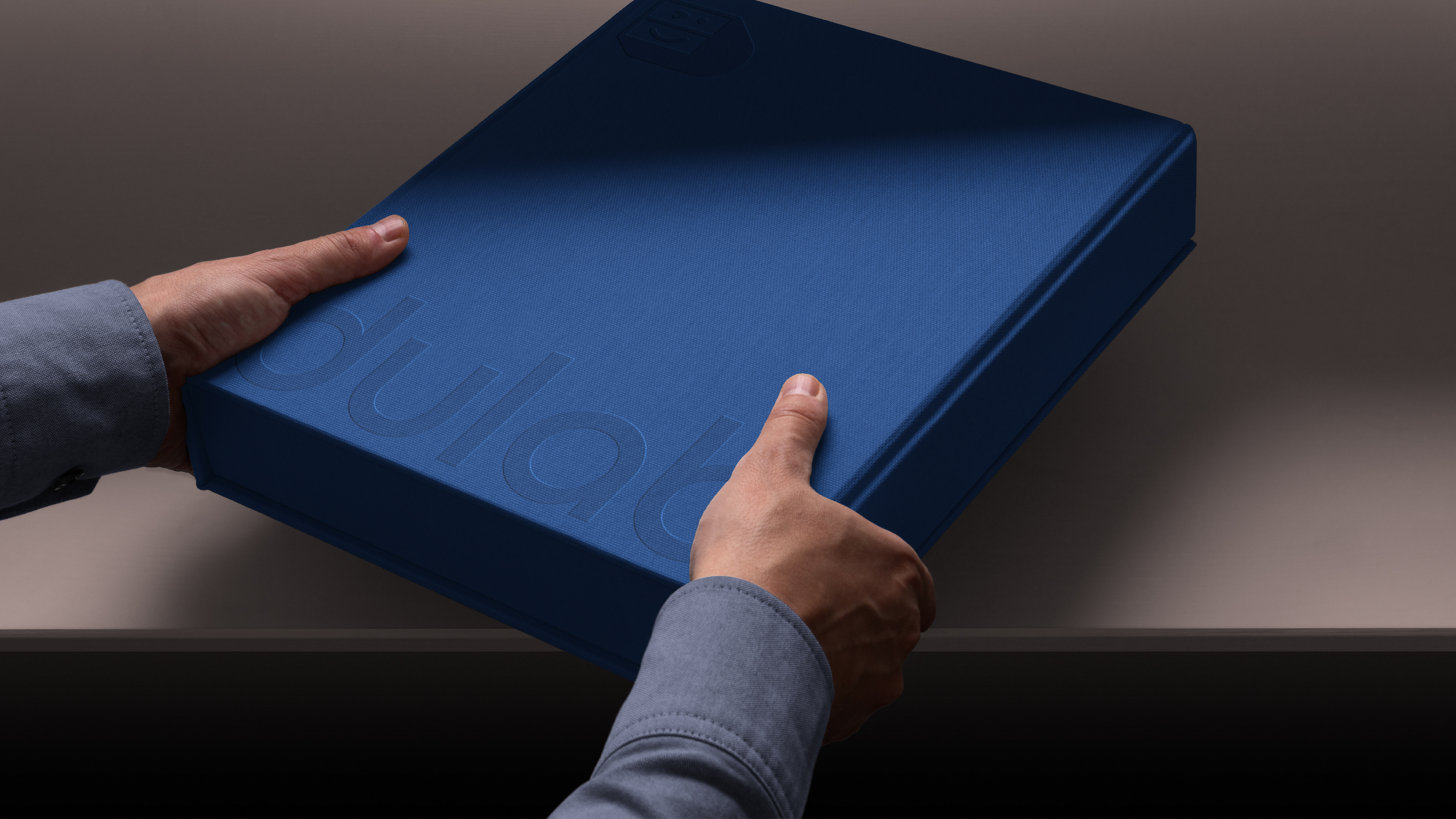
The visual identity was carefully crafted to reflect the brand’s essence with clarity, sophistication, and approachability. The design system is rooted in a modernist approach, favoring simplicity and functional elegance.
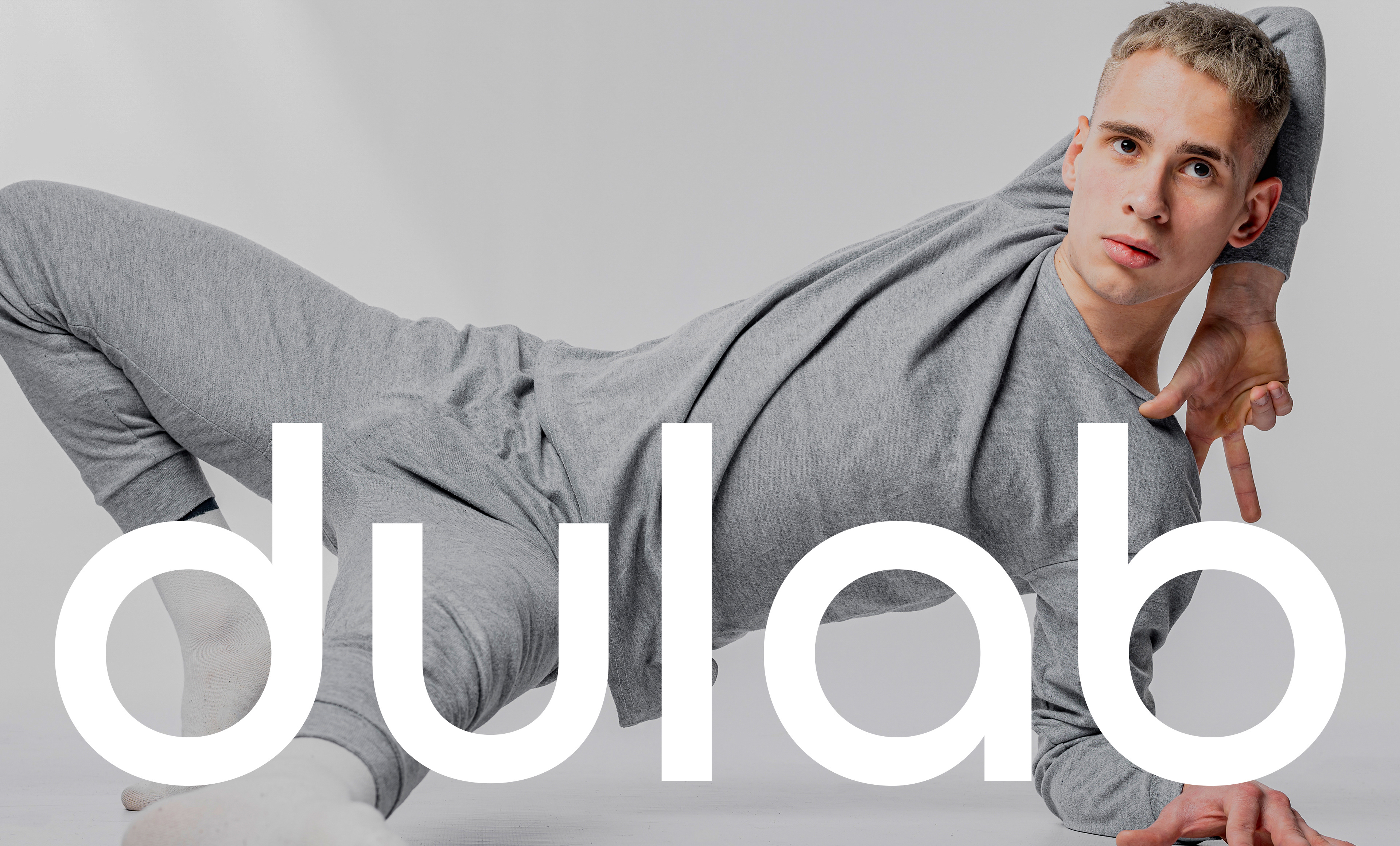
Typography plays a central role in this system. Ulm Grotesk is used as the primary typeface, chosen for its clean geometry and subtle humanistic details, ensuring both legibility and a refined visual tone. Neurial Grotesk serves as the supporting typeface, complementing Ulm with its contemporary character and versatility in secondary text and captions.
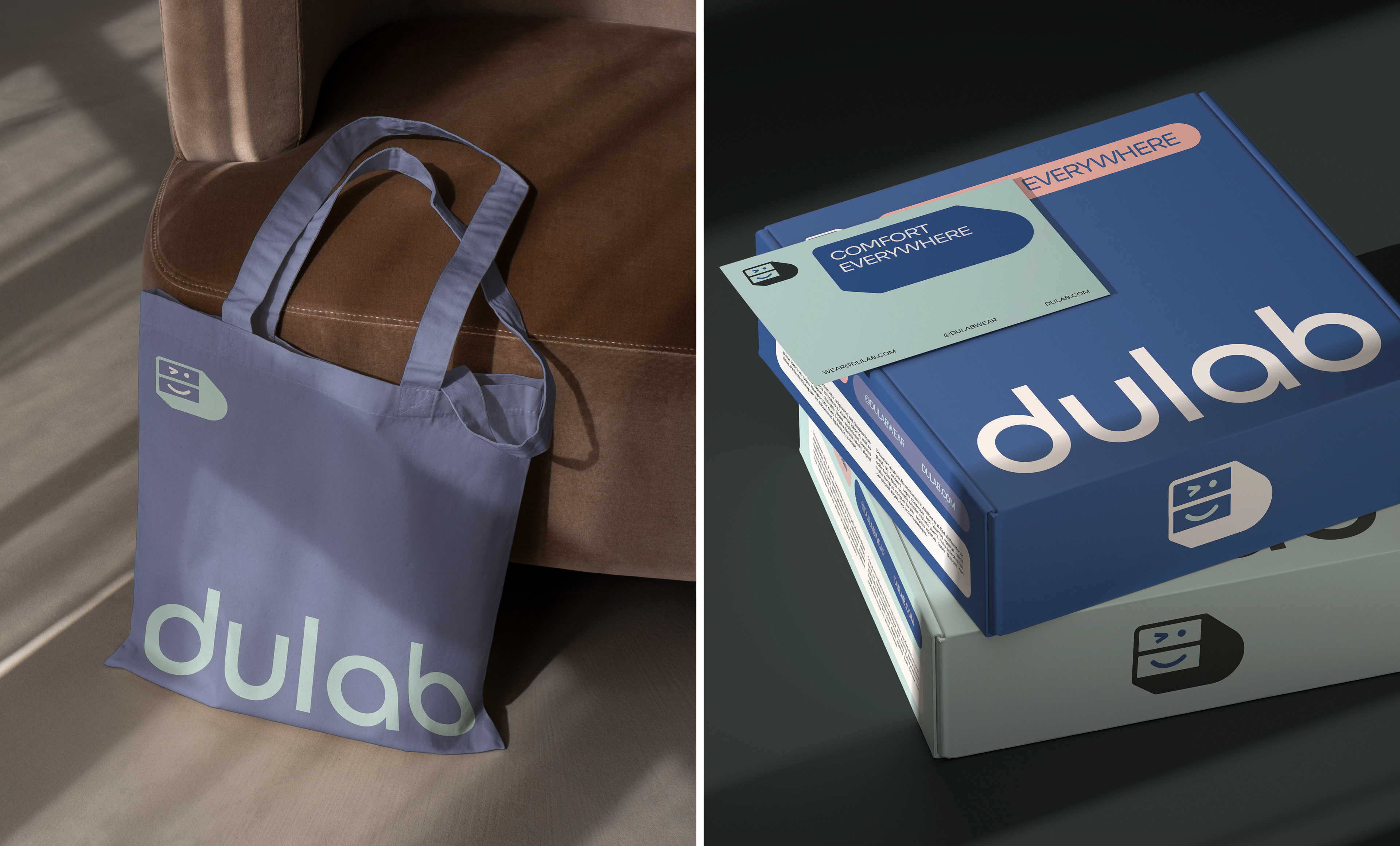
The supporting elements were designed to be adaptable across digital and physical mediums. Visual motifs and layout structures maintain consistency while allowing expressive flexibility, guided by a restrained color palette and precise typographic hierarchy.
Together, these elements create a cohesive and professional brand image that communicates trust, innovation, and clarity.