
Dose
January 2022 . Brand design and Visual Identity . Brazil
"We want to make a difference from the inside out.
Put out what we believe and take action.
Revolutionize, break paradigms and be who we really want to be."
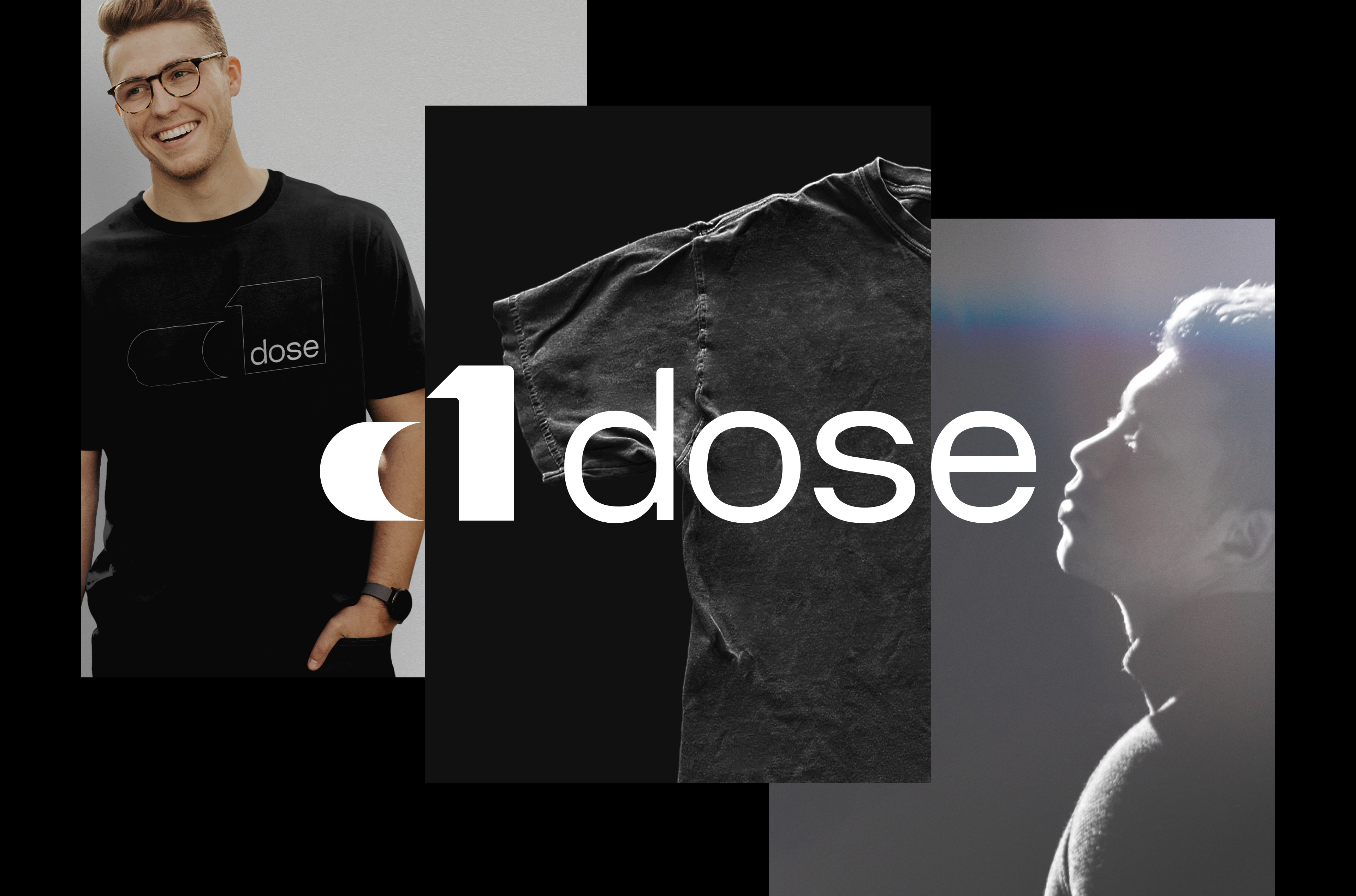
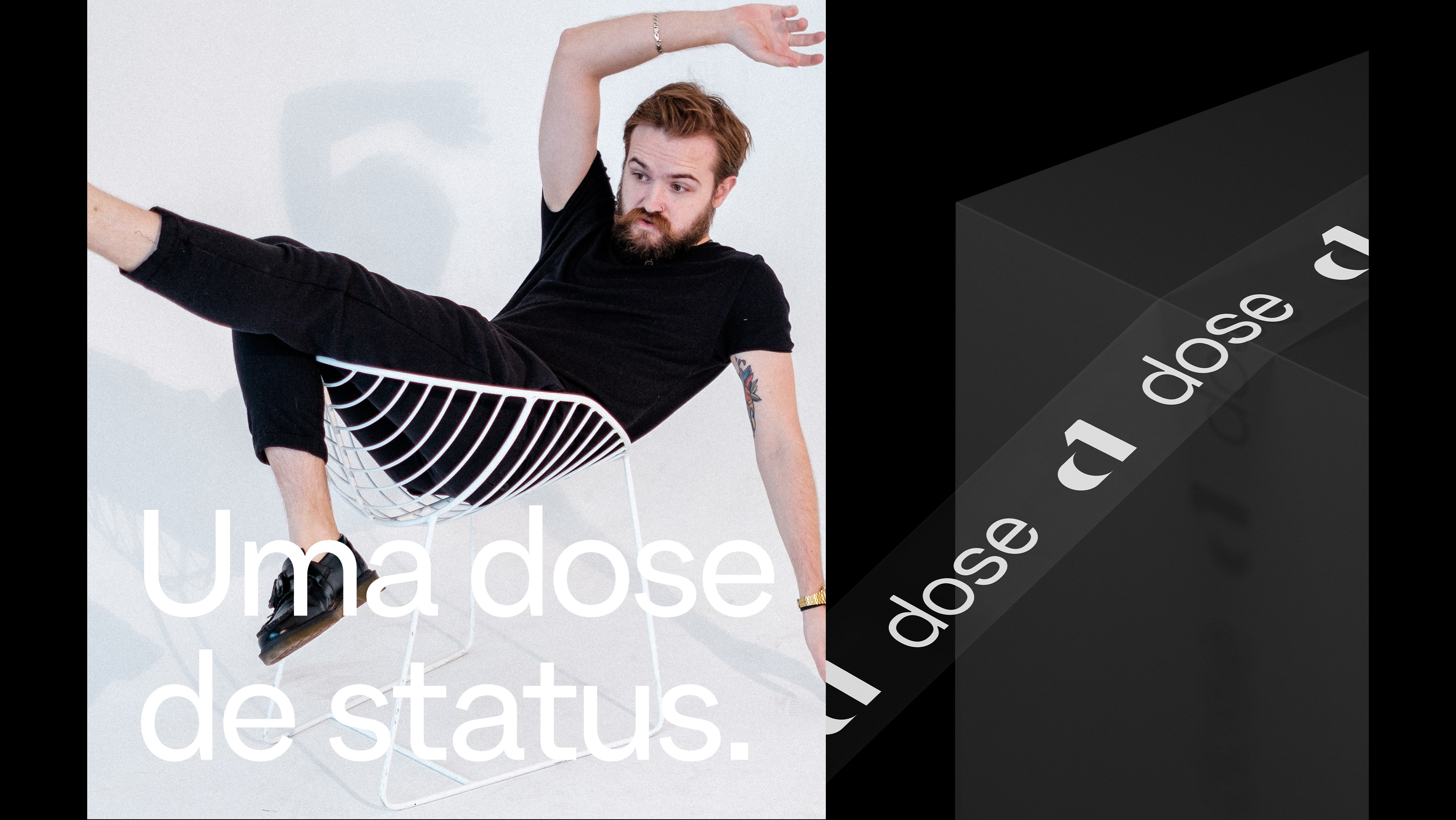
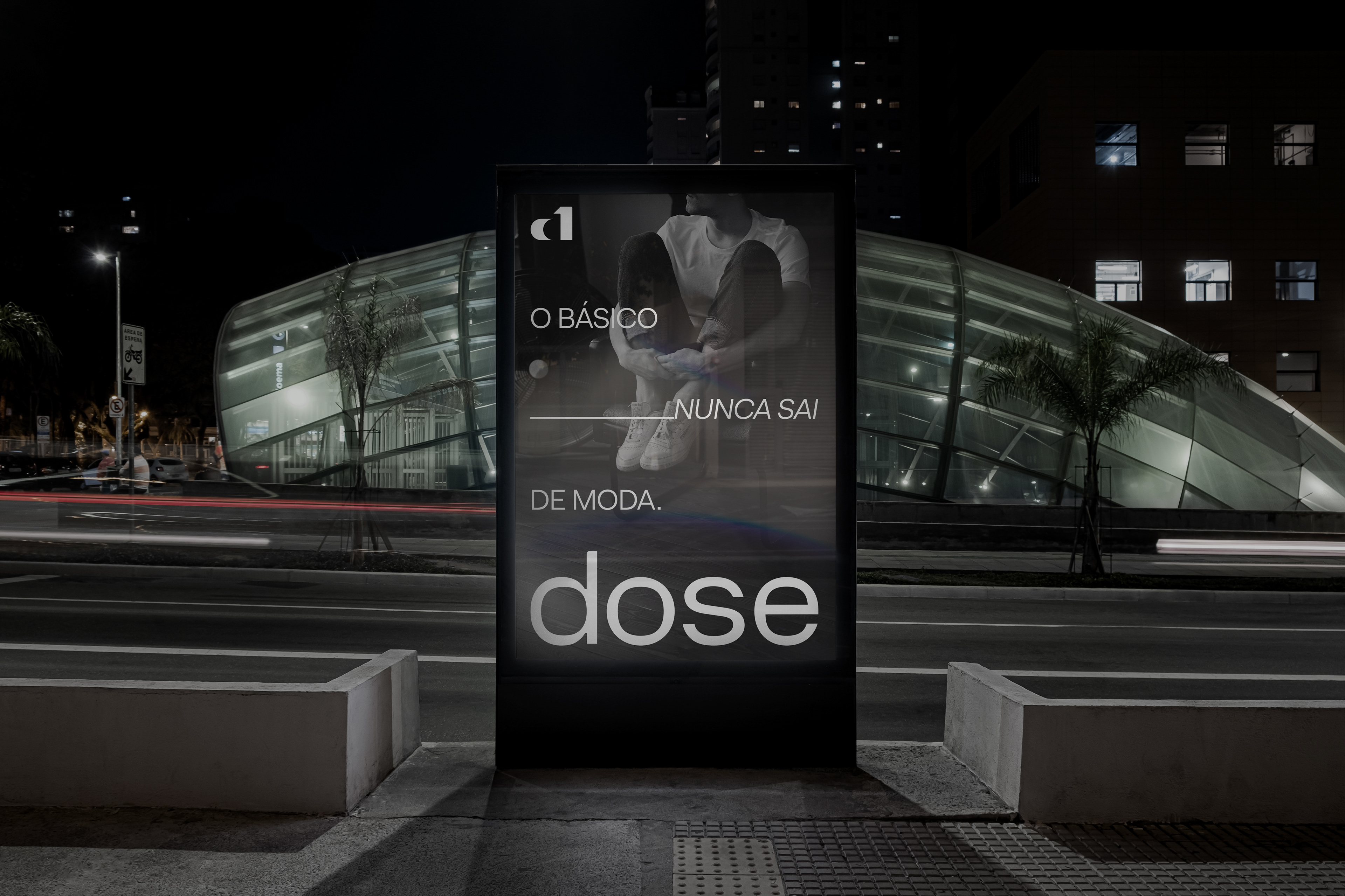
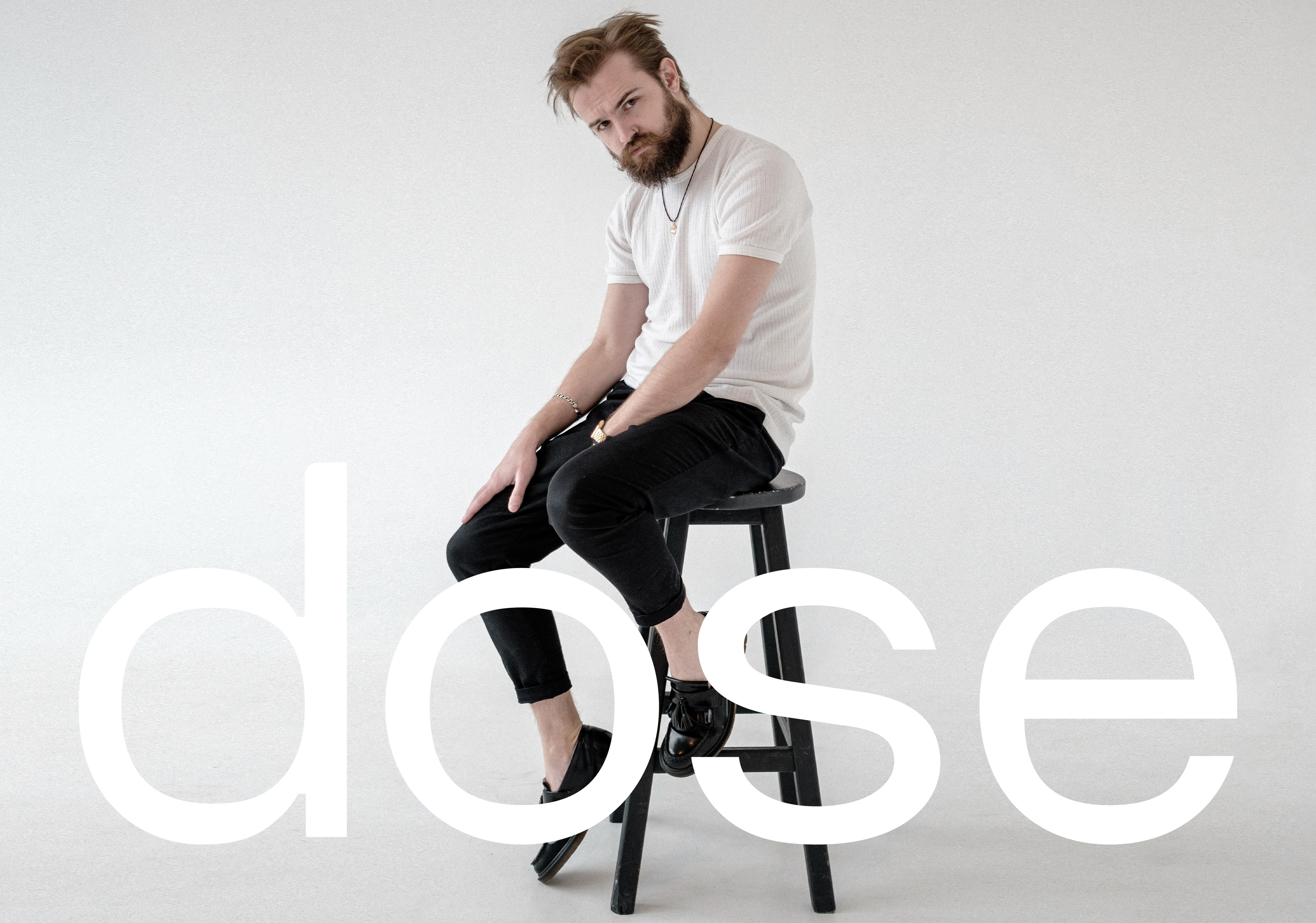
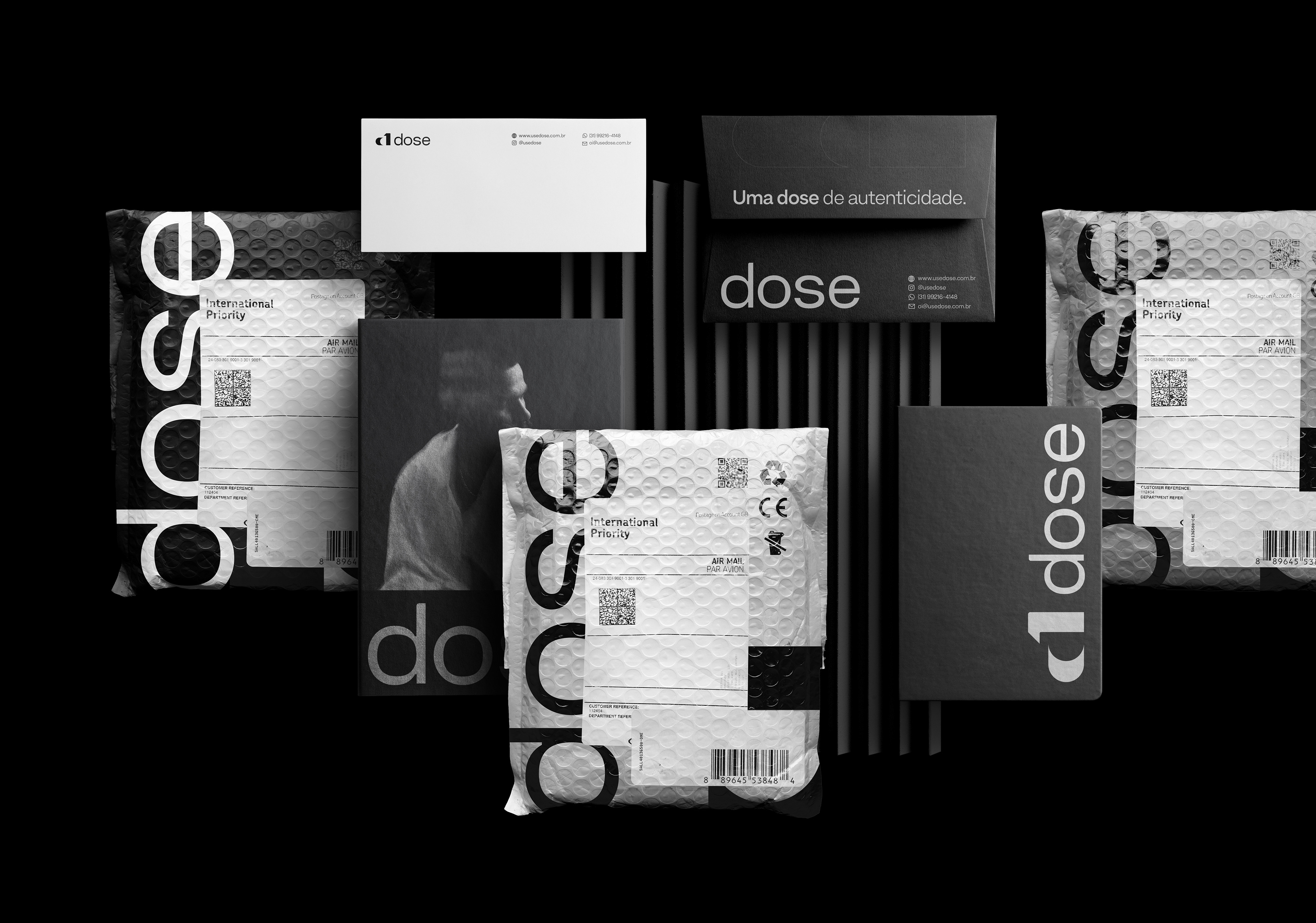
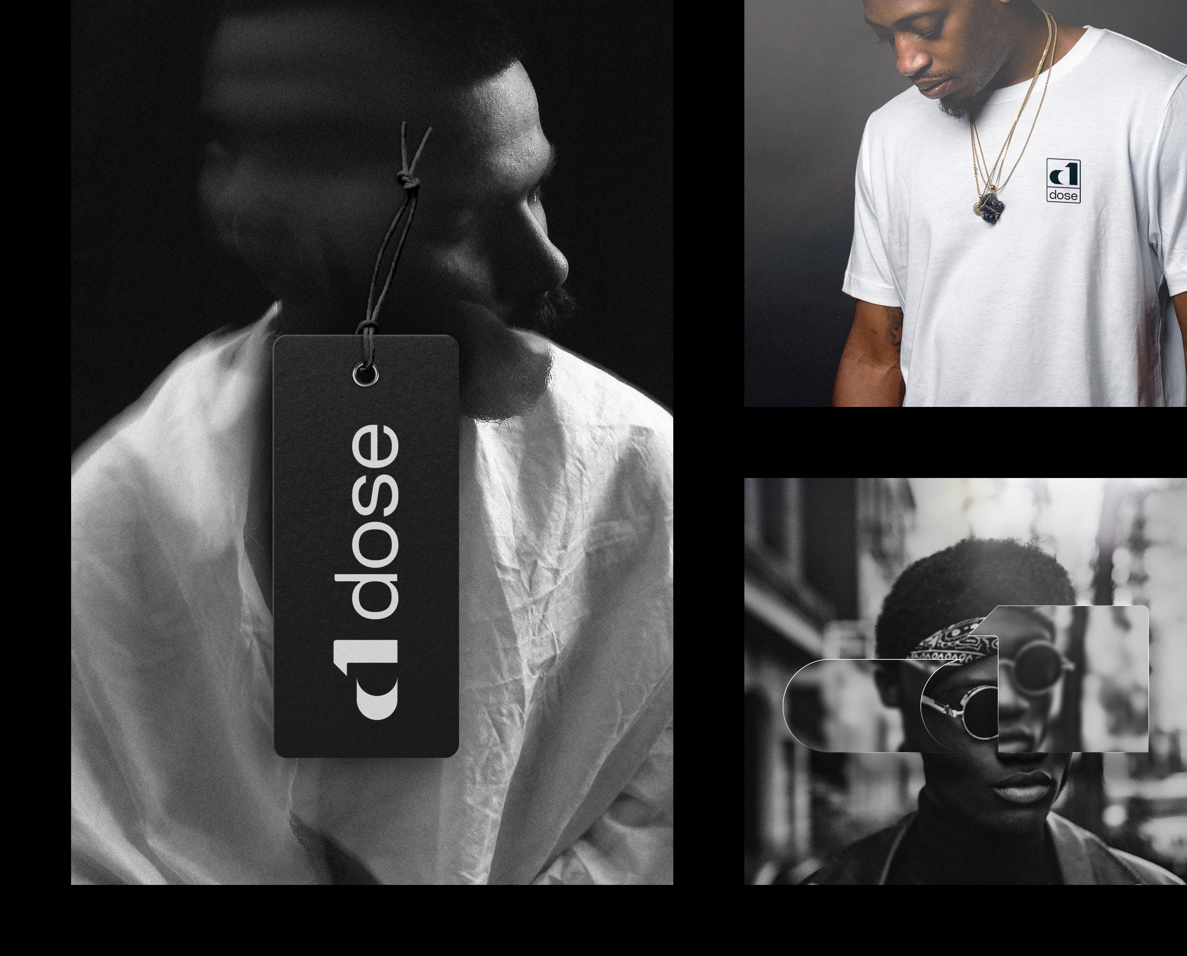
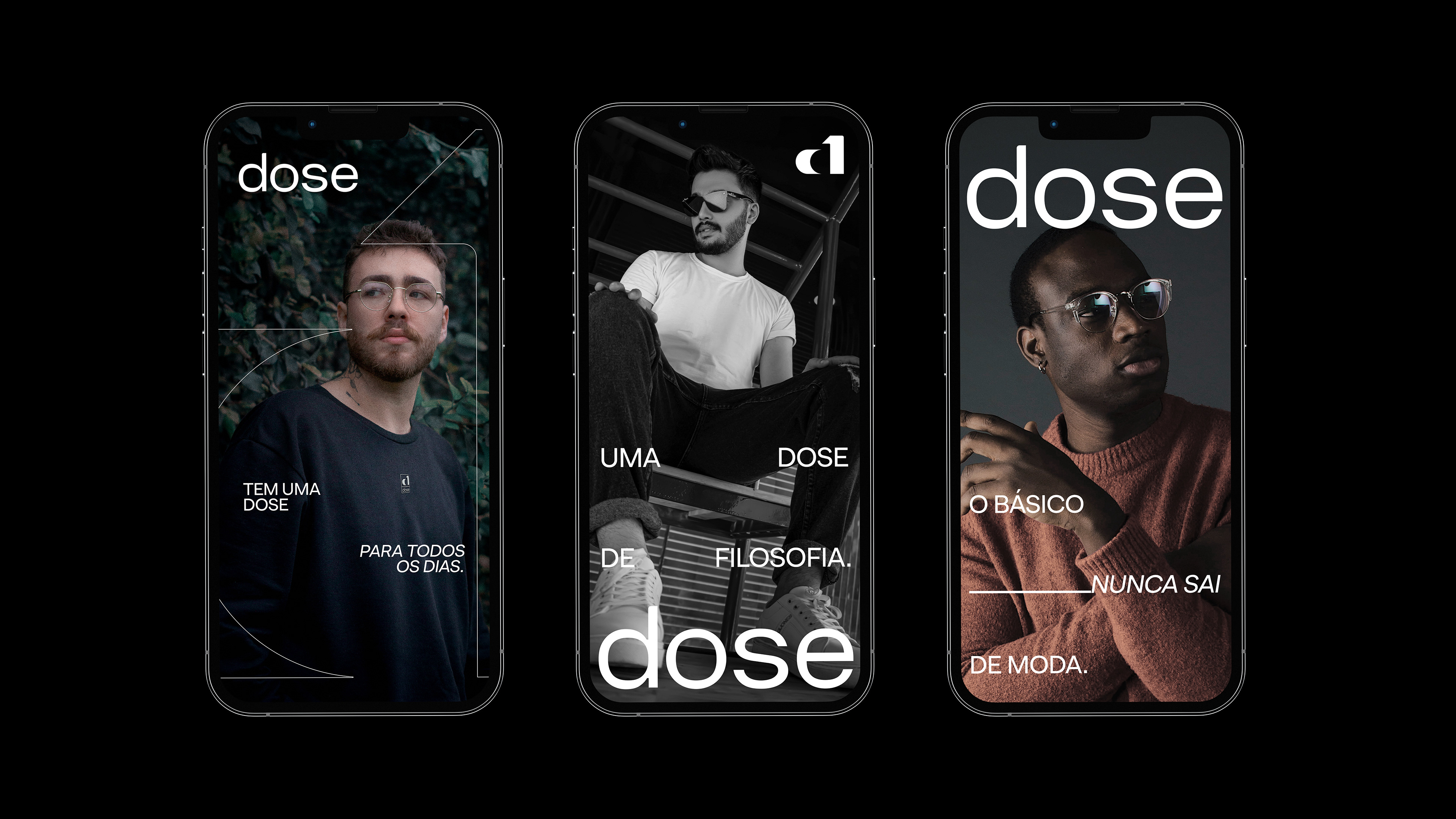
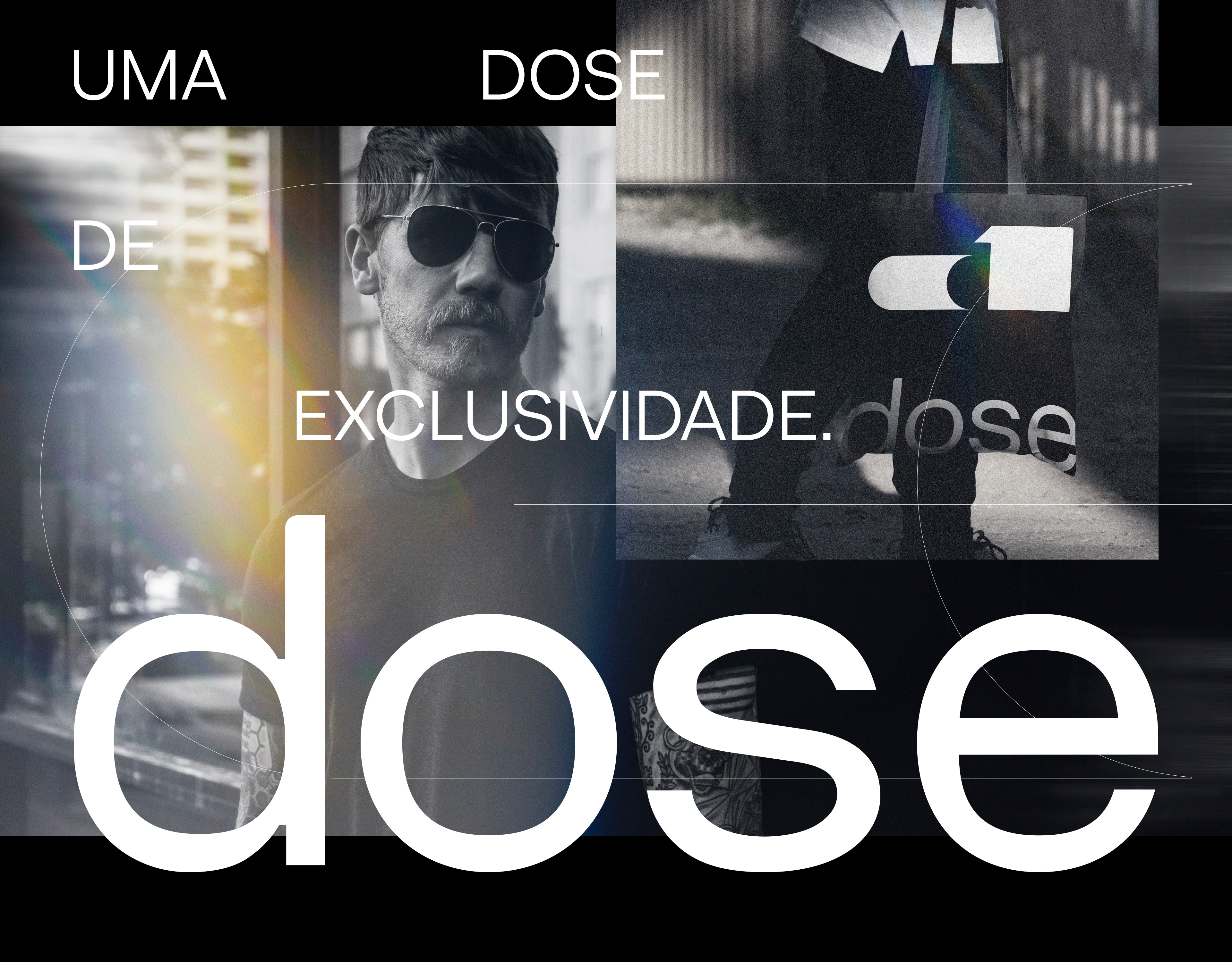
Dose is a brand of Brazilian men's clothing that focuses on something basic, clean and quality, the brand preys on these three issues. It is a brand that believes that clothing is a form of expression and many of our intentions, ideas, lifestyle are transmitted through our clothing, so the idea of the company is to put in your pieces a dose of something you want to express, as a dose of Authenticity or a dose of Irreverence. Who knows, a dose of Philosophy or a dose of Status.
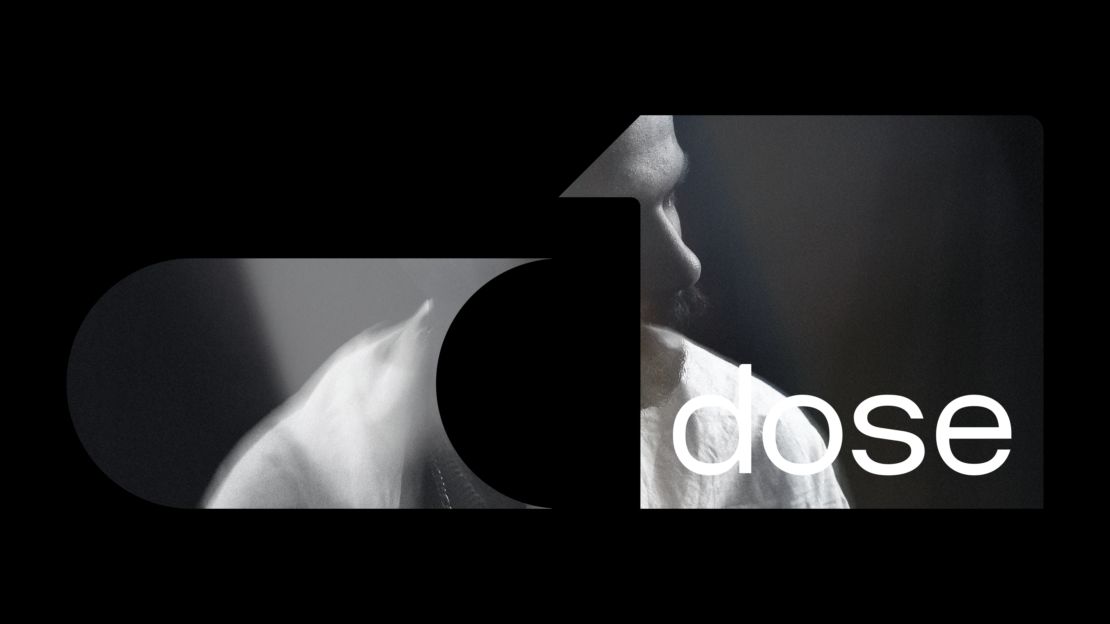
My Challenge
I wanted to create a symbol that was modern, minimalist and light, that represented Dose's ideals, that would be well recognized by its audience and that would be seen as a professional brand by potential new customers.
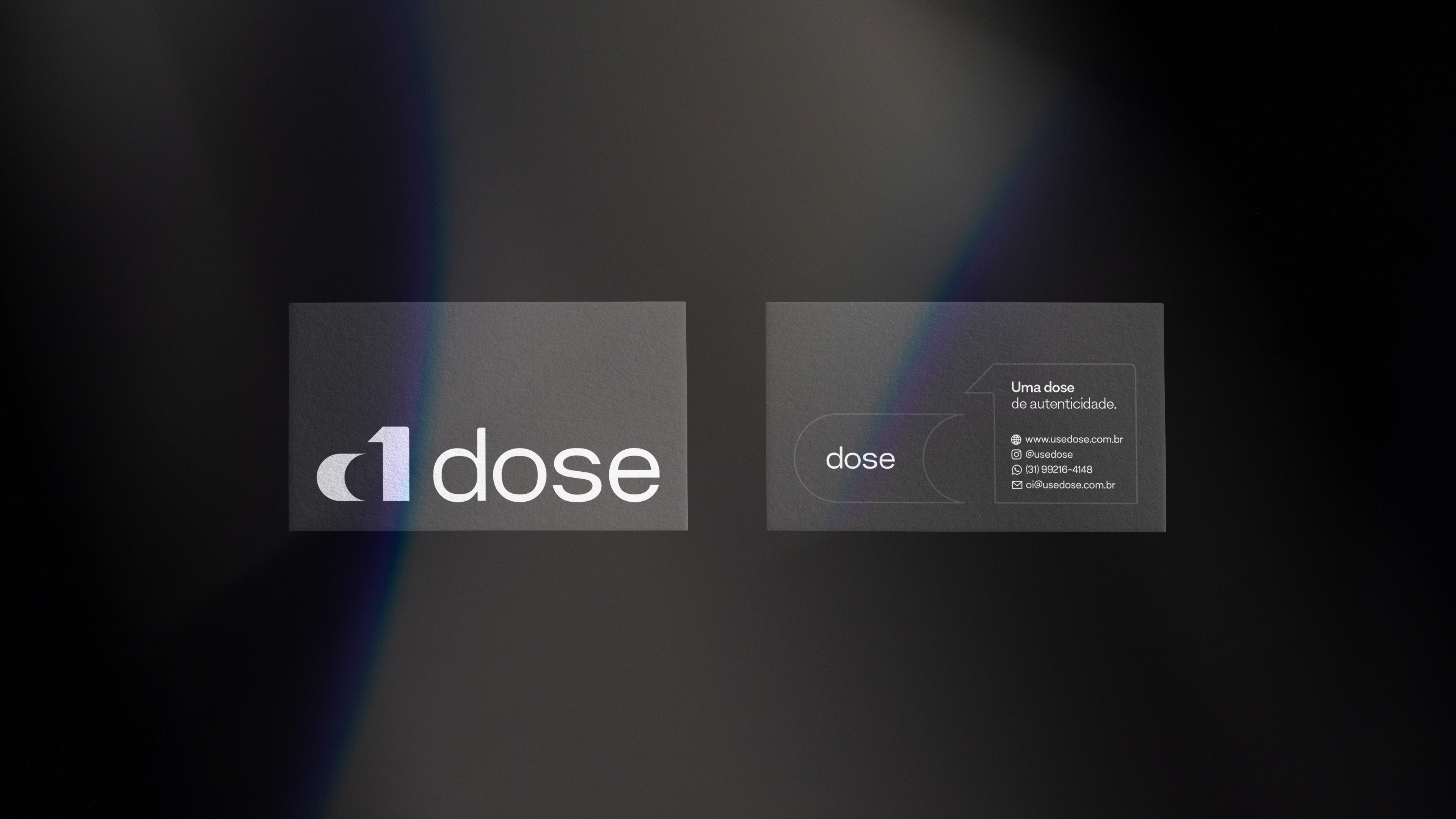
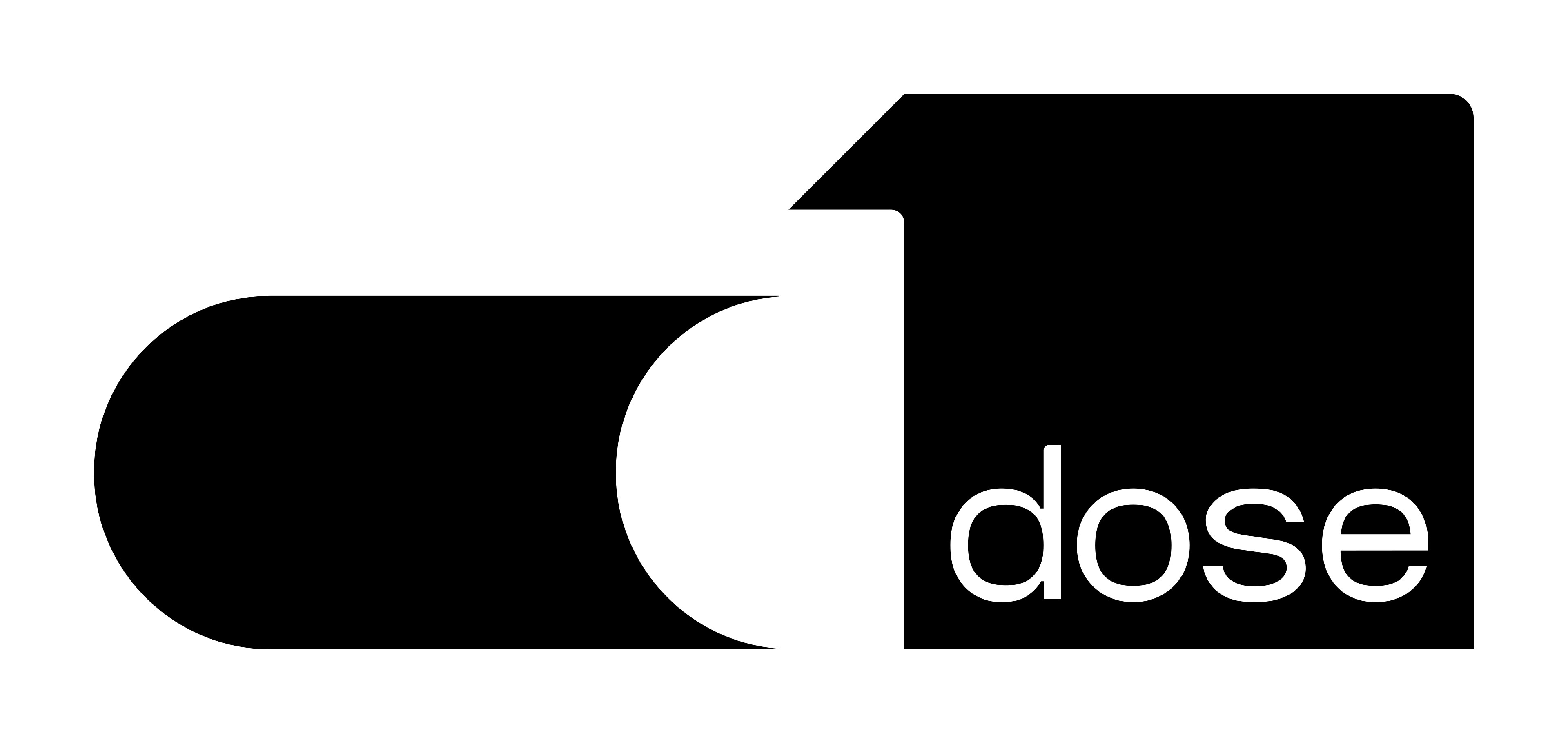
My idea was to create a symbol that would be negative as the client had already requested. Then you can see the representation of the lowercase "d" in the symbol inside a larger d along with the number 1.
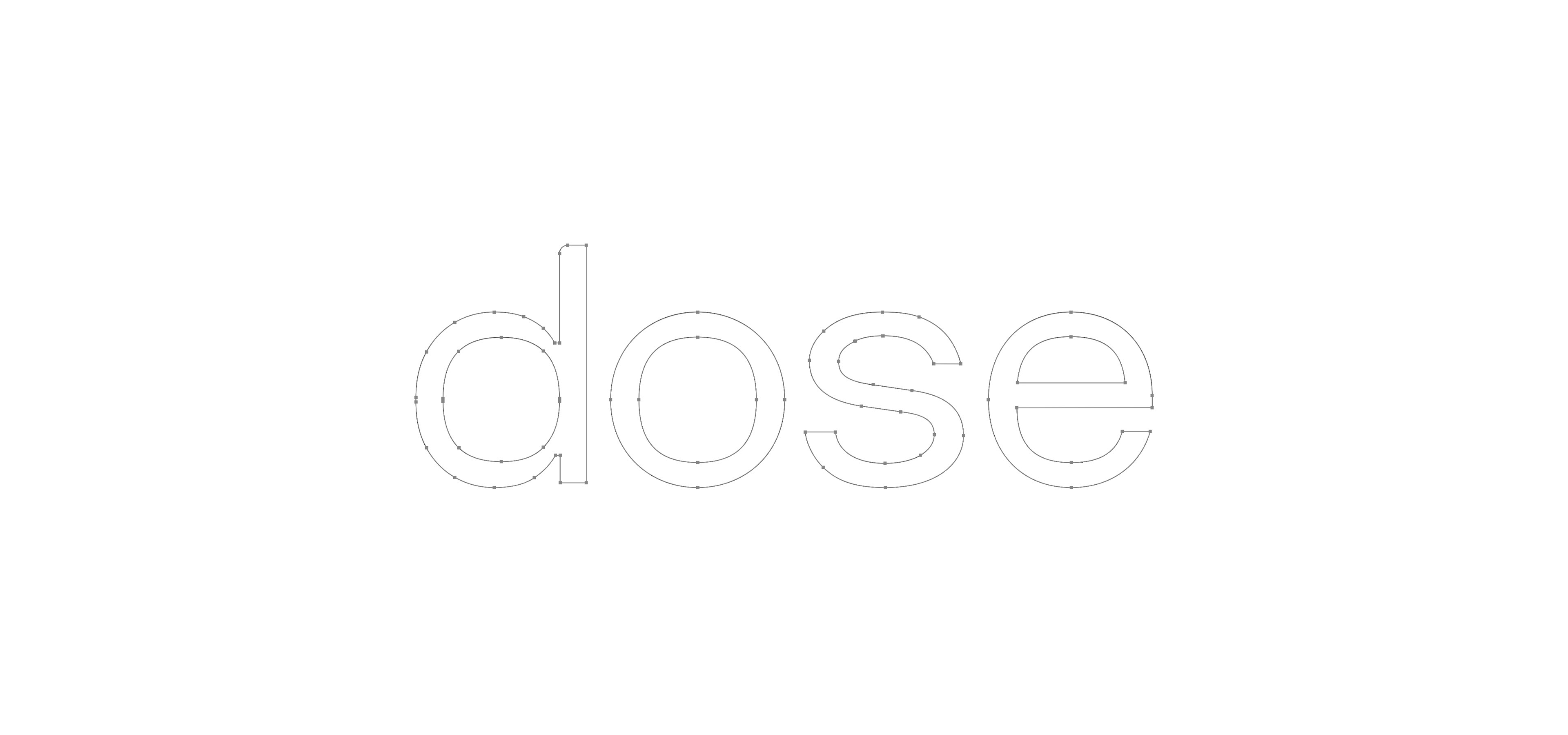
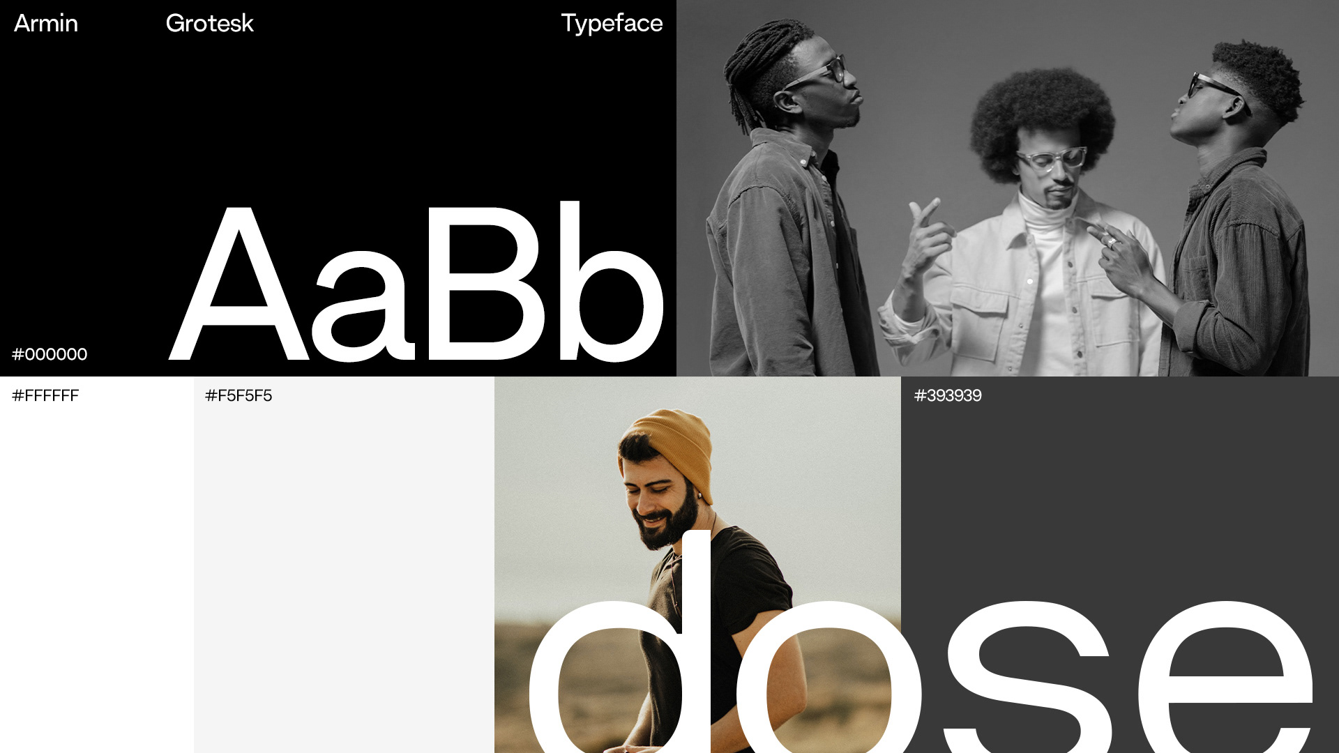
My proposal was to create a brand with a unique font, which is not based on a single font, several fonts that I stylized and put together to generate harmony, precisely to the purpose that Dose wants.