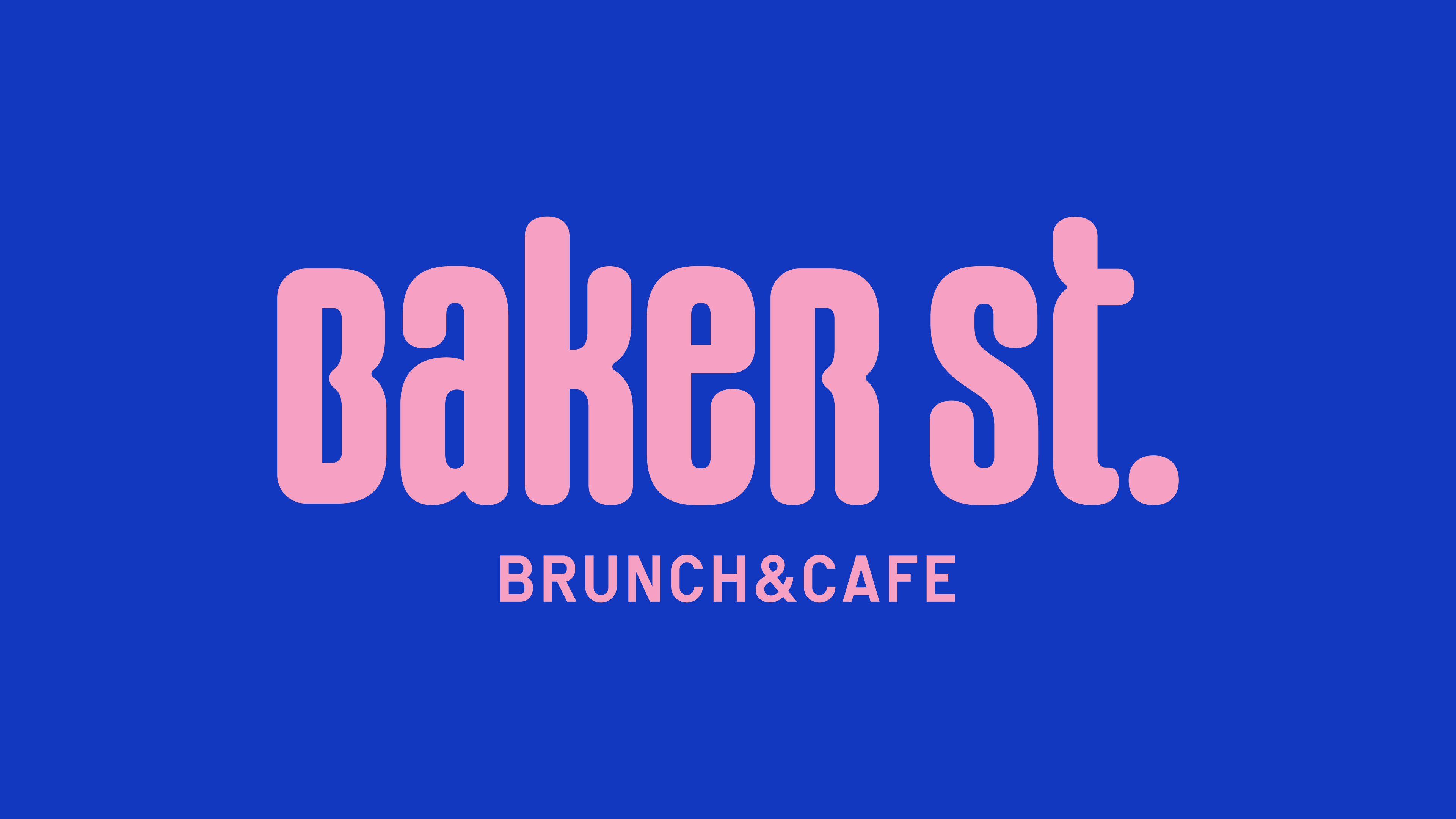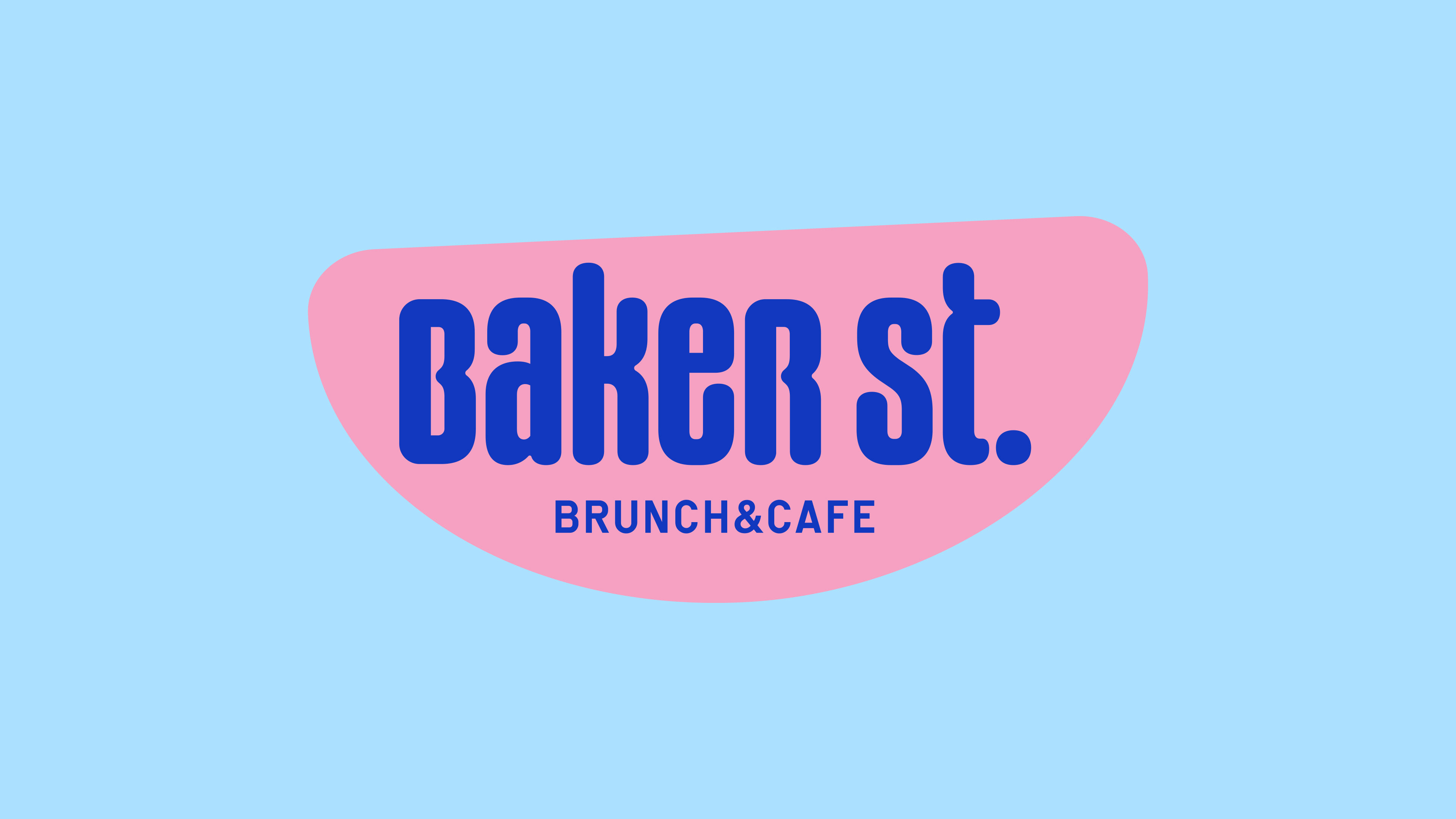

Baker St. Brunch & Cafe
April 2022 . Brand design and Visual Identity . Canada
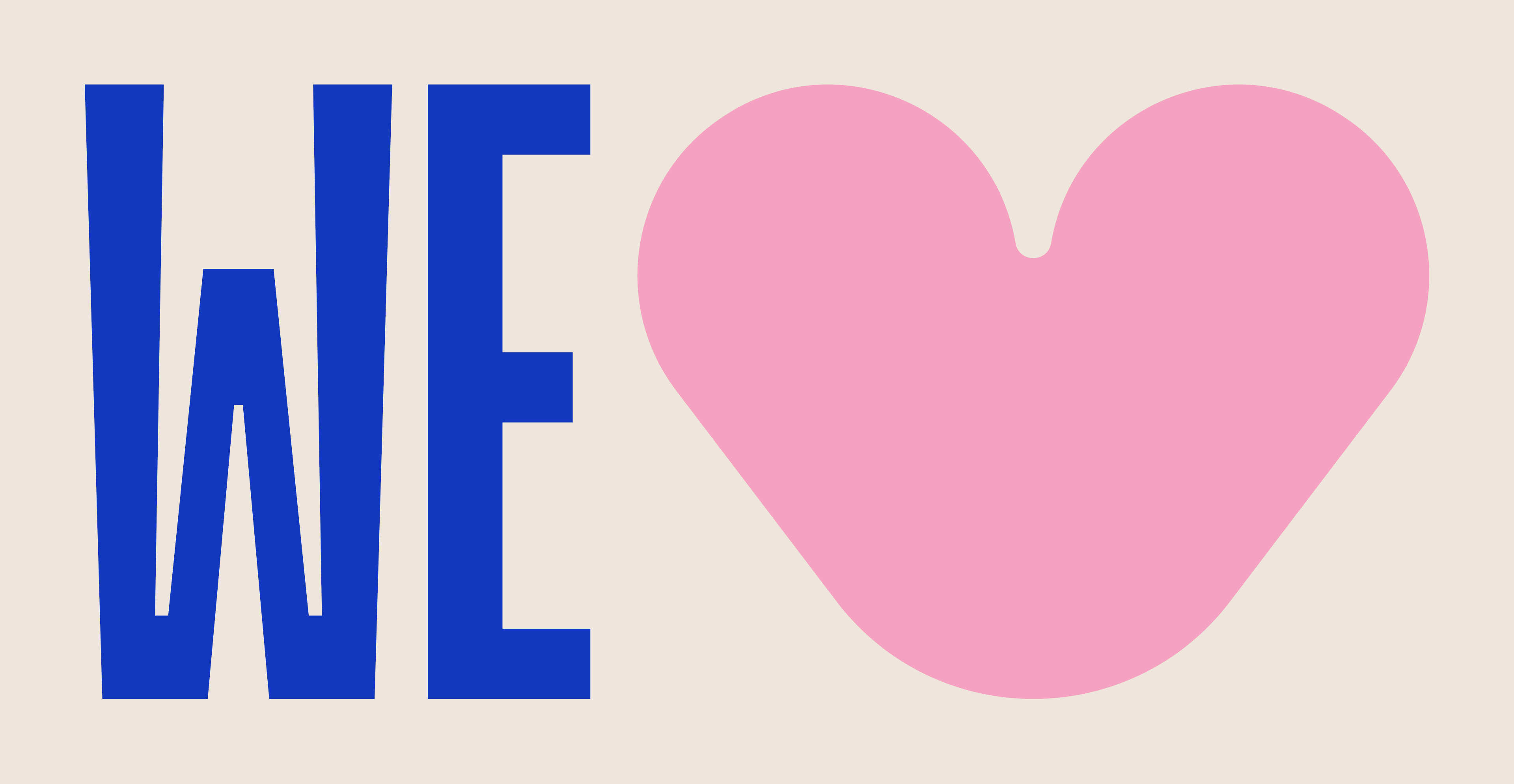
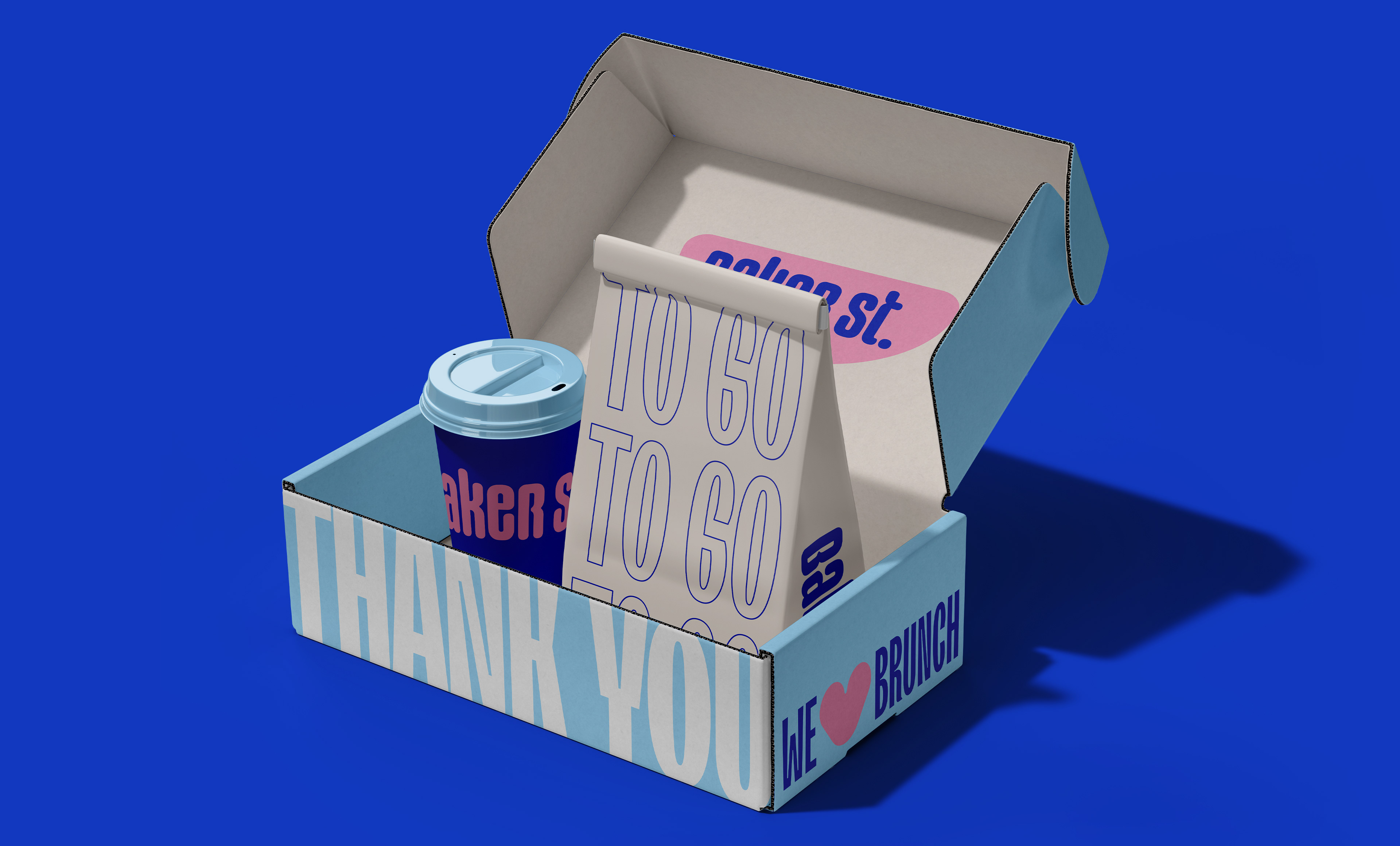
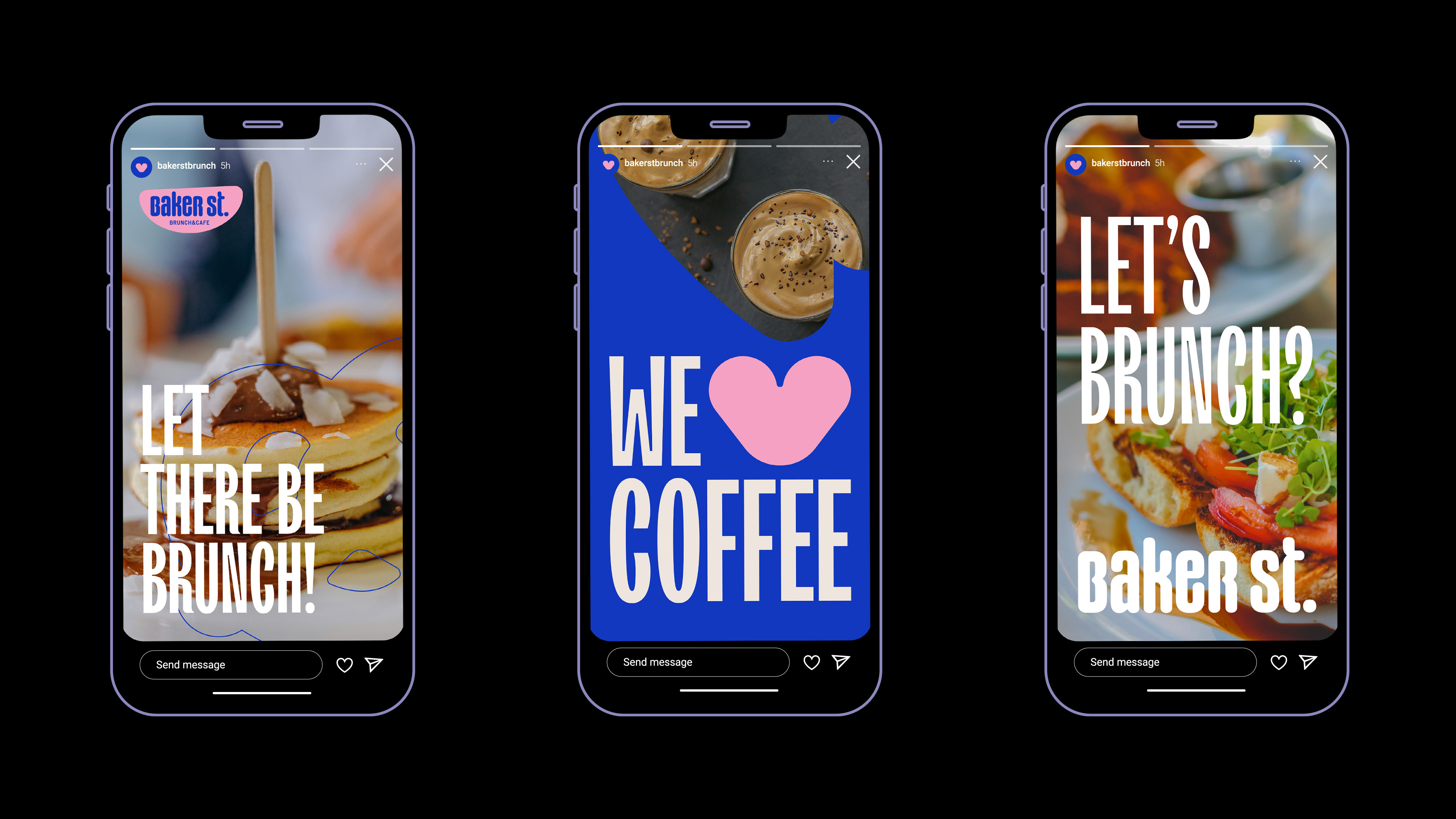
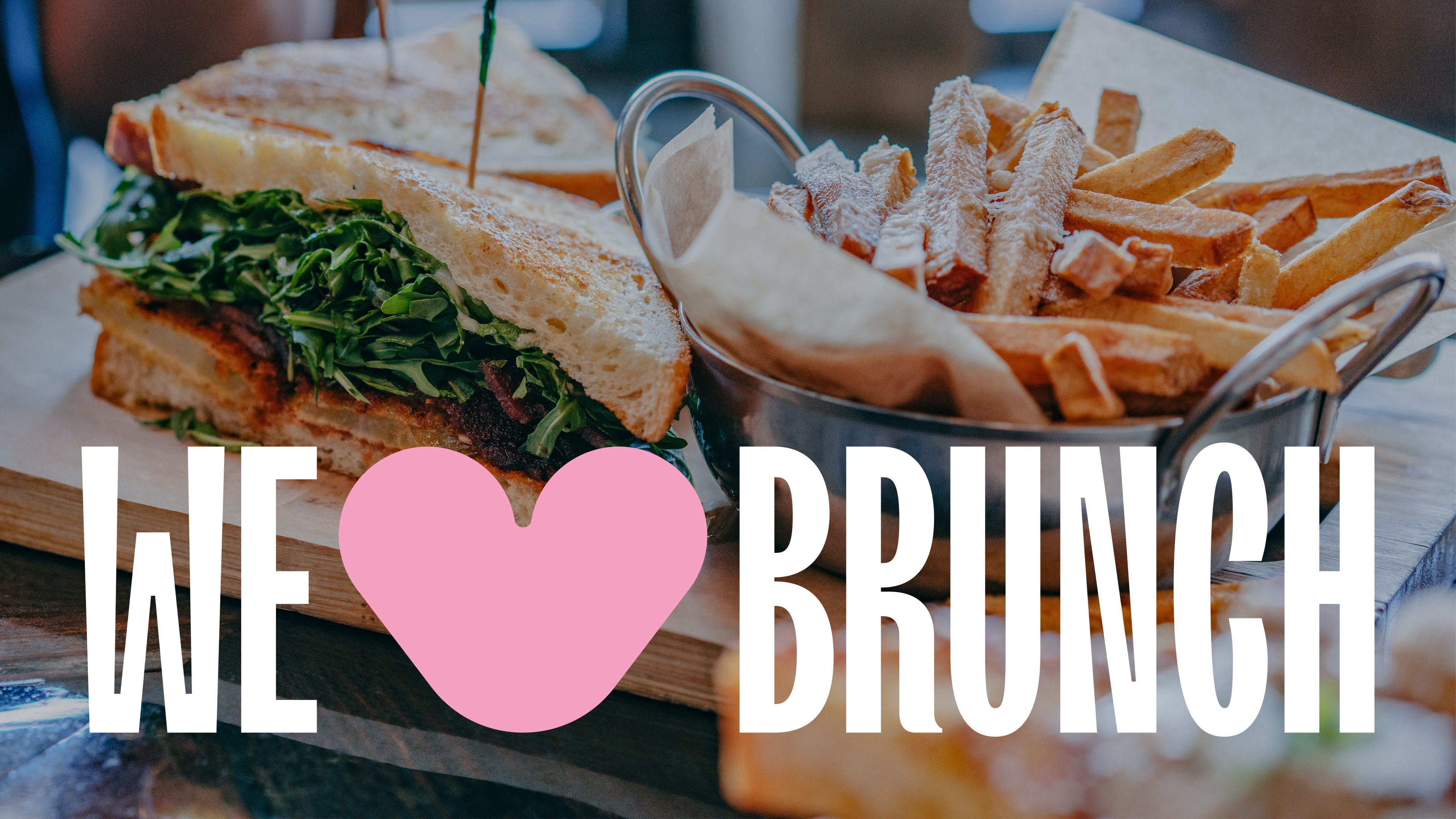
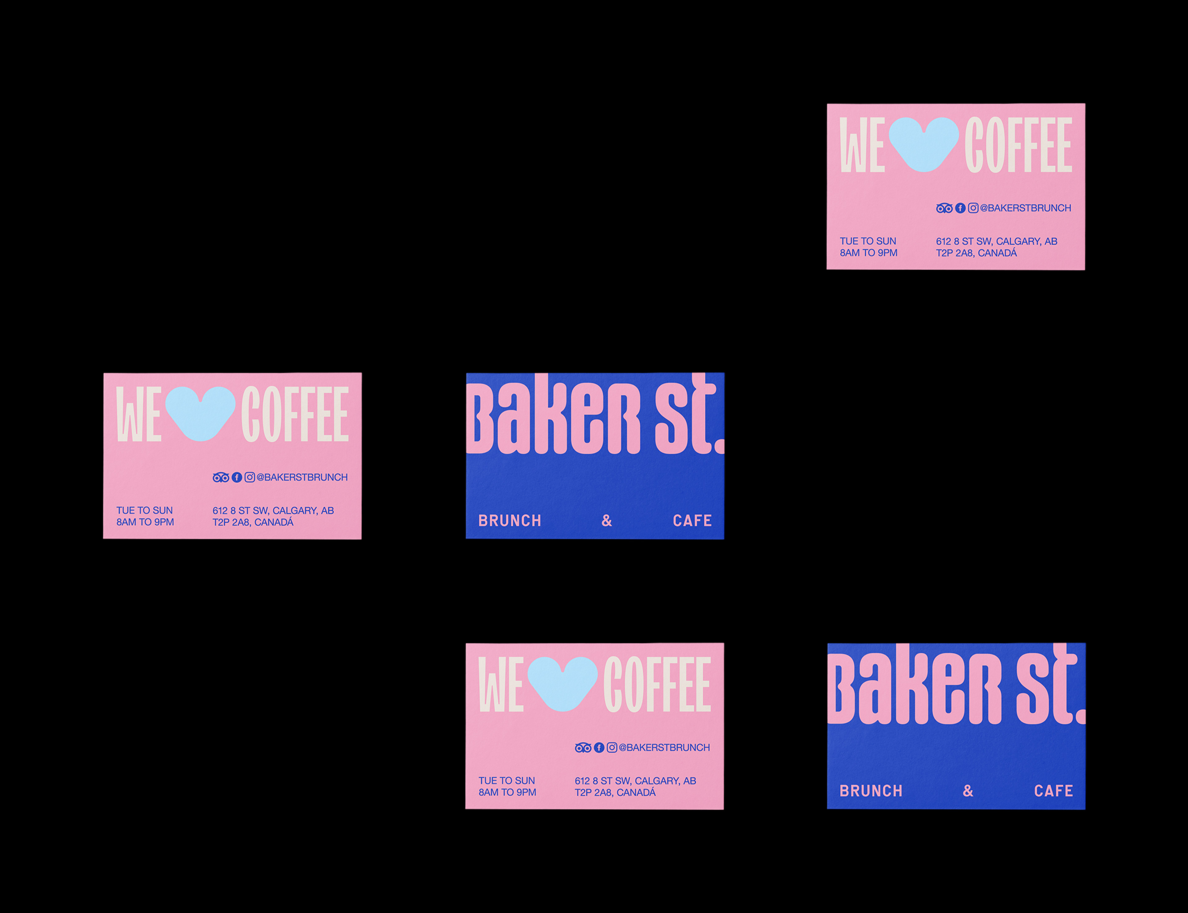
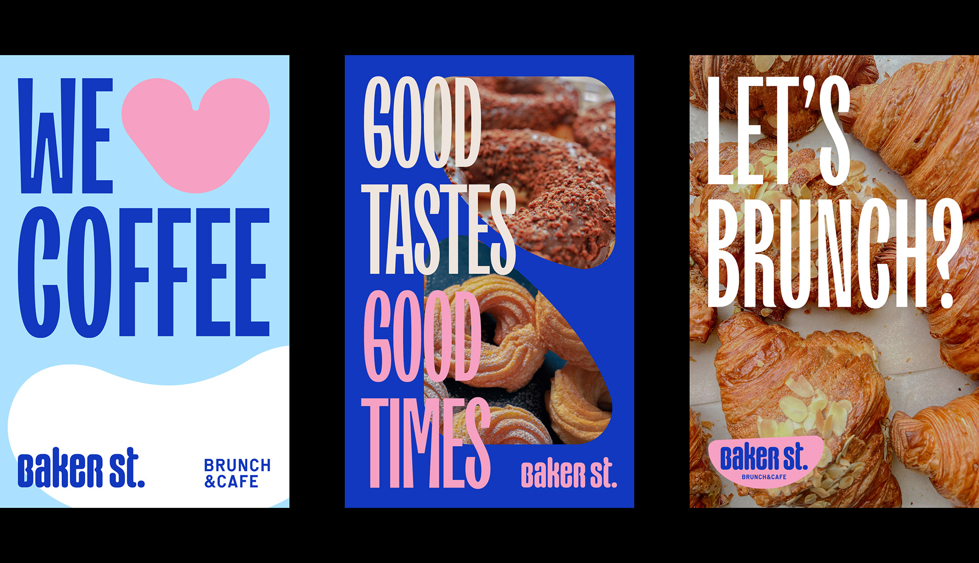
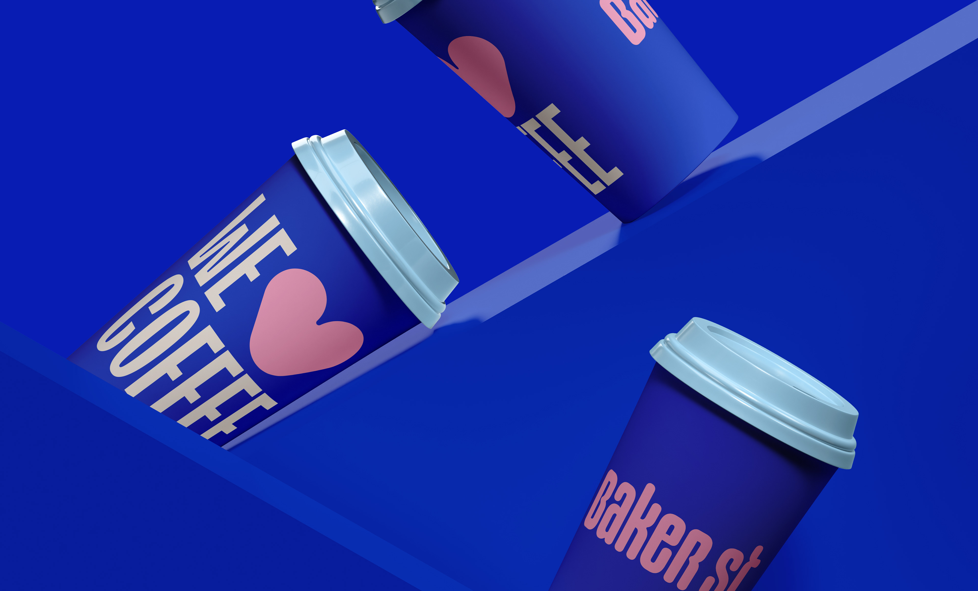
We 💙 Coffee
We 💙 Brunch
We 💙 People
Baker St. Brunch & Cafe is a Brunch and Cafe space in Calgary, Alberta, Canada. The name was chosen in honor of the famous street in London located in the Marylebone district of Westminster. Its name is a reference to the builder William Baker, one of those responsible for the construction of the work in the 18th century. Among its many tourist attractions is the fictional residence of detective Sherlock Holmes and Dr. John Watson, located at 221B Baker Street.
Brunch and Cafe is a huge market, and there is great demand and projected growth in this industry in the US and Canada, which is why Baker St. starts its activities, considering that its founder already has market experience in this sector.
Challenge
Baker St. it is very familiar, parents, children and grandparents, but also caters to young people from 25 to 35 years old who are looking for trends and live in a big city. Another difference is its average ticket, which is higher than traditional Fast Food chains, so it was important for the brand to convey a feeling of high standard, but not so much, after all, its direct competitor as a cafe is a low ticket compared to the chain of the most famous cafes in the world.
The main challenge proposed to us was to develop a visual identity that was colorful and at the same time minimalist, without forgetting to be friendly.
Solution
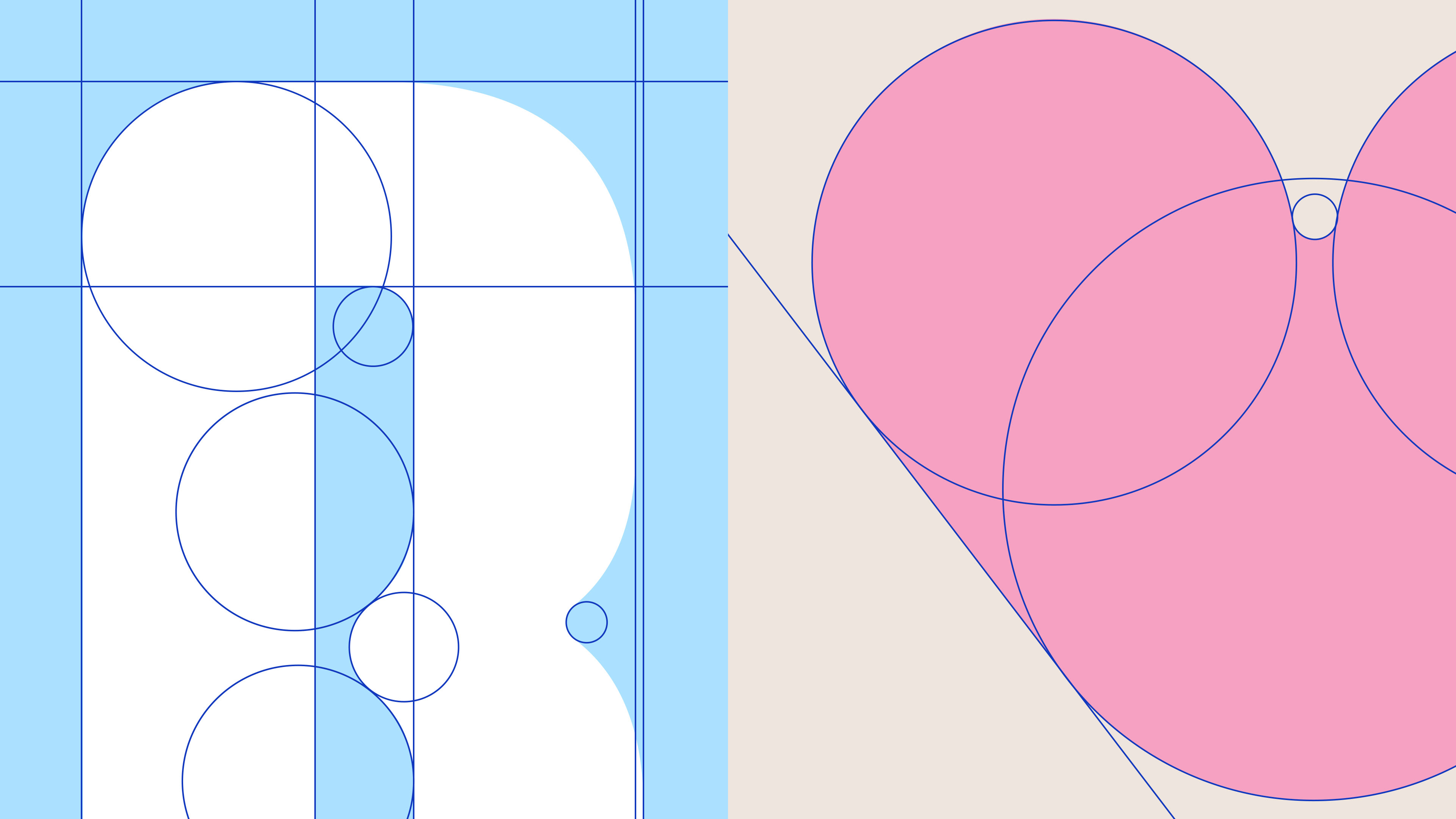
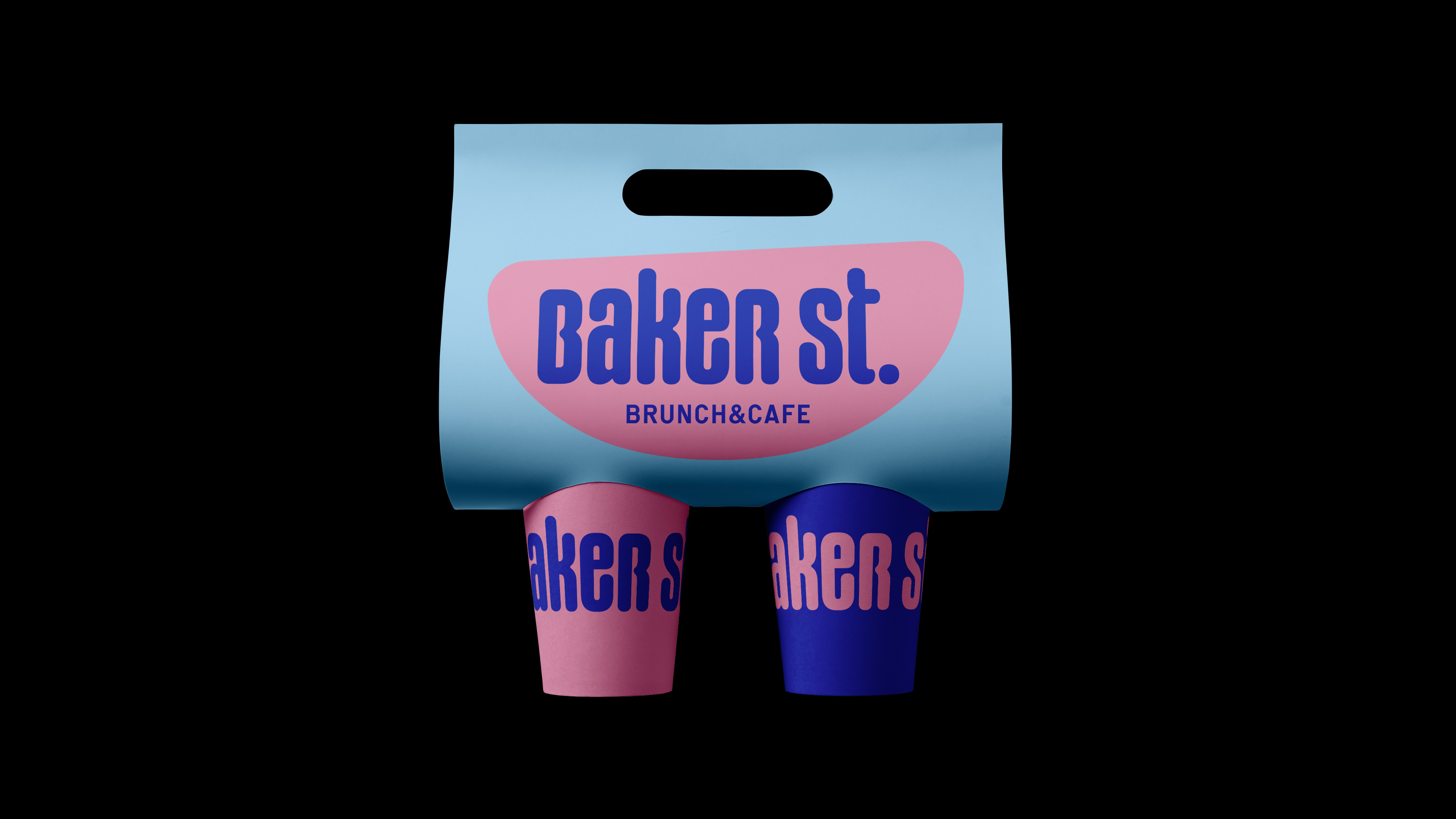
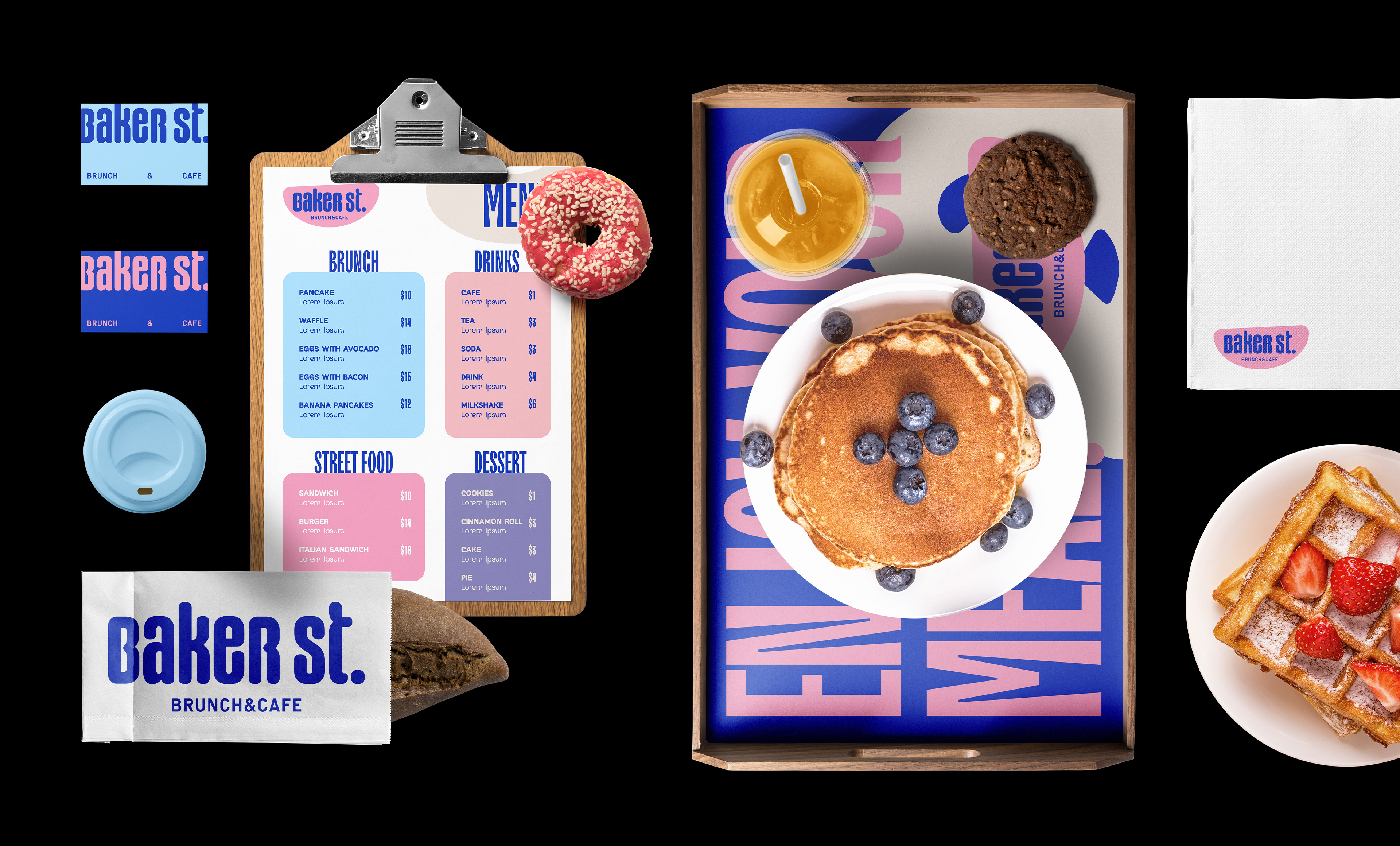
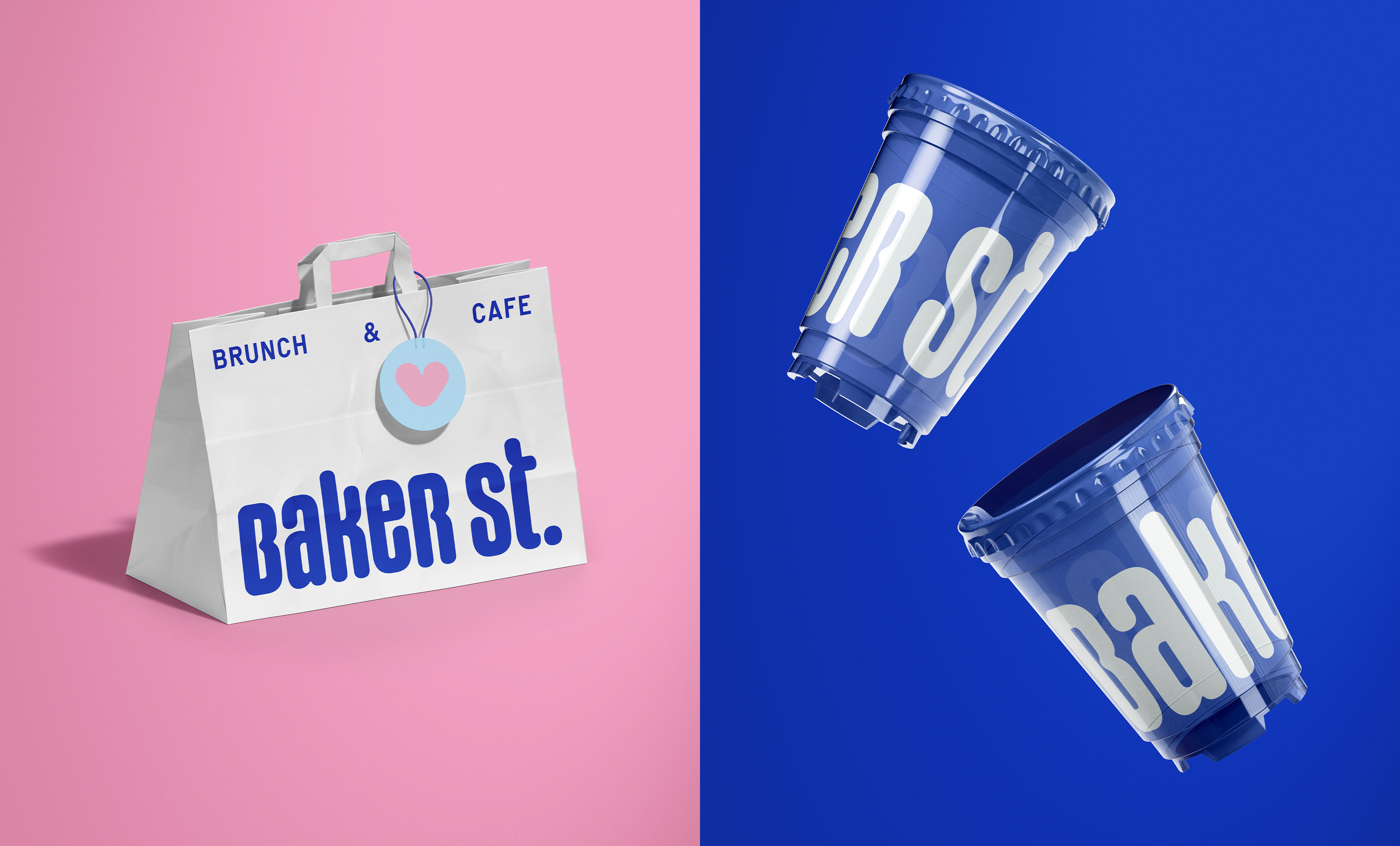
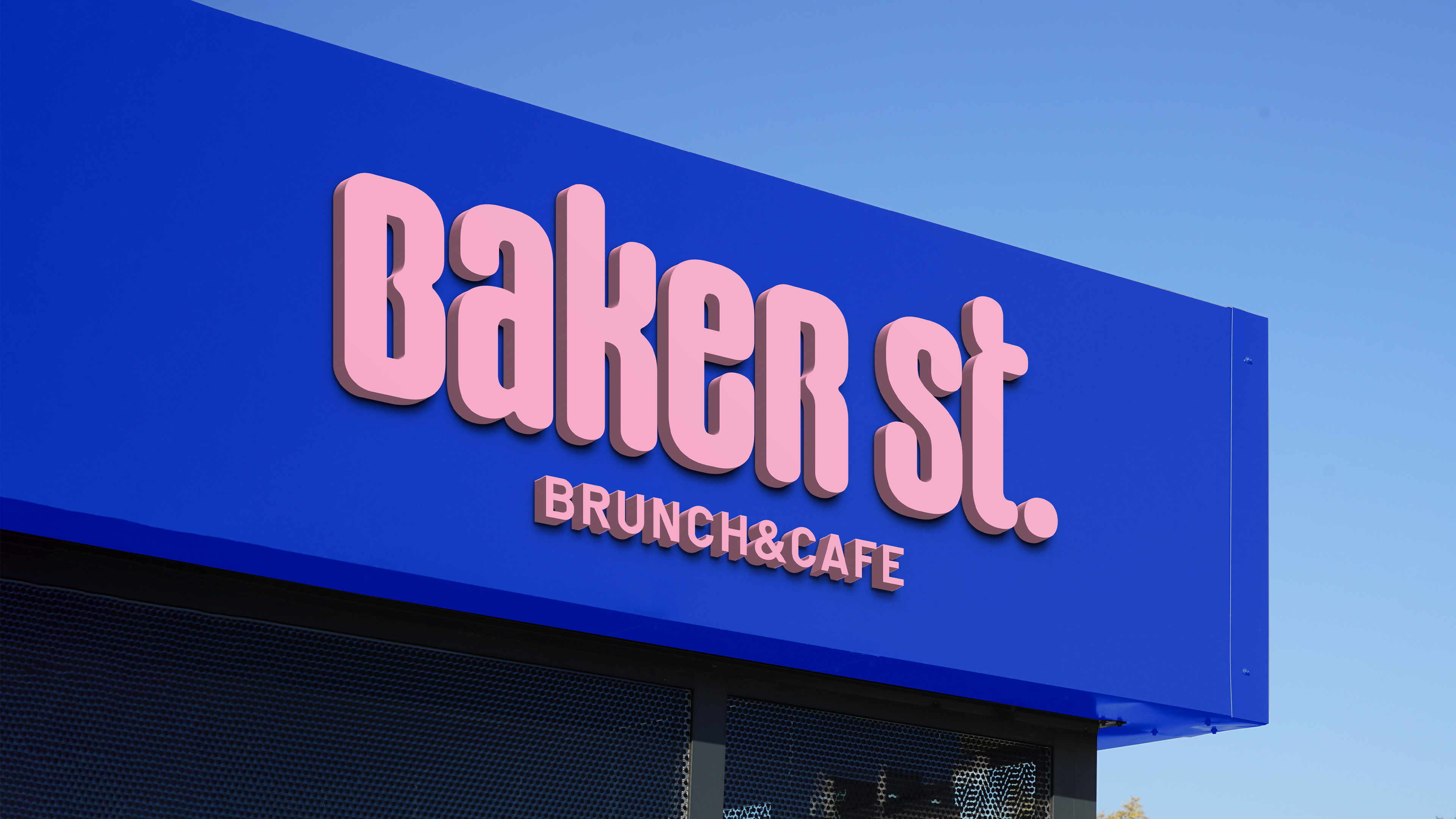
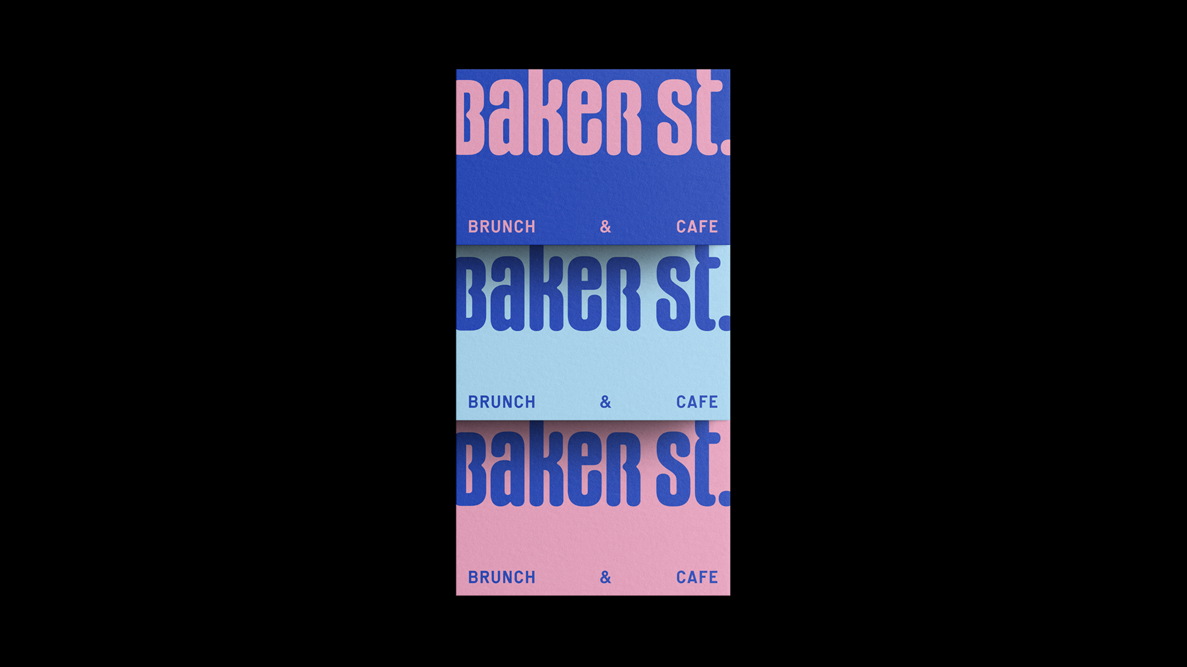
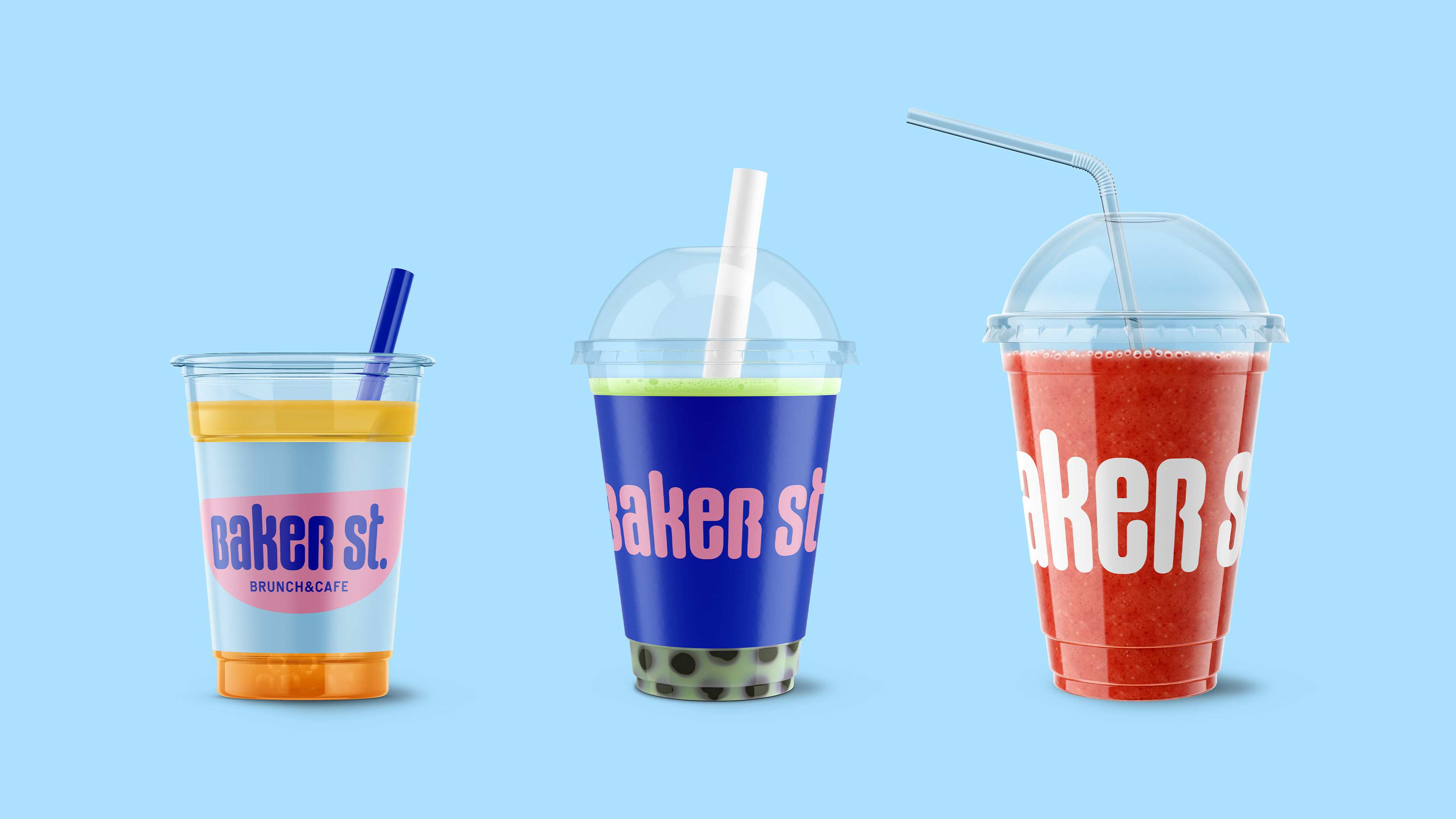
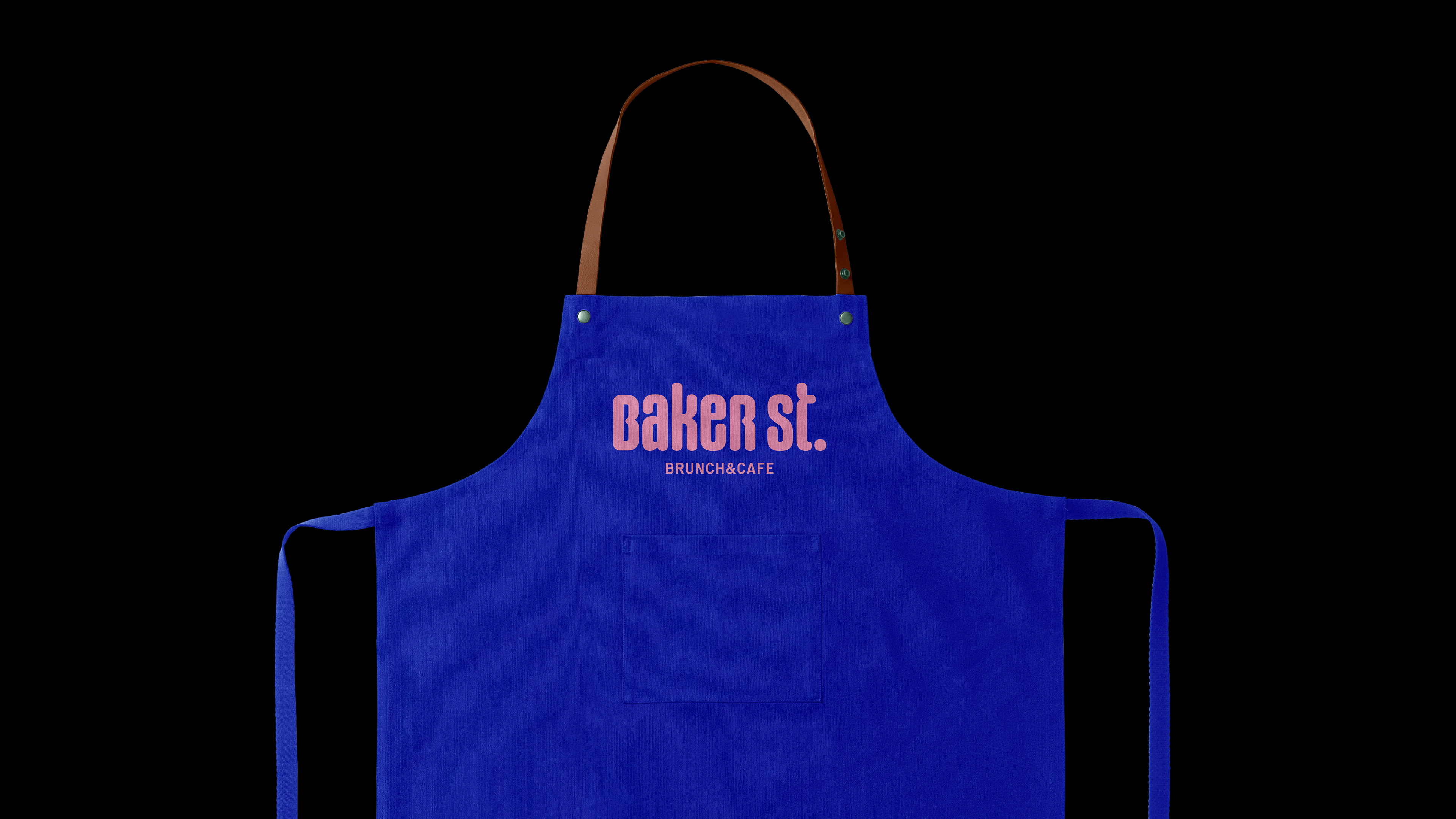
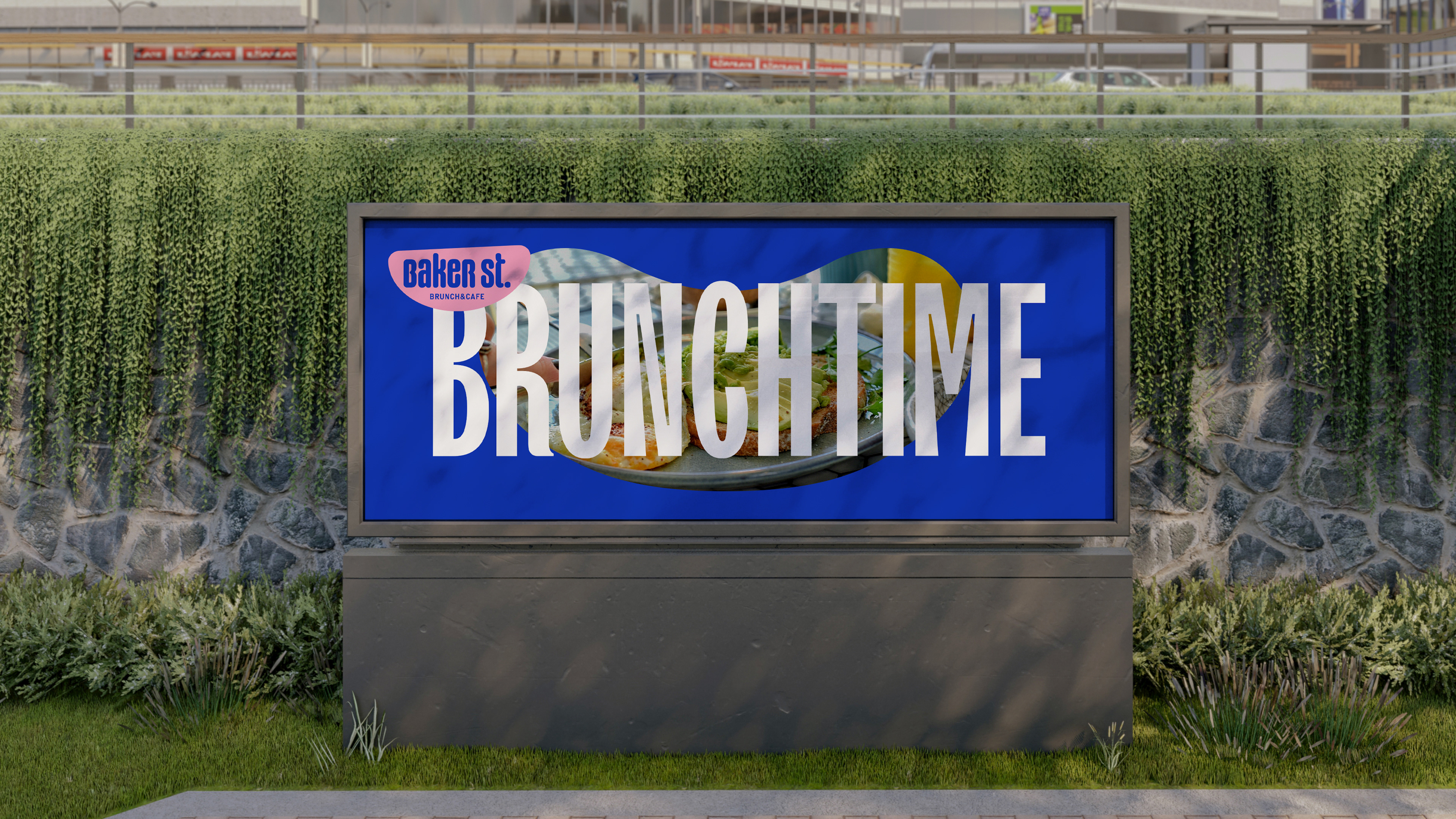
The solution was to create a visual identity very much based on shapes, constant use of typography and the colors of the palette. The goal was to create a simple, basic and friendly brand.
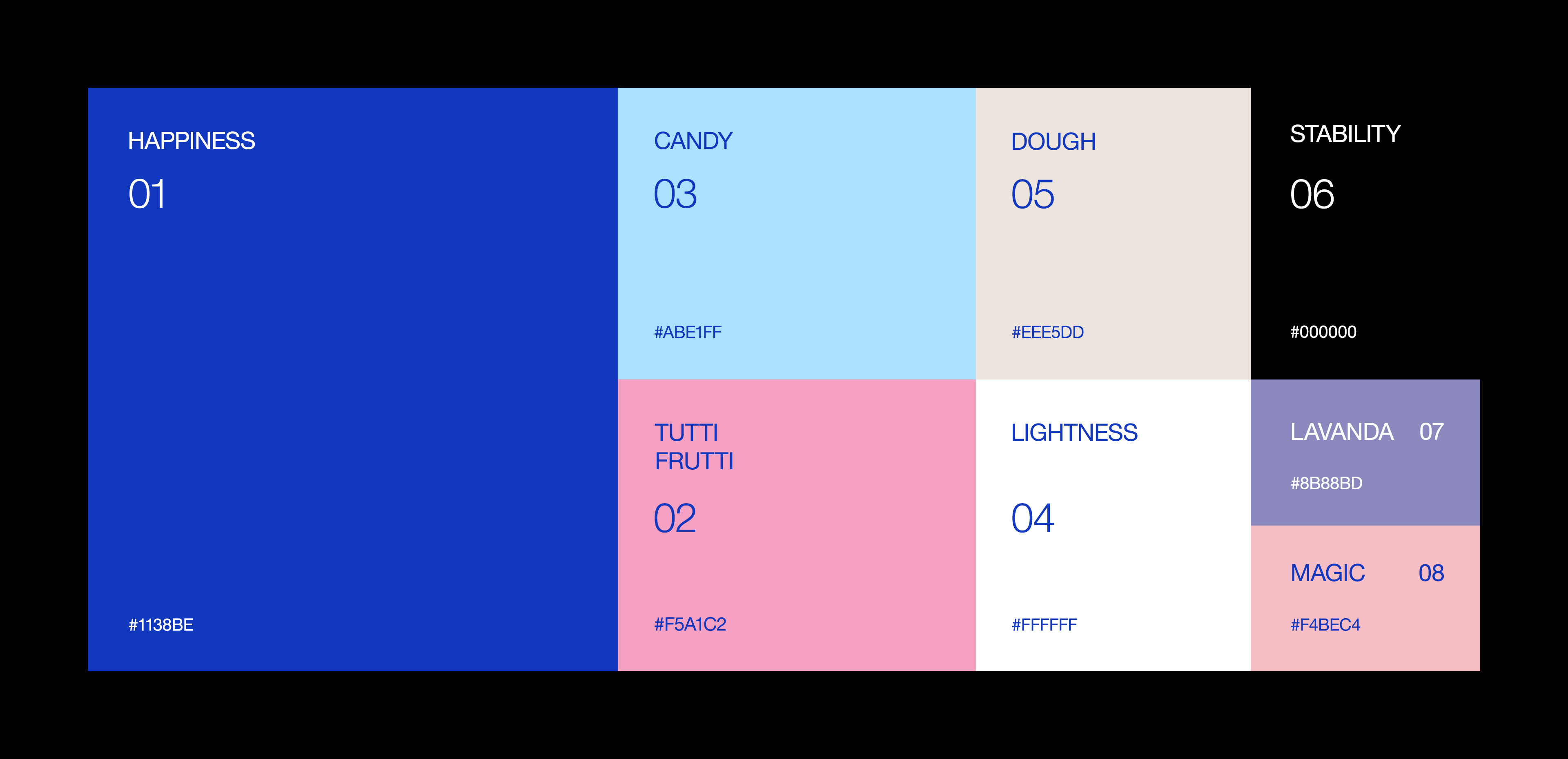
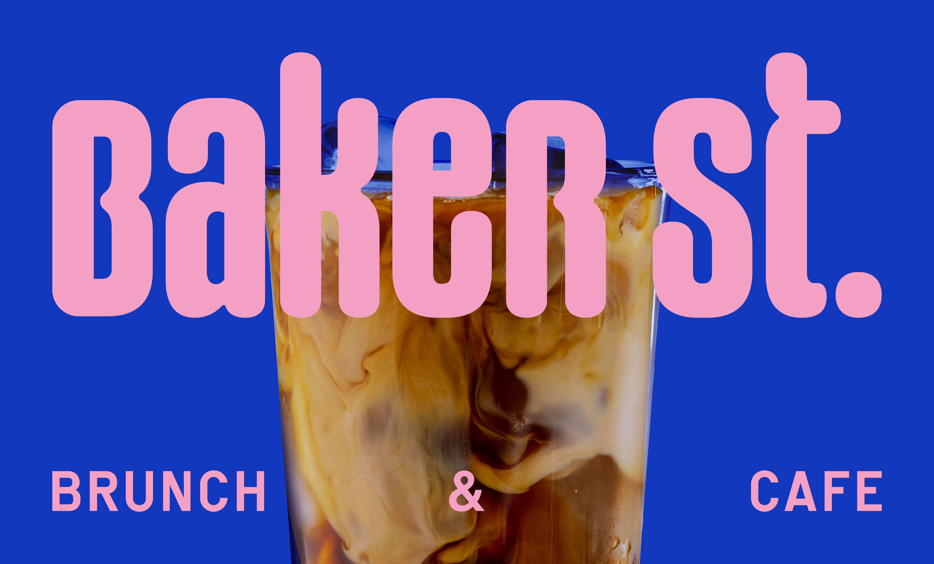
We sought to escape the commonplace of using red and black as the predominant colors, for which blue was chosen as the main color of the palette, making the brand, in addition to having a differentiation from its competitors, create its own personality.
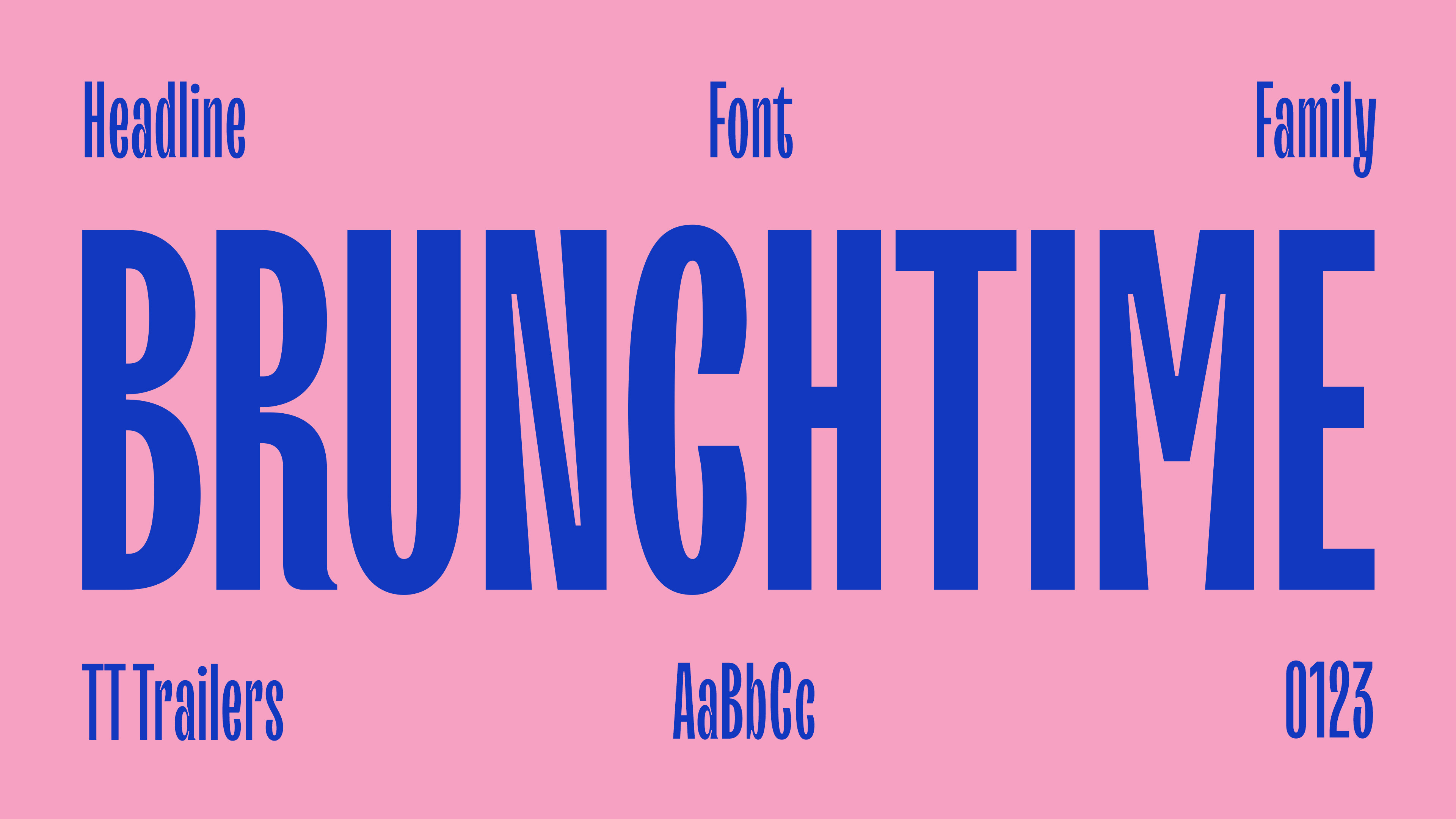
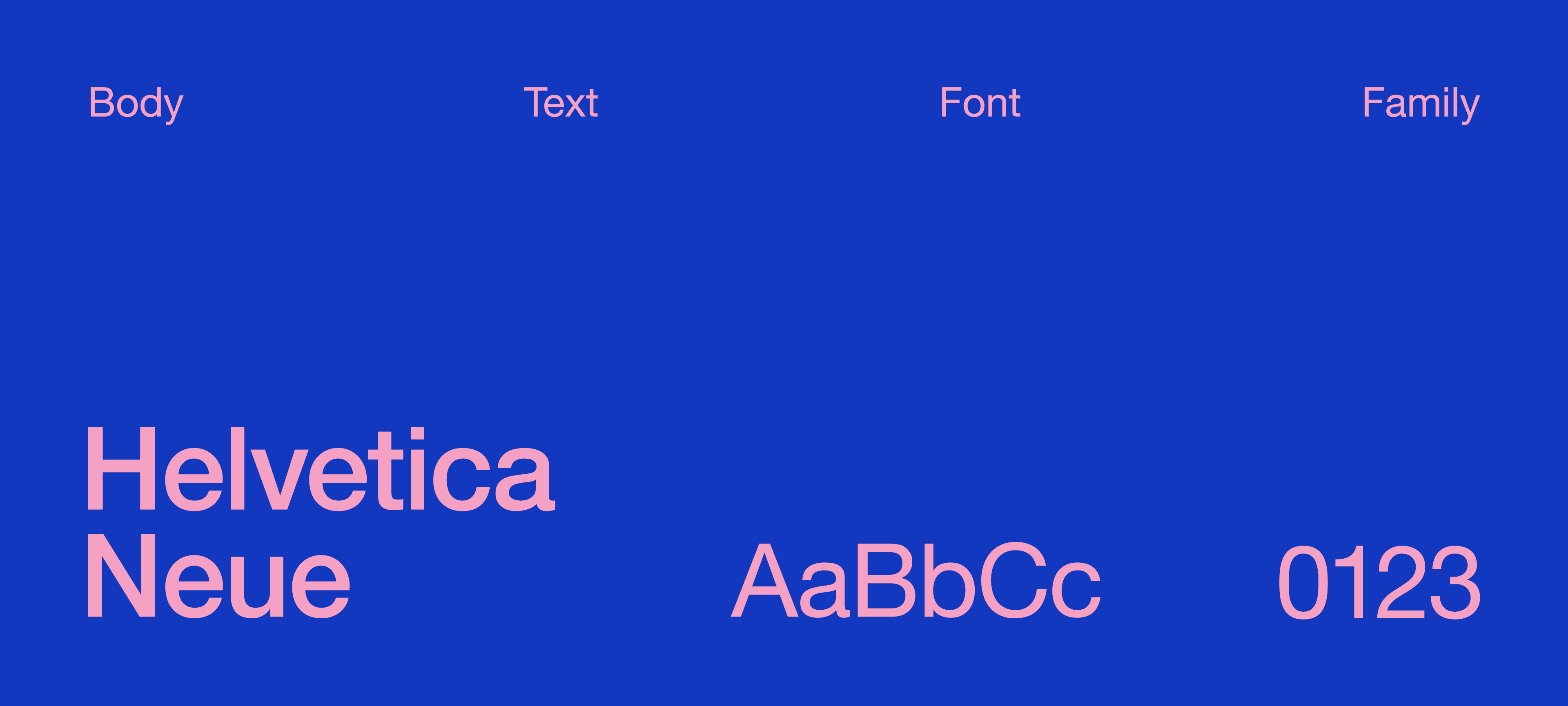
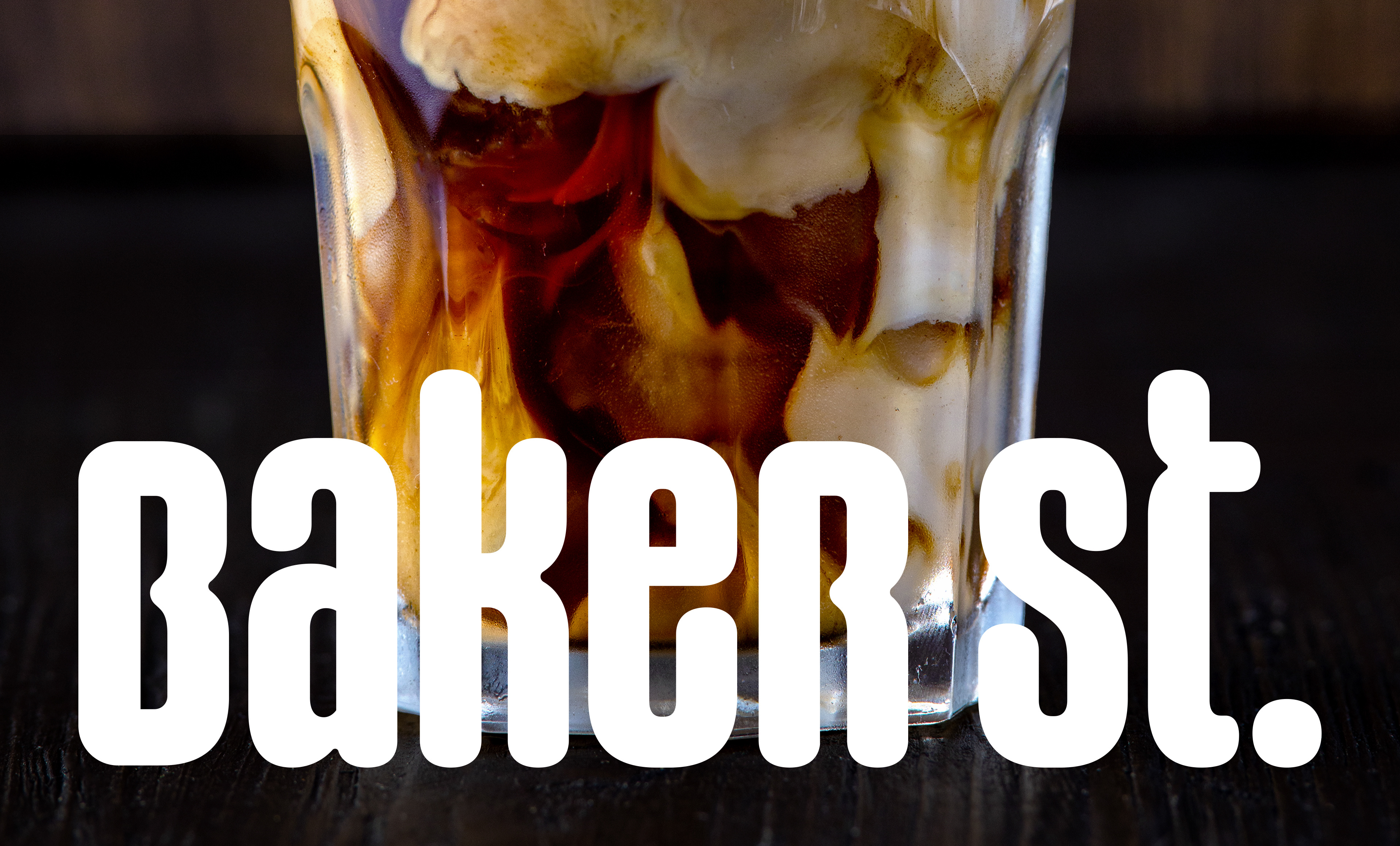
The typographic style was chosen to be fun and modern, the two fonts used as support typography, have these two proposals, one is more fun and the other more modern, one generates more proximity and also adds aesthetics to the Visual Identity because it is about one strong source and the other was brought in to support.
Another thing we thought was important to bring to the brand was the use of shapes, such as a heart, a smile or something related to coffee and brunch. The heart was thought to have the same essence as the logo, but it was not thought of as a symbol, the idea is to use it as a brand support.
We love people more than we love our brand.